Rob Whitworth’s dizzying ‘flow-motion’ tour around Barcelona.
(h/t thehighdefinite)
Hugely informative Map of Europe at the start of 1914, including a chronology of the first months of World War I.
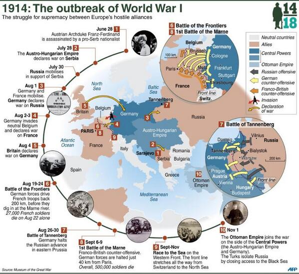
(h/t AFP)
Jason Keane’s beautiful tilt-shifted time-lapse film of Cork in Southern Ireland.
(h/t broadsheet)
Photographer Luke Shepard’s Nightvision is a stunning amalgamation of Europe’s finest architecture from 36 cities in 21 countries.
NIGHTVISION from Luke Shepard on Vimeo.
Nightvision is a celebration of the brilliance and diversity of architecture found across Europe. Over the course of three months I journeyed with a friend through 36 cities in 21 countries with the ambition of capturing some of the greatest European structures in a new and unique way. Comprised of thousands of carefully taken photographs, strung together and stabilized in post-production, Nightvision aims to inspire appreciation for these man-made landmarks.
For the full list of buildings, check lshep.com
Tomorrow Croatia will become the 28th Member of the European Union. In preparation for this, the folks over at neurope.eu have prepared an informative infographic detailing many interesting facts and figures about Europe’s newest member.

Infographic design by: Stedas dizajn – infographic design and web usability
A beautiful Tilt-shift video of Dublin created as a Student project by Olivia Ricci, Stephen Duffy, Rafal Baran & Afshin Moosavi.
Music: Hoppipolla by Sigur Ros.
For more check tiltshiftdublin.com.
(h/t thejournal.ie)
Matthieu Chardon creates a beautiful montage of Dublin and it’s historic buildings.
(via broadsheet)
Ireland’s disastrous bank bailout has seen the Government pump more than €64.1 billion into the majority of Irish banks. The effect of this saw the country apply to he EU and IMF for a bailout to keep the sovereign afloat. Newly elected TD Stephen Donnelly reveals the context of this bailout in comparison with other EU countries.
The graphic underlines the impact that the banking crisis has had on the average Irish taxpayer.

(via Stephen Donnelly)
Sports website TheScore have visualized the 12 million Euro 2012 tweets to produce the infographic below. The data was taken from social analytics company Sysomos and highlights a new tweets-per-second record for sports in the the final match between Spain and Italy.
Some stats from the infographic:

(h/t mashable.com)
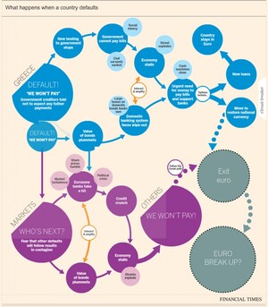
The idea of a Greek exit from the eurozone looks more and more likely each day, with the consequences now said to be ‘managable’. There has been a number of flowcharts and interactive graphics highlighting likely consequences resulting from such a scenario. Some of the most recent are outlined below. Click on the graphics for the full interactive versions.
Financial Times
This interactive graphic from the Financial Times (FT) outlines the likely consequences of a Greece eurozone exit.
Lombard Street Research / (via Guardian)
Along, with this Lombard Street Research has provided a flowchart (considering what happens in the event of a Greek euro exit) and the options ahead for the eurozone.

BBC
The BBC also has a handy interactive graphic contemplating what could happen next if Greece leaves the eurozone.

(h/t broadsheet)

