Category Archives: Graphs and Charts

Graphs and Charts Politics Visualizations

Growth in America’s Wealth disparity – [VISUALIZED]

David Cay Johnston writing at Tax Analysts has a superb visualization of the growth in Income inequality in America. The chart below features data taken from the Internal Revenue Service and highlights the growth in income inequality in the USA since the 1960s.
Wealth disparity in America

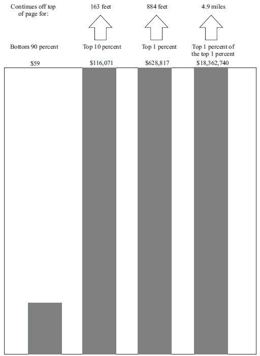
The bottom 90 percent is represented by an inch-high bar while the growth of the top 10 percent needs a 163 foot-tall bar and the top 0.01% need a 4.9 mile-high bar to represent their wealth growth.

The income growth and shrinkage figures come from analysis of the latest IRS data by economists Emmanuel Saez and Thomas Piketty, who have won acclaim for their studies of worldwide income patterns over the last century.

In 2011 entry into the top 10 percent, where all the gains took place, required an adjusted gross income of at least $110,651. The top 1 percent started at $366,623.

The top 1 percent enjoyed 81 percent of all the increased income since 2009. Just over half of the gains went to the top one-tenth of 1 percent, and 39 percent of the gains went to the top 1 percent of the top 1 percent.

Ponder that last fact for a moment — the top 1 percent of the top 1 percent, those making at least $7.97 million in 2011, enjoyed 39 percent of all the income gains in America. In a nation of 158.4 million households, just 15,837 of them received 39 cents out of every dollar of increased income.

(h/t boingboing)

Graphs and Charts Infographic Travel

Evolution of Container Ships – [INFOGRAPHIC]

The BBC Magazine has a terrific story on the evolution of container ships and discusses a new vessel – the largest ever – to enter service later this year.

From the article:

What is blue, a quarter of a mile long, and taller than London’s Olympic stadium? The answer – this year’s new class of container ship, the Triple E. When it goes into service this June, it will be the largest vessel ploughing the sea.
Each will contain as much steel as eight Eiffel Towers and have a capacity equivalent to 18,000 20-foot containers (TEU).

Evolution of Container Ships

(via sunfoundation)

Funny Graphs and Charts

Correlation and Causation – [CHART]

Redditor Jasonp55 has created a fine example of the issues surrounding the confusion of correlation with causation.  The issue relates to associating the number of individuals diagnosed with Autism and the sales of organic food – Correlation does not imply causation.

Real cause of increasing autism prevalence?

(via boingboing)

Art Funny Graphs and Charts Video

Solving the Problem of Ugly Greeting Cards – [VIDEO]

An interesting Kicktarter project to tackle the pressing issue of ugly greeting cards. The project promises to develop a robust solution to the loathsome issue of greeting cards that are so ugly that they make babies cry.

For full images of the cards and to support this project check Kickstarter. My favorite card below:

Greeting Card

(via boingboing)

Graphs and Charts Visualizations

The Elements According to Relative Abundance – [VISUALIZATION]

A periodic chart by Prof W Sheehan of University of Santa Clara depicting each element of the Periodic table by its relative Abundance.

Roughly, the size of an element’s own niche is proportioned to its abundance on Earth’s surface, and in addition, certain chemical similarities.

H is Hydrogen, C is Carbon and O is Oxygen…but you knew that already. (Periodic table)

The Elements According to Relative Abundance

(via Visual.ly)
Graphs and Charts Infographic Visualizations

Modern Approaches to Data Visualization – [VISUALIZATION]

David Friedman (Editor of Smashing Magazine) has crafted together a superb collection of resources representing some of the most interesting modern approaches to data visualization.

The article goes through some fascinating ways to visualize data including: Mindmaps, Ways of displaying news/data/connections and websites. Along with this, the article highlights many useful resources and tools to assist in creating powerful charts, diagrams, maps, statistics and data visualisations. An altogether fantastic resource.
Data visualization - Modern approaches

Check out the full article at Smashing Magazine – Data Visualization: Modern Approaches.

Graphs and Charts

What Americans Do At Weekends – [GRAPHIC]

Planet Money’s Graphing America series asks the question; What do those people do on the weekends, when they’re not working?

Taking data from the American Time Use Survey (conducted by the Bureau of Labor Statistics), they answer the question below.
What Americans Actually Do All Weekend

(via NPR’s Planet Money)

Graphs and Charts Visualizations

100 Years Of Immigrants In America – [GRAPHS]

NPR’s Planet Money have a couple of new charts showcasing the change in the immigration as a share of the U.S. population over the past century. Given the rhetoric on immigration it’s interesting to note how this percentage has barely changed over the past 100 years.
% of US population born in a foreign country

The also note:

A century ago, U.S. immigrants were overwhelmingly European. Today, Latin America and Asia are the big drivers of U.S. immigration, and Europe accounts for just a small fraction of the whole.

Percentage of foreign born population

(via Planet Money)

Enterprise 2.0 Funny Graphs and Charts

Enterprise IT Adoption – [CHART]

Simon Wardley’s fantastically accurate representation of the enterprise IT adoption cycle.

Enterprise IT Adoption

While the chart could be dismissed as a bit of fun, it has it’s origins in a tweet below from Joe Drumgoole. I challenge those of you working in a corporate IT environment to confess there’s not some truth in it.

(via Adoption cycles)
(h/t boingboing)

Funny Graphs and Charts

Replying to Emails – [FUNNY]

Visual.ly explaining the age old email conundrum of why you sometimes don’t get replys to emails. We’ve all been there…
Email replys

(via visual.ly)