Art Time-lapse Travel Video

US Cities Light Up – [VIDEO]

Filmmaker Aaron Keigher beautifully captures the transition from dusk to night light of US cities Boston, Chicago, Las Vegas and all throughout California.

Art Mashup Music Video

DJ Earworm’s 2016 ‘United State of Pop’ – [VIDEO]

DJ Earworms’s 2016 mashup of the 25 most popular songs in the US has just dropped.

It includes mashups of songs including:
Bruno Mars – 24K Magic
Calvin Harris and Rihanna – This Is What You Came For
D.R.A.M. and Lil Yachty – Broccoli
Desiigner – Panda
DJ Snake and Justin Bieber – Let Me Love You
DNCE – Cake By The Ocean
Drake featuring Wizkid and Kyla – One Dance
Fifth Harmony and Ty Dolla $ign – Work From Home
Flo Rida – My House
Justin Bieber – Love Yourself
Justin Timberlake – Can’t Stop The Feeling!
Lukas Graham – 7 Years
Major Lazer featuring Justin Bieber and MØ – Cold Water
Mike Posner – I Took A Pill In Ibiza
Rae Sremmurd – Black Beatles
Rihanna – Needed Me
Rihanna and Drake – Work
Sia – Cheap Thrills
The Chainsmokers and Daya – Don’t Let Me Down
The Chainsmokers and Halsey – Closer
The Weeknd and Daft Punk – Starboy
Twenty One Pilots – Stressed Out
Twenty One Pilots – Heathens
Twenty One Pilots – Ride
Zayn – Pillowtalk

Infographic

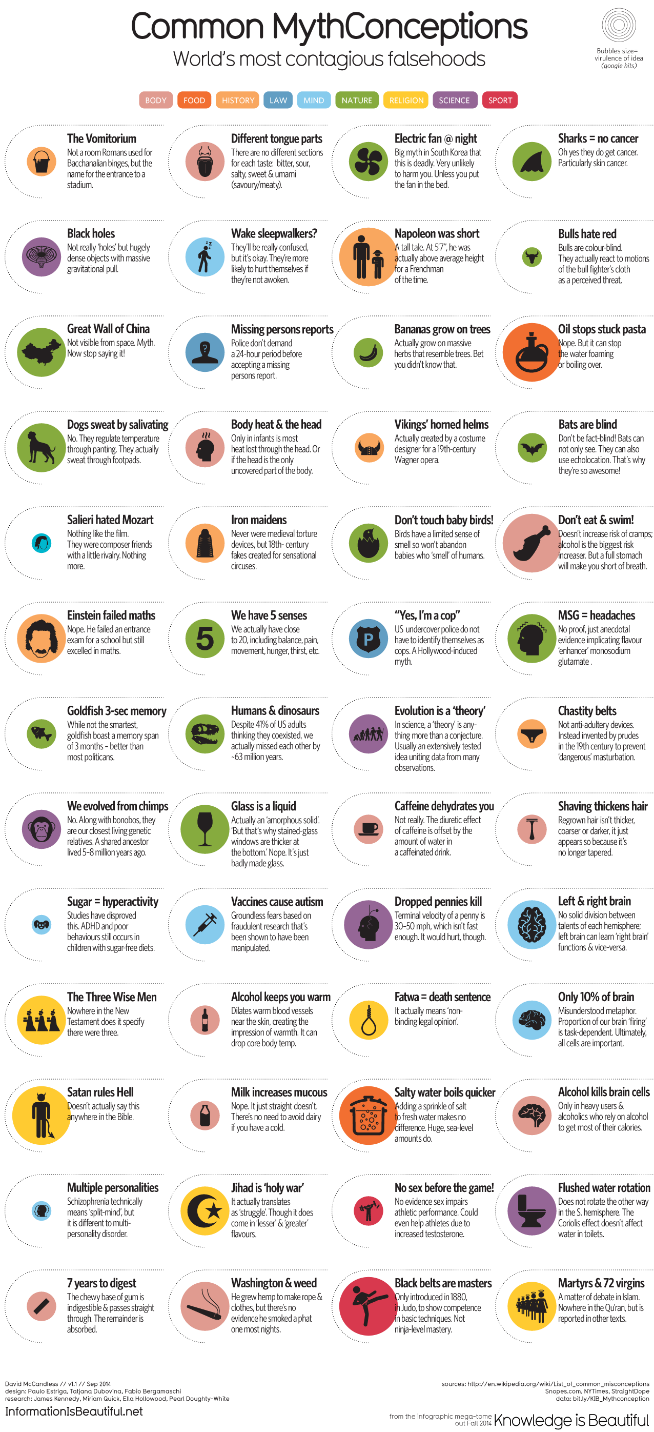
Common Misperceptions – [INFOGRAPHIC]

Information is Beautiful provides a concise collection of the 52 Most Common Myths Debunked.

Tilt-Shift Time-lapse Travel Video

Awesome Albania – [Tilt-Shift Video]

A fantastic journey through the wonders and magnificence of Alanaia. This 4k tilt-shift video travels UNESCO World Heritage sites like Berat, Gjirokastra and Butrin. It shows the beautiful beaches of Ksamil, Himara along with the serenity of the capital Tirana.

Art Travel Video

Amazing Hong Kong – [VIDEO]

Brandon Li’s stunningly beautiful short video on the daily life and culture in Hong Kong.

(h/t boingboing)

Art Graphs and Charts Visualizations

2015 NYT Year in Visual Stores and Graphics – [VISUALIZATION]

2015 has been a breakthrough year for the New York Times in terms of the breath and reach of its storytelling techniques. Whether it’s through data visualizations or maps, we’ve seen an increase in the scope and breath of graphics to drive narrative and explanation. The news organization has gathered together some of its best examples in 2015: The Year in Visual Stories and Graphics.

My favorites of each category are below:

Visual features

The Dawn Wall – El Capitan’s Most Unwelcoming Route

Longform Stories

Buying Power – The Families Funding The 2016 Presidential Election

Data-Driven Articles

What Drives Gun Sales: Terrorism,Politics and Calls for Restrictions

Maps

The World According to China

Motion Graphics and Video Stories

Three Hours of Terror in Paris, Moment by Moment

Data Visualization

TThe Flight of Refugees Around the Globe

Video

Steven Pinker on Linguistics and Style – [VIDEO]

Steven Pinker presents the latest research in linguistics and cognitive science. He outlines differences in style guides and some hilarious misuses of words and grammar.

(h/t boingboing)

Mashup Music Video

DJ Earworm Mashup – United State of Pop 2015 [VIDEO]

DJ Earworm’s mashup of 2015’s biggest US hits.

Infographic Science

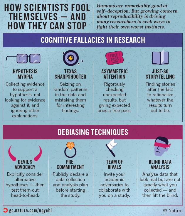
How Scientists Fool Themselves – [INFOGRAPHIC]

Research is tough and there are numerous ways in which data can be interpreted incorrectly. Nature recently published an striking article detailing the many ways in which scientists end up tricking themselves into seeing evidence that isn’t there, resulting in publishing false results. The highlights are outlined below

(Source: How scientists fool themselves – and how they can stop)

Infographic

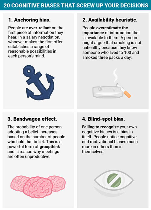
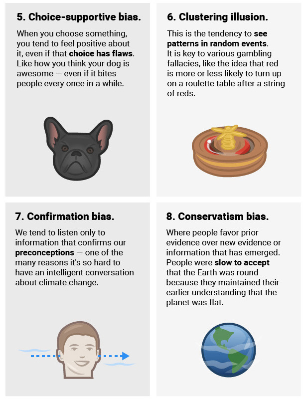
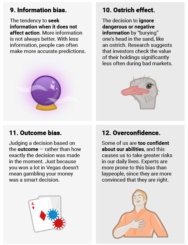
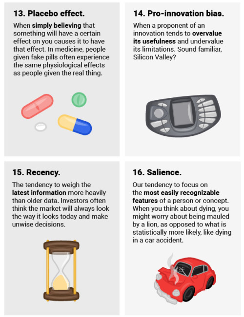
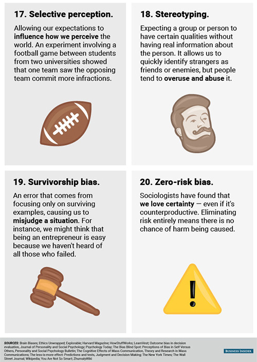
20 Cognitive Biases – [INFOGRAPHIC]

20 of the most popular and common cognitive biases.

(via thisishappiness)