A different kind of Periodic table…

(h/t broadsheet)
A different kind of Periodic table…
(h/t broadsheet)
The Economist’s superb visualization of 2014’s upcoming elections.
Today's #Dailychart shows that 2014 is a big year for elections worldwide http://t.co/yWNx8YldaA pic.twitter.com/2nHxds7JGG
— The Economist (@TheEconomist) January 6, 2014
(h/t sunlightfoundation.com)
The folks over at wait but why have created a fantastic series of charts representing different timescales in history. They seek to put a wide range of historical moments into a time perspective.
From the blog:
Humans are good at a lot of things, but putting time in perspective is not one of them.It’s not our fault—the spans of time in human history, and even more so in natural history, are so vast compared to the span of our life and recent history that it’s almost impossible to get a handle on it…To try to grasp some perspective, I mapped out the history of time as a series of growing timelines—each timeline contains all the previous timelines (colors will help you see which timelines are which).

For the full series of charts, head to wait but why.
(h/t boingboing)
Doghousediaries’ nice visual representation of where your data lives.
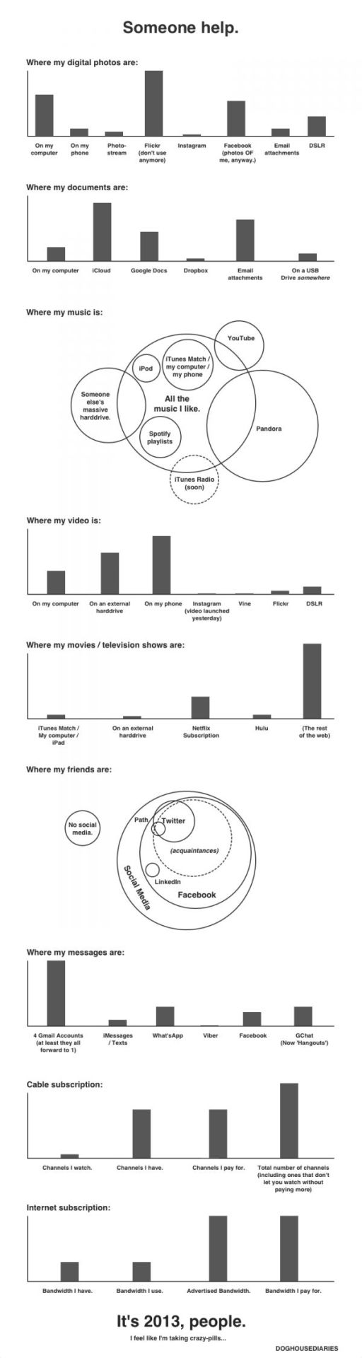
(h/t sunlightfoundation)
Michael Rigley beautiful animation below – titled “Network” – provides a thought provoking analysis of the sheer mass of personal data being captured and stored by mobile phone companies. The video was created for his BFA design thesis project at the California College of Art.
(via boingboing)
Google has announced a new visualization page highlighting the latest trending topics in different colors and sizes. It provides information on real-time searches being executed on the site. Check out Google Trends.

(via mashable)
Jay Gordon has created a mesmerizing visualization of the daily flows of London commuters. Spatial.ly notes how:
It combines the 16 million or so daily transactions made with London’s Oyster cards with vehicle-location data from the city’s 8,500 buses to infer journeys of approximately 3.1 million Oyster users. After inferring the times and locations of each bus boarding and alighting, bus and rail transactions are combined to reconstruct each cardholder’s daily travel history.
From more check jaygordon.net.
Nanex (a developer of real-time trading software) has put together an astonishing video visualizing the stock trading activity in Johnson & Johnson (JNJ) as it occurred during a particular half a second on May 2, 2013.
For more, check out the Huffington Post’s article on the subject.
(h/t SunlightFoundation)