The folks over at UsVsTh3m have created a neat explainer for the latest Daft Punk record.
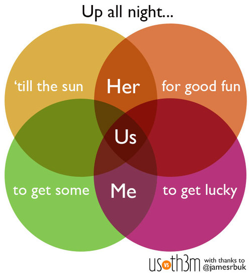
Watch the video below and check the resemblance.
(via UsVsTh3m)
Bayern Munchen’s 2:1 victory against Borussia Dortmund in this year’s Champions League securing their fifth title in Europe’s most prestigious football cup. For anyone who missed this trilling finale, the Guardian has recreated a shortened version of the match in Lego.
Twitter also visualized the final – in terms of tweets per minute and player mentions.

(h/t mashable)
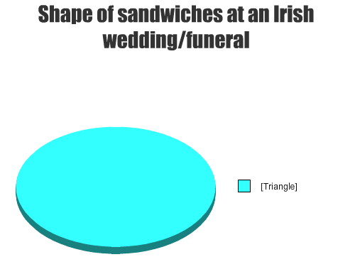
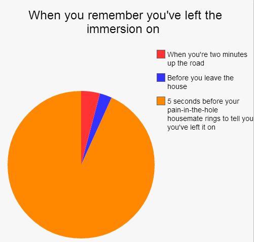
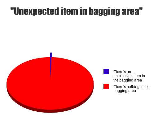
The Daily Edge has a funny compilation of pie-charts on themes Irish people – or those that have lived in Ireland – can all identify with. It contains 17 visualisations of instances which somehow highlight traits to the Irish character. My top five are below:
1) Fields of Athenry

2) Sandwiches
3) Gaeilge

4) The immersion
5) Tesco
In a similar vein to those above RTE’s Republic of Telly recently had a short clip on the them of being Irish. Check it out below
(for some more funny pie-charts check thepoke’s collection).
A lesson in how not to create pie charts…

(h/t broadsheet)
Just a funny pie-chart referencing the 80’s chart topping band Bros.

(h/t broadsheet)
Just a funny comic…step 5 is hilarious.

(via broadsheet)
The folks over at HappyPlace have created a wonderful chart to indicate what cats and dogs want from their petting interaction. Some useful advice for all pet owners.


(via HappyPlace)
Redditor Jasonp55 has created a fine example of the issues surrounding the confusion of correlation with causation. The issue relates to associating the number of individuals diagnosed with Autism and the sales of organic food – Correlation does not imply causation.
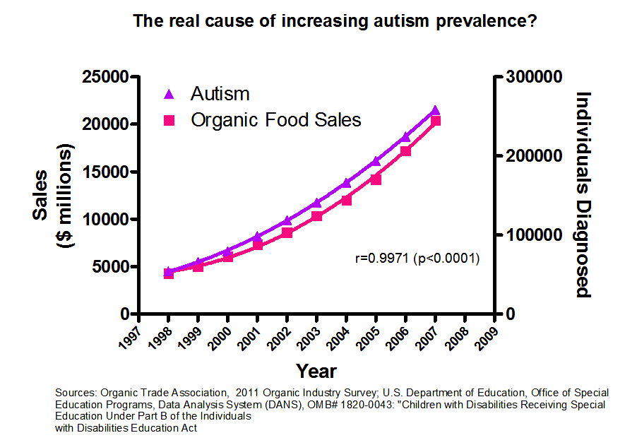
(via boingboing)