The folks over at UsVsTh3m have created a neat explainer for the latest Daft Punk record.
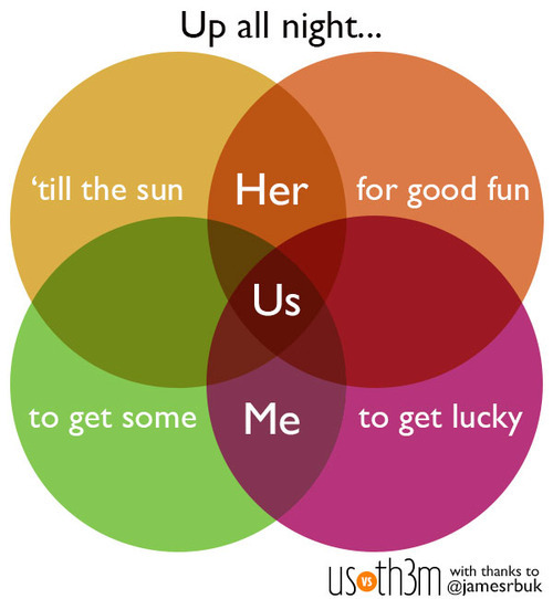
Watch the video below and check the resemblance.
(via UsVsTh3m)
Sociological Images’s Lisa Wade has good concise blog post highlighting the errors in a recent set of graphics released by the Romney campaign. She points out:
Mitt Romney’s campaign put out a set of graphics illustrating a “gap” between what Obama promised and what he has delivered. The graphic is in the form of a Venn diagram, a visual designed to show the overlap between two conditions…
Unfortunately, Romney’s overlapping circles are not Venn diagrams, making the campaign somewhat ridiculous and giving nerdy liberals all over America a good chuckle.


Graphjam also weights in on the subject:

(via Sociological Images and Graphjam)
(h/t Boingboing)
Venn Diagrams – is there anything they cannot do!
(via broadsheet)

