A powerful video highlighting the differences in perceptions versus reality of the distribution of wealth in America. The reality is often not what we think it is.
(via boingboing)
A powerful video highlighting the differences in perceptions versus reality of the distribution of wealth in America. The reality is often not what we think it is.
(via boingboing)
Michael Shainblum presents a kaleidoscope of visuals from some of the great American cities: Chicago, San Francisco, San Diego, Las Vegas and Los Angeles.
Michael says:
These clips were all processed from their original form, into the kaleidoscopic visuals that you see in this video. Many people visit these large cities every day, and all of these places have been shot and filmed, but I wanted to emulate these urban landscapes in a way that nobody has even seen before. I wanted to put man-made geometric shapes, mixed with elements of color and movement to create less of a structured video, and more of a plethora of visual stimulation.
Music: Bassnectar – Butterfly (ft. Mimi Page)
(h/t broadsheet)
Michael Shainblum’s beautiful homage to his hometown of San Diego, California.
Most people only get to experience the tourism side San Diego, but I wanted to show the city through my own eyes and artistic vision. I wanted to showcase San Diego from the eyes of somebody who has lived there their entire life.
WELCOME HOME TIMELAPSE from Michael Shainblum on Vimeo.
Music: Hooray for Earth – True Loves
David Cay Johnston writing at Tax Analysts has a superb visualization of the growth in Income inequality in America. The chart below features data taken from the Internal Revenue Service and highlights the growth in income inequality in the USA since the 1960s.
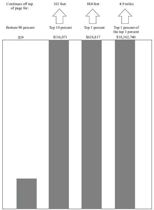
The bottom 90 percent is represented by an inch-high bar while the growth of the top 10 percent needs a 163 foot-tall bar and the top 0.01% need a 4.9 mile-high bar to represent their wealth growth.
The income growth and shrinkage figures come from analysis of the latest IRS data by economists Emmanuel Saez and Thomas Piketty, who have won acclaim for their studies of worldwide income patterns over the last century.
In 2011 entry into the top 10 percent, where all the gains took place, required an adjusted gross income of at least $110,651. The top 1 percent started at $366,623.
The top 1 percent enjoyed 81 percent of all the increased income since 2009. Just over half of the gains went to the top one-tenth of 1 percent, and 39 percent of the gains went to the top 1 percent of the top 1 percent.
Ponder that last fact for a moment — the top 1 percent of the top 1 percent, those making at least $7.97 million in 2011, enjoyed 39 percent of all the income gains in America. In a nation of 158.4 million households, just 15,837 of them received 39 cents out of every dollar of increased income.
(h/t boingboing)
Planet Money’s Graphing America series asks the question; What do those people do on the weekends, when they’re not working?
Taking data from the American Time Use Survey (conducted by the Bureau of Labor Statistics), they answer the question below.


(via NPR’s Planet Money)
NPR’s Planet Money have a couple of new charts showcasing the change in the immigration as a share of the U.S. population over the past century. Given the rhetoric on immigration it’s interesting to note how this percentage has barely changed over the past 100 years.

The also note:
A century ago, U.S. immigrants were overwhelmingly European. Today, Latin America and Asia are the big drivers of U.S. immigration, and Europe accounts for just a small fraction of the whole.

(via Planet Money)

