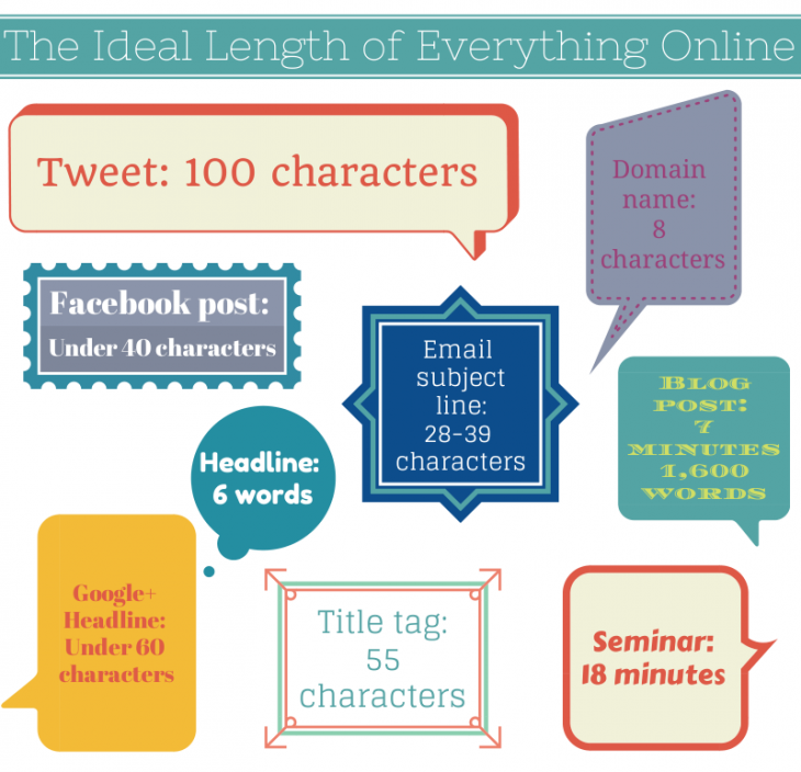
A simple guide for the ideal length of all your online content.
(h/t thenextweb)
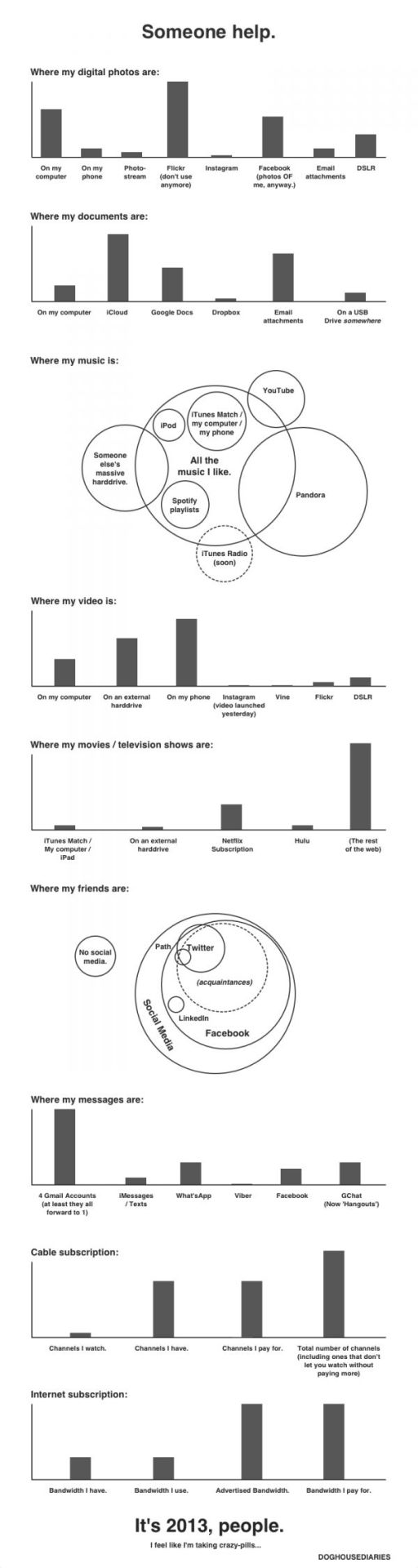
Doghousediaries’ nice visual representation of where your data lives.
(h/t sunlightfoundation)
Bayern Munchen’s 2:1 victory against Borussia Dortmund in this year’s Champions League securing their fifth title in Europe’s most prestigious football cup. For anyone who missed this trilling finale, the Guardian has recreated a shortened version of the match in Lego.
Twitter also visualized the final – in terms of tweets per minute and player mentions.

(h/t mashable)
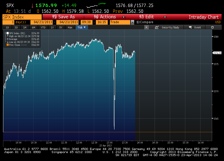
Earlier this week the Associated Press reported its official Twitter account was hacked. The hacker tweeted out that there had been a White House explosion causing a huge drop in the Dow Jones Industrial Average before it quickly recovered.
(h/t Sunlightfoundation)
Foursquare has released a heat-map of check-ins showing the impact of Hurricane Sandy on check-ins throughout Manhattan. The visualization shows how the southern half of the city, which suffered blackouts and flooding, reflects a steep drop in online activity post-sandy.

(via Gigaom)
The folks over at thescore created this great infographic a few weeks ago to highlight the differences and similarities between arguably Europe’s two best football leagues. The flamboyance and money of the English Premier League, versus the technical prowess of the Spanish La Liga. The Infographic takes a look how both leagues figure in the world of social media, versus the real world.

(via thescore)
Social media monitoring company Brandwatch have created a cool data visualization Web tool, which reveals what twitter user sentiment on the England and Germany squads. The chatter is updated in real-time as people tweet about different players.
Unfortunately (or fortunately), there is no such visualization available for the Ireland squad.

As TheNextWeb says:
If nothing else, this is a good example of how, with the right presentation, social data can be aggregated and used to give a good overview of national sentiment around an event.
(via TheNextWeb)
NewsWhip – an Irish based News aggregation site – has created the superb infographic below, ranking news sites based on how many viral stories they produced during January 2012. The definition of a viral story is one getting at least 100 likes or shares (on Facebook) or 100 Tweets (on Twitter).

(via NewsWhip)