Tag Archives: Euro Debt

Europe Infographic Spending

Ireland’s Bank Bailout – [INFOGRAPHIC]

Ireland’s disastrous bank bailout has seen the Government pump more than €64.1 billion into the majority of Irish banks. The effect of this saw the country apply to he EU and IMF for a bailout to keep the sovereign afloat. Newly elected TD Stephen Donnelly reveals the context of this bailout in comparison with other EU countries.

The graphic underlines the impact that the banking crisis has had on the average Irish taxpayer.

Bank Bailout: Unbearable

(via Stephen Donnelly)

Europe Infographic Visualizations

Consequences of a Greek eurozone exit – [INFOGRAPHIC]

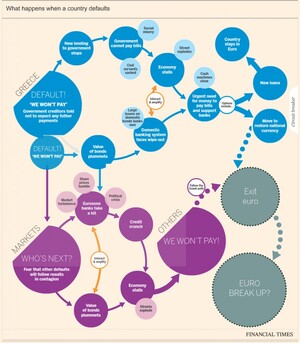
The idea of a Greek exit from the eurozone looks more and more likely each day, with the consequences now  said to be ‘managable’. There has been a number of flowcharts and interactive graphics highlighting likely consequences resulting from such a scenario. Some of the most recent are outlined below. Click on the graphics for the full interactive versions.

Financial Times

This interactive graphic from the Financial Times (FT) outlines the likely consequences of a Greece eurozone exit.

Consequences of a Greek eurozone exit

Lombard Street Research / (via Guardian)

Along, with this Lombard Street Research has provided a flowchart (considering what happens in the event of a Greek euro exit) and the options ahead for the eurozone.

Greek euro exit flowchart: what happens next

BBC

The BBC also has a handy interactive graphic contemplating what could happen next if Greece leaves the eurozone.

What could happen next if Greece leaves the eurozone?

(h/t broadsheet)

Europe Infographic

The EU’s Response to the Euro Crisis – [INFOGRAPHIC]

The Institute of International and European Affairs (IIEA) recently released an informative Infographic entitled “The European Union’s Response to the Euro Crisis”. It provides and overview of many of the EU’s actions taken to date to tackle the crisis and provides an overview of some policies still under discussion e.g the Fiscal compact.

The infographic is fairly comprehensive in its presentation of data, which rather detracts from any narrative regarding the response to the crisis. Nevertheless, it represents a smorgasbord of policy actions, rules and ideas implemented over the last few years.
Euro Crisis

Europe Infographic

Euro Debt Crisis Key Indicators – [INFOGRAPHIC]

Created by Hang IO as an entry for the visualization challenge Money Panics, the infographic below explains some of the Key Indicators in relation to the Euro Debt Crisis.
Some quick numbers:
  • European Debt as a % of Gross Domestic Product (GDP) in 2011 was 87.3%
  • Greece has the highest Government Gross Debt as % of GDP at  142.8%
  • Ireland has the highest Government Debt per Capita at €33,105 per person

(via hangio.net)


Infographic Visualizations

Then and Now: The European Debt Crisis

Mint.com has a new infographic on how the debt of major European countries has evolved from 2000 to 2010. It makes for sobering reading given the bailouts of Greece, Ireland and Portugal. It highlights the large and growing sovereign debts as a percentage of Gross Domestic Product. (source Eurostat)

Then and Now: The European Debt Crisis

(via mint.com)

Infographic Visualizations

Eurozone debt web – Interactive Visualization

An interactive visualization of the Eurozone’s debt web, gathered from data by the IMF, Bank for International Settlements, World Bank and UN Population Division.

For an interactive perspective, visit the BBC site.