Nice Infographic by ivanisawesome highlighting the huge variations in GDP between different African countries.
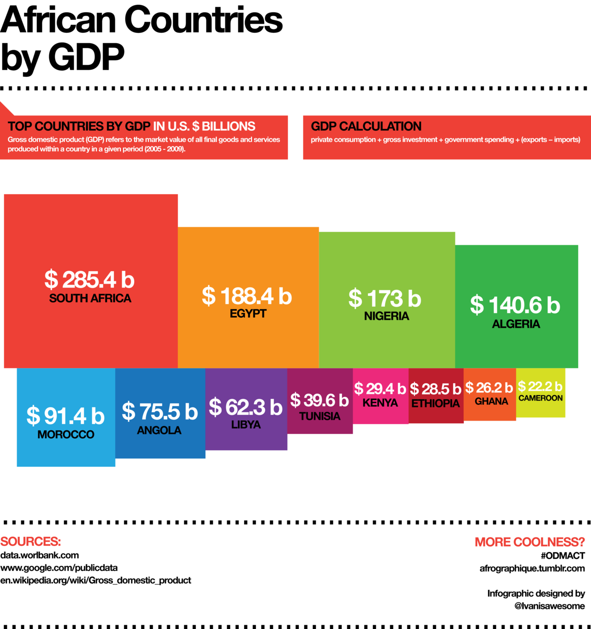
(via worldbank)
Nice Infographic by ivanisawesome highlighting the huge variations in GDP between different African countries.
(via worldbank)
Last month, the Cabinet Office’s Efficiency and Reform Group (ERG) released details of their approach to eradicating wasteful government spending and how this achieved over £5.5 billion in savings for the UK taxpayer.
Strict spending controls were implemented cut expenditure by departments on IT contracts, property, marketing, temporary staff and consultancy. These savings are highlighted in a useful Tree-map and accompanying video below released by the Cabinet Office.

The video – created by the Efficiency and Reform Group in the Cabinet Office and released as part of the same news story – outlines how and where the 2011/12 £5.5bn in savings were achieved. It breaks down the £5.5bn into its component parts (as outlined in the graphic above) to show where and how the money was saved.
Altogether the Tree-map and accompanying video represent a clear and effective mechanism of communicating the breath of savings the Cabinet office ERG group have achieved over the past year.
(via Cabinet Office)
As part of NPR’s Graphing America series, Planet Money takes a look at how the poor, middle class and rich spend their money. Not surprisingly, the poor spend more of their money on essentials like groceries and utilities while the rich spend more on education and saving for retirement.

The figures highlighted in the graph above come from the Consumer Expenditure Survey, which includes lots of useful data on spending patterns in the U.S.
(via Planet Money)
The folks over a NPR’s excellent Planet Money podcast recently reported on how easy it was to setup an off-shore company. One of the more fascinating aspects to the podcast is that while most countries require some kind of documentation e.g. a passport, when setting up an offshore company, there is one country that requires no such identification. It makes it the easiest country in the world to register a company anonymously. Can you guess which country that is?

For more on this story, check Adam Davidson’s column on the topic in the NY Times: My Big Fat Belizean, Singaporean Bank Account.
(via Planet Money)
The video shows how presidential candidates (Barack Obama, Mitt Romney, Ron Paul, Rick Santorum and Newt Gingrich) raised money state by state during 2011/2012.
The circle sizes indicate the amount of contribution per capita giving to the candidates by each state. The timelines show the overall money per capita raised by candidates during a particular time.
The data is based on the Sunlight Foundations APIs, based on Federal Election Commission data released on Feb. 2012.
(via Sunlight Foundation)
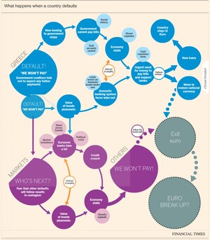
The idea of a Greek exit from the eurozone looks more and more likely each day, with the consequences now said to be ‘managable’. There has been a number of flowcharts and interactive graphics highlighting likely consequences resulting from such a scenario. Some of the most recent are outlined below. Click on the graphics for the full interactive versions.
Financial Times
This interactive graphic from the Financial Times (FT) outlines the likely consequences of a Greece eurozone exit.
Lombard Street Research / (via Guardian)
Along, with this Lombard Street Research has provided a flowchart (considering what happens in the event of a Greek euro exit) and the options ahead for the eurozone.

BBC
The BBC also has a handy interactive graphic contemplating what could happen next if Greece leaves the eurozone.

(h/t broadsheet)
Invisible Children is a US-based campaigning group, founded in 2004 by film-makers, which has been working in Uganda – monitoring LRA movements and helping displaced children and families. They recently released a 30-minute film – Kony 2012 – to raise awareness of the activities of Joseph Kony, who leads the Lord’s Resistance Army. The film has gone viral – amassing over 70 million views – but has led to a lot of questions about the group and their finances.
This morning, Invisible Children issued a detailed response to the criticism here with one of the interesting aspects being the infographic detailing their 2011 expenses. The graphic provides a clear view of how they spent their income in 2011:
Below is a screen-shot from pages 35 and 36 of the 2011 Invisible Children annual report that detail our total expenses for Fiscal Year 2011. An expense statement by class is the way nonprofits present their expenses to the public because it’s the clearest way to show the purpose of different organizational expenses vs. a line item expense statement such as the one on page 6 of our Audited Financial Report.

For more on InvisibleChildren’s financial details, check www.invisiblechildren.com/financials.
Socialcast.com have collated data from a number of different surveys to illustrate the power of recognition in the enterprise. This infographic underscores the reasons to recognize employees aswell as how to recompense their performance effectively.
From the blog post:
According to a Westminster College study, 65 percent of surveyed managers believe that money is the primary driver of employee performance. However, the same data shows that employees actually feel differently. This discrepancy had lead to a disproportionate amount of attention paid to financial incentives and not enough spent on simple employee recognition and support. In general, managers can easily over look these non-financial incentives that can be powerful tools for improving employee engagement and performance. Before spending more on salaries, it makes sense to understand the value of a simple pat on the back in the enterprise.

(via Socialcast.com)
Ever wondered how France allocates its budget? A new interactive visualization displays how the country proposes to allocate its spending for across the range of government departments i.e. Employment, Education, Defense, etc. It’s based on 2012 budget policy data that will soon be voted on in Parliament.
The size of each rectangle is proportional to the level of allocations.
For the full graph – only a screengrab of which is shown below – head over to Et voilà le travail.


