Tag Archives: Spending

Spending Video Visualizations

Food for $5 – [VIDEO]

The folks over at Buzzfeed have put together a cool visual representation of how much food you can buy or $5 USD in different countries. The foods they look at include bananas, coffee, beef, rice, potatoes, eggs and beer, while the countries investigated are Italy, France, Sweden, Ethiopia, USA, UK, China and Japan.

(h/t flowingdata)

Spending Video Visualizations

5 Years of Mircrofinance Activity – [VIDEO]

What happens when 620,000 lenders fund 615,000 entrepreneurs, students, and other microfinance borrowers around the world? Five+ years of Kiva loan activity (over 4 million lender-borrower connections).

Intercontinental Ballistic Microfinance from Kiva on Vimeo.

Politics Spending Visualizations

Obama / Romney Campaign Spending – [VISUALIZATION]

The wonderful tumbler bindersfullofburgers has a couple of great visualisations highlighting where the Obama and Romney campaigns have spent their election dollars.

Obama Campaign
Obama's Campaign Spending

Romney Campaign
Romney's Campaign Spending

(h/t SunlightFoundation)

Infographic Politics Spending

US Gov Bailouts by Industry – [INFOGRAPHIC]

NPR’s Planet Money team have created a simple infographic to highlight the US Government’s bailout of various  industries over the past four years. The infographic highlights that:

while much of the bailout money has been paid back, the government still owns large shares in companies such as AIG and GM, and has yet to recoup some $200 billion in bailouts.

Gov Bailouts

The figures on which the infographic is based come from ProPublica, and are based on funds disbursed by the Treasury Department, but exclude programs launched by the Federal Reserve as part of the bailout. Repayments are based on money recovered by the Treasury through direct payments, dividends, interest, stock sales and other collateral.

Beware, however, as the numbers above do not tell the full story about the cost of these bailouts. For more on this, check The Profitable Bailout? Inside the Real Costs of the Saving AIG and Wall St.

(via Planet Money)

Graphs and Charts Spending Visualizations

50 Years Of US Government Spending – [GRAPH]

The fascinating graphic below – from NPR – details US federal government spending and how this has changed from 50 years ago, 25 years ago and last year. It categories spending into areas such as defense, social security and medicaid.

50 Years Of Government Spending, In 1 Graph

For more details on the categorisations above, check out Planet Money’s blog post on the chart.

Data sourceOffice of Management and Budget

(via NPR Planet Money)

Infographic Spending

Spending Patterns: 1947 – 2007 – [INFOGRAPHIC]

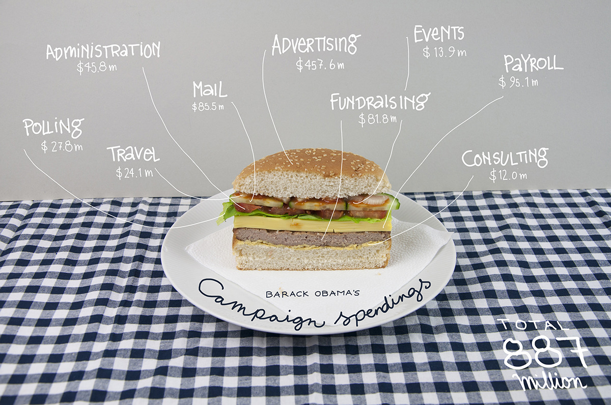
The Atlantic has published research into how US consumer spending has changed in 2007 compared to 1947 levels. The results are visualized through two interactive infographics, which tell the story of we’re now spending less on the production of tangible goods and more on services such as health care, education and recreation.

From the article:

Taking 1967 as our starting point, 30% of the cost of the things we consumed that year went to manufacturing them; by 2007, that figure had fallen to 16%. In contrast, what we spent on business services over the same period jumped from 12% to 26%. That’s because baked into the price of everything we buy is the rising cost of advertising, accounting, legal services, insurance, real estate, consulting, and the like—jobs performed by the high-wage workers of our modern economy.

Click on the images for the full interactive infographics.

Infographic: How spending has changed

Change in spending over the past 40 years

Infographic: How we spend (Breaking It Down)

The infographics were created by Kiss Me I’m Polish, based on data from the Bureau of Economic Analysis, Department of Commerce and Census Bureau and noted the challenge in converting the complex datasets into a high level overview:

The data set we were provided was full of complexities – and we wanted our illustration to reflect those meticulous details without becoming visually overwhelming. So we created simple charts and blasted them with a hefty dose of playful and comprehensive imagery.

(via The Atlantic)

Infographic Politics Spending Visualizations

Canada Budget 2012 – [INFOGRAPHIC]

Canada’s Globe and Mail has good set of infographics explaining Canada’s 2012 federal budget. The interactive set of infographics explores revenue, expenses and projects from the budget and serves as a useful template for providing easy explanations of complex spending choices and patterns.
Infographic: Your 2012 federal budget explained

(via The Globe and Mail)

Politics Spending Visualizations

UK Budget 2012 – [INTERACTIVE]

The folks over at  Where Does My Money Go and Daily Bread have created a simple budget 2012 interactive showing where British taxpayer’s taxes are spent. It provides a slider for users to select their salary, and then breaks down the associated income tax and national insurance paid into buckets for areas such as the National Health Service (NHS), education and defence.

The UK Chancellor George Osborne is planning to provide taxpayers with a personal tax breakdown detailing how much of their income is paid to the state and what it is being spent on. These annual tax statements are due to be issued from 2014 – 15.

Budget 2012: how your taxes are spent - interactive

Specimen annual tax statement due to be issued from 2014-15 onwards.

A mock up of a 'tax receipt'.

Photo: Guardian/HM Treasury/PA


(via Guardian data blog)

Infographic Spending

InvisibleChildren’s 2011 Expenses – [INFOGRAPHIC]

Invisible Children is a US-based campaigning group, founded in 2004 by film-makers, which has been working in Uganda – monitoring LRA movements and helping displaced children and families. They recently released a 30-minute film – Kony 2012 – to raise awareness of the activities of Joseph Kony, who leads the Lord’s Resistance Army. The film has gone viral – amassing over 70 million views –  but has led to a lot of questions about the group and their finances.

This morning, Invisible Children issued a detailed response to the criticism here with one of the interesting aspects being the infographic detailing their 2011 expenses. The graphic provides a clear view of how they spent their income in 2011:

Below is a screen-shot from pages 35 and 36 of the 2011 Invisible Children annual report that detail our total expenses for Fiscal Year 2011. An expense statement by class is the way nonprofits present their expenses to the public because it’s the clearest way to show the purpose of different organizational expenses vs. a line item expense statement such as the one on page 6 of our Audited Financial Report.

For more on InvisibleChildren’s financial details, check www.invisiblechildren.com/financials.

Politics Spending Visualizations

Slicing the 2013 US Federal Budget – [VISUALIZATION]

President Barack Obama budget for 2013 was submitted to Congress earlier this week. The document is more that 250 pages long, but helpfully the New Your Times have created a cool interactive visualization of budget spending data. Created by Shan Carter, it provides four ways of exploring where the $3.7 Trillion is spent.

Slicing the Federal BudgetTo experience the full interactive budget, and explore types of spending, spending by departments and changes since last year, head over to NYTimes.