Tag Archives: Science

Infographic Science

How Scientists Fool Themselves – [INFOGRAPHIC]

Research is tough and there are numerous ways in which data can be interpreted incorrectly. Nature recently published an striking article detailing the many ways in which scientists end up tricking themselves into seeing evidence that isn’t there, resulting in publishing false results. The highlights are outlined below

(Source: How scientists fool themselves – and how they can stop)

Earth Video

What is Reality? – [VIDEO]

Fascinating BBC documentary exploring the idea that what we think is real may just be a cosmic hologram, and our world is just a set of mathematical equations we cannot fully understand.

(h/t boingboing)

Infographic

Top 100 Papers Most Cited Research Papers – [INFOGRAPHIC]

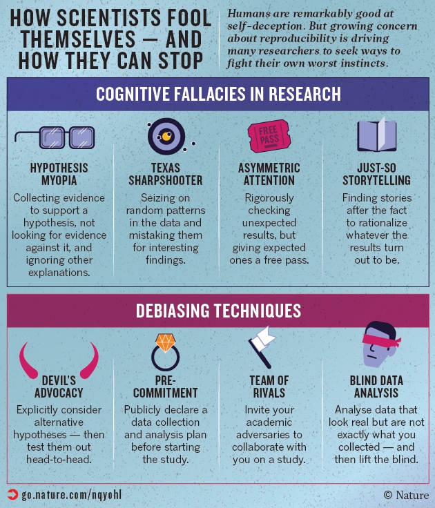
Nature magazine’s top 100 papers cited by others, presents a fascinating insight into the scientific process and how research papers build on each other to validate their arguments.

Citations, in which one paper refers to earlier works, are the standard means by which authors acknowledge the source of their methods, ideas and findings, and are often used as a rough measure of a paper’s importance…The search covered all of Thomson Reuter’s Web of Science, an online version of the SCI that also includes databases covering the social sciences, arts and humanities, conference proceedings and some books. It lists papers published from 1900 to the present day.

The exercise revealed some surprises, not least that it takes a staggering 12,119 citations to rank in the top 100 — and that many of the world’s most famous papers do not make the cut. A few that do, such as the first observation1 of carbon nanotubes (number 36) are indeed classic discoveries. But the vast majority describe experimental methods or software that have become essential in their fields.

The most cited work in history, for example, is a 1951 paper2 describing an assay to determine the amount of protein in a solution. It has now gathered more than 305,000 citations — a recognition that always puzzled its lead author, the late US biochemist Oliver Lowry. “Although I really know it is not a great paper … I secretly get a kick out of the response,” he wrote in 1977.

(h/t boingboing)

Graphs and Charts Visualizations

Periodic Elements by Country of Discovery – [CHART]

PhD student Jamie Gallagher maps the countries where scientists were living when they discovered the period elements in the table below. The United Kingdom comes first, followed jointly by Sweden and Germany.


(h/t broadsheet)

Graphs and Charts Visualizations

The Elements According to Relative Abundance – [VISUALIZATION]

A periodic chart by Prof W Sheehan of University of Santa Clara depicting each element of the Periodic table by its relative Abundance.

Roughly, the size of an element’s own niche is proportioned to its abundance on Earth’s surface, and in addition, certain chemical similarities.

H is Hydrogen, C is Carbon and O is Oxygen…but you knew that already. (Periodic table)

The Elements According to Relative Abundance

(via Visual.ly)
Graphs and Charts Visualizations

The problem with online graphs and charts – Correlation and Causation

One of the most basic rules in science and statistics is Correlation does not imply causation. As such, the correlation between two variables does not automatically imply that one causes the other.

RauCreativity has put it simply with the problem and example below.

The Problem with online graphs and charts

(via RauCreativity.com)