The Observatory of Economic Complexity describes itself as a tool that allows users to quickly compose a visual narrative about countries and the products they exchange. Their superb interactive visualization below shows the makeup of Ireland’s 2010 exports.
For the full story of how the country’s exports have changed since 1962 (from 23% live cattle to current 2.1%) , check out the full interactive at The Observatory of Economic Complexity.
It provides:
The observatory provides access to bilateral trade data for roughly 200 countries, 50 years and 1000 different products of the SITC4 revision 2 classification.
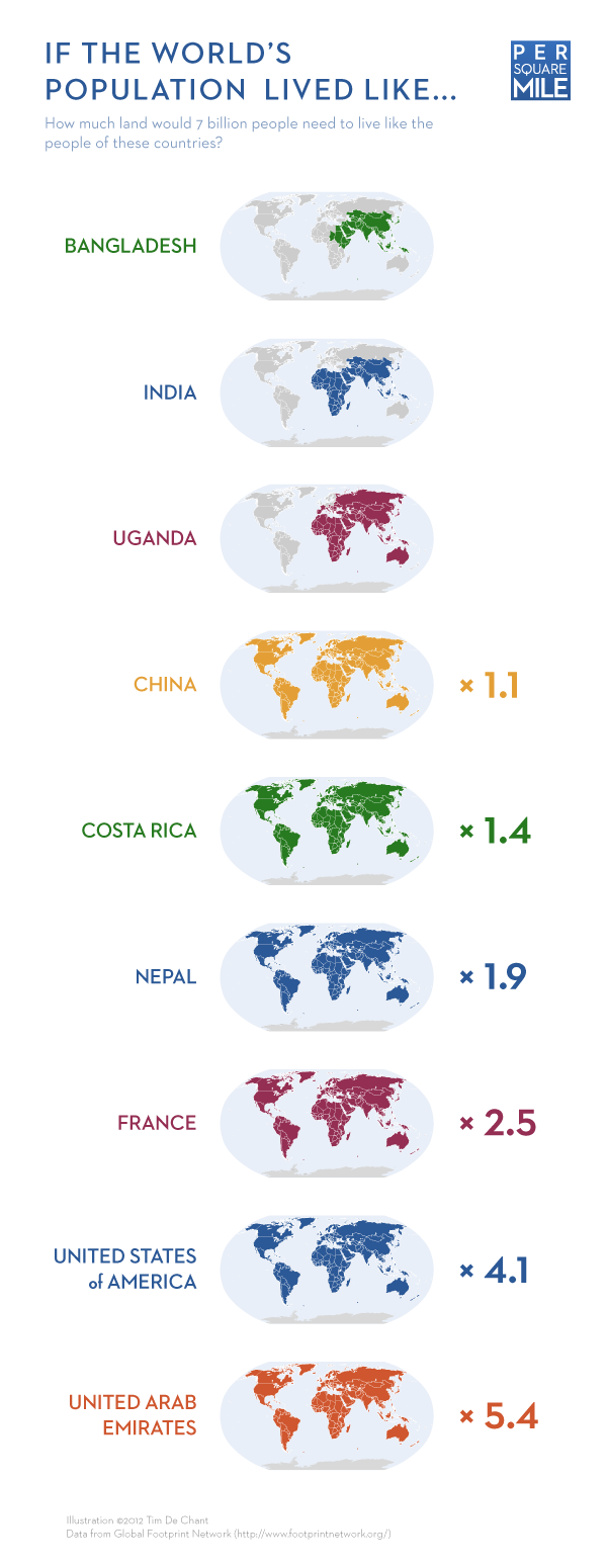
How much of the earth’s space would be taken up if the world’s population liked like the populations of Bangladesh, India, Uganda, China, Costa Rica, Nepal, France, United States, United Arab Emirates.
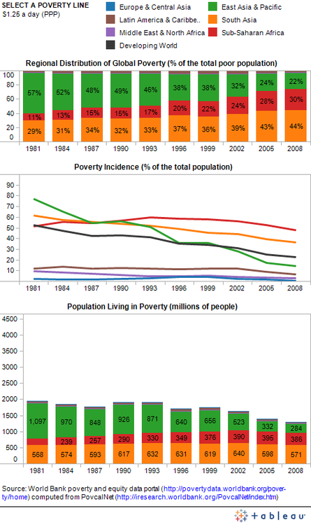
The World Bank just launched a new Data Visualization Tumblr blog dedicated to the latest and greatest open data visualizations on the fight against poverty.
The blog is part of the bank’s Open Data Initiative and will feature “open data visualizations made by economists, graphic artists and all of you open data enthusiasts from both inside and outside the Bank”.
The first visualization presented on the site details Global Poverty Trends and was created using the bank’s re-vamped version of PovcalNet: an interactive on-line computational poverty analysis tool. The team downloaded the table with regional poverty estimates and then used PovcalNet to calculate the results for additional poverty lines. They then combined all the data in the three-panel visualization below – for full interactive version of the chart check out Seeing Between the Lines: Visualizing Global Poverty Trends .
A fantastic time-lapse video put together by photographer Knate Myers based on photographs taken from the International Space Station. Every photo was taken from the International Space Station. Wow!
14 year-old twin brothers Cary and Michael Huang have created an superb interactive visualization of the scale of the Universe. It traces the relative scale of things – from quantum foam to the observable universe.
Tripso have created a short animation of photographs taken across the world over a 12 month period. The movie shows a world map in which pixels light up according to the relative amount of pictures taken. Some tweaking had to be made however, due to their observation that:
There are more pictures taken in the city of Paris alone on one day that in all of Africa in a year so we corrected for the average.
The original article on the animation highlights more information on a series of snapshots describing some interesting trends and anomalies.
Last year, Kien Lam quit his job, packed a bag with his camera and bought a one-way ticket to London. Crossing through 17 countries he captured a series of beautiful time lapse vistas. The journey takes him through USA, England, France, Portugal, Spain, Morocco, Egypt, Turkey, Jordan, Thailand, Indonesia, Japan, Argentina, Uruguay, Chile, Bolivia and Peru.
Original Music: “Places and Faces” by William Lam.
For more of Lam’s photographs and commentary, check kienlam.net.
There has been lots of reviews of the best visualizations of 2011. FlowingData’s collection is particularly good and represents a wide variety of the best data graphics and animations around. Others such as those from Visual.ly, Fastcodedesign and Visualizing.org highlight the vast array of incredible infographics and data visualizations created during the year.
My top ten are listed below with a brief description and link to the originals.
1. Twitter map showing traffic surges after Japan tsunami
Twitter saw a huge 500% increase in Tweets from Japan as people reached out to friends, family and loved ones in the moments after the March 2011 earthquake. This video above shows the volume of @replies traveling into and out of Japan in a one-hour period just before and then after the earthquake. Replies directed to users in Japan are shown in pink; messages directed at others from Japan are shown in yellow.
This video above displays worldwide retweets of Tweets originating in Japan for one hour after the earthquake. Senders’ original Tweets are shown in red; Tweets retweeted by their followers in the hour after the event are displayed in green.
BBC Software engineer Gareth Lloyd scraped all geotagged Wikipedia articles with time attached to them in order to create a glimpse of the evolution of the world. The video above is based on a mapping over time of 14,200 events listed on Wikipedia.
Events begin in 499 BC, when the first documented historical events appear in Europe. We then move onto the middle mark which shows activity in Asia. 1492 is when Columbus sailed to the new world, and there’s a burst of activity worldwide. The present day shows an image of activity resembling a modern map.
The New York Times Lab Cascade project describes itself as a tool to ‘allow for the precise analysis of the structures which underly sharing activity on the web’.
Cascade allows for precise analysis of the structures which underly sharing activity on the web. This first-of-its-kind tool links browsing behavior on a site to sharing activity to construct a detailed picture of how information propagates through the social media space. While initially applied to New York Times stories and information, the tool and its underlying logic may be applied to any publisher or brand interested in understanding how its messages are shared.
The video below represents what a cascade for a typical article looks like:
The map is used well to show general location, but it fades into the background since it is not the most important information. The bar charts show great data about quantity, and the venn diagrams show how those quantities overlap each other.
The Guardian’s London riots animation highlights how misinformation spread on Twitter during a time of crisis. It shows how these rumors are born, spread, and are corrected on one of the fastest social networks around.
The analysis done by the team is great, and calls out some pivotal events in the timeline of each rumor. As the timeline progresses, the main visualization grows and changes like popcorn, showing the interaction of different rumor threads.
This fantastic visualization from Derek Watkins hows how ‘formal US territorial control expanded in North America from 1700 to 1900, as seen through changes in the spatial distribution of post offices’.
Each year, graphic designer Nicholas Felton creates an “annual report” summarizing an entire year of his life through a series of charts and graphs. For 2010, instead of representing his own life he captured the entire life of his father, Gunter, who died last September.
It used hundreds of small, location aware tags attached to different types of trash to follow progress of trash through city’s waste management system. These revealed the stunning final journey of everyday trash in a series of real time visualizations. The project represented “an initial investigation into understanding the ‘removal-chain’ in urban areas and it represents a type of change that is taking place in cities: a bottom-up approach to managing resources and promoting behavioral change through pervasive technologies”.
This map visualizes all bikes of the public hire schemes in London and many other cities throughout the world. The animated map displays information on the distribution of all the checkin points, the level of use at any given time and the availability of bicycles at each point.
Along with the interactive map, there is a superb real-time animation of the use of bikes in London.
Earlier this year an Austrian law student Max Schrems sent a request to Facebook to provide him with all his personal data. As Facebook has its European Operations center within the EU – in Dublin, Ireland – it must conform to EU law, and thus was obliged to provide all the data it stored about him.
Facebook sent Max received a CD containing about 1,222 pages (PDF files). This included deleted chats and other interactions dating back to 2008. This data was then visualized by Berlin-based newspaper taz.de.
Pingdom.com have created an animated GIF illustrating the development of the world’s online population over the past 20 years. The data comes from the World Bank and shows that there are now an estimated 2 billion Internet users as of March 2011, representing about a third of the world’s population.
Regarding the animation:
The darker the shade of red a country is, the higher the Internet penetration is.
White means there is no data from the World Bank, or it’s less than 1 Internet user per 100 people.