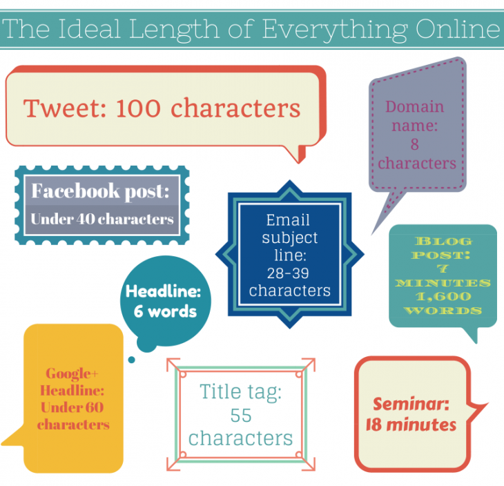
A simple guide for the ideal length of all your online content.
(h/t thenextweb)
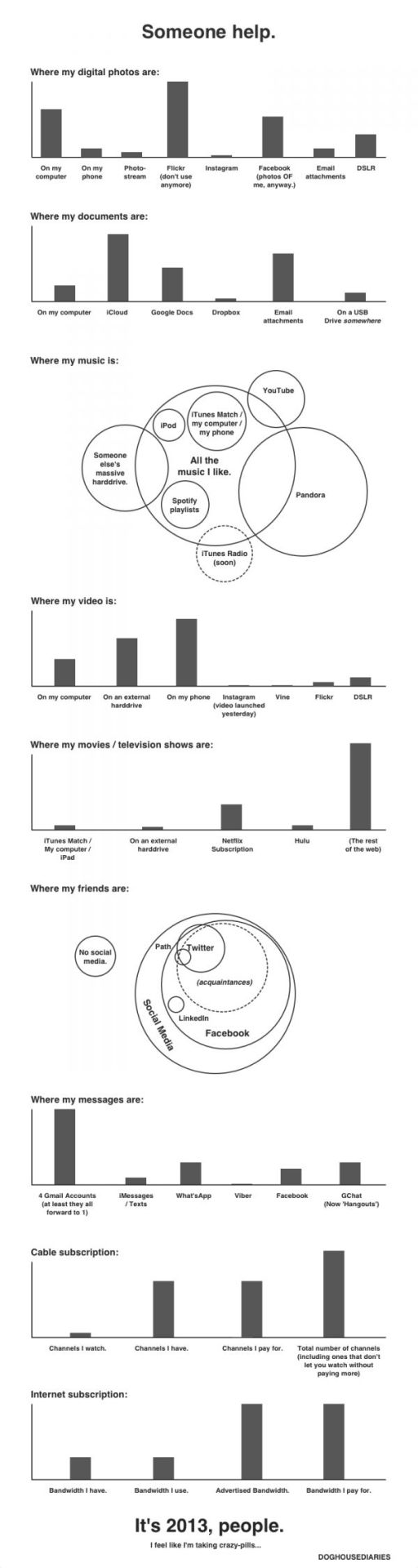
Doghousediaries’ nice visual representation of where your data lives.
(h/t sunlightfoundation)
Bayern Munchen’s 2:1 victory against Borussia Dortmund in this year’s Champions League securing their fifth title in Europe’s most prestigious football cup. For anyone who missed this trilling finale, the Guardian has recreated a shortened version of the match in Lego.
Twitter also visualized the final – in terms of tweets per minute and player mentions.

(h/t mashable)
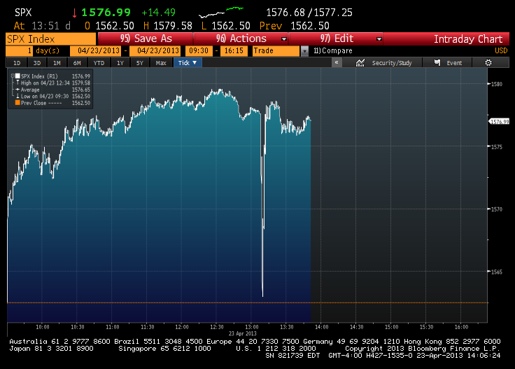
Earlier this week the Associated Press reported its official Twitter account was hacked. The hacker tweeted out that there had been a White House explosion causing a huge drop in the Dow Jones Industrial Average before it quickly recovered.
(h/t Sunlightfoundation)
Foursquare has released a heat-map of check-ins showing the impact of Hurricane Sandy on check-ins throughout Manhattan. The visualization shows how the southern half of the city, which suffered blackouts and flooding, reflects a steep drop in online activity post-sandy.

(via Gigaom)
Why Save PBS — some powerful statistics on why America’s Public Service Broadcaster should be protected.

The folks over at Google Maps have crafted a nifty infographic outlining the summer search activity on maps.google.com in various countries. From the end of May to the beginning of September, the infographic highlights some of the top-rising searches and most often-searched landmarks on Google Maps.

From the blog post:
North Americans sought out the best local beaches to help cool off from the summer heat. In comparison, many more people from Spain, Italy and France searched for community swimming pools. In cooler areas of the U.K. the rising Google Maps searches included many indoor activities such as squash, bars and going to the gym. And, as expected, travel was a clear choice for the summer, as indicated by a surge in searches for lodging in almost every region.
The folks over at thescore created this great infographic a few weeks ago to highlight the differences and similarities between arguably Europe’s two best football leagues. The flamboyance and money of the English Premier League, versus the technical prowess of the Spanish La Liga. The Infographic takes a look how both leagues figure in the world of social media, versus the real world.

(via thescore)