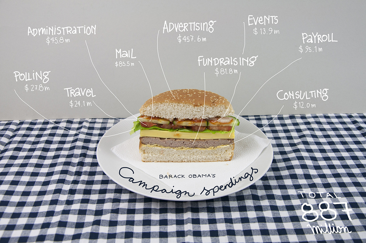
The wonderful tumbler bindersfullofburgers has a couple of great visualisations highlighting where the Obama and Romney campaigns have spent their election dollars.
Obama Campaign
Romney Campaign

(h/t SunlightFoundation)
The wonderful tumbler bindersfullofburgers has a couple of great visualisations highlighting where the Obama and Romney campaigns have spent their election dollars.
Obama Campaign
Romney Campaign
(h/t SunlightFoundation)
According to MSN, the World – except China – would vote for Obama.
In 34 of the 35 countries where MSN quizzed its online readers, the current US president won well over half of the votes. The only exception was China, where readers backed Romney by 52% to 48%.

According to a BBC World Service opinion poll of 21,797 people in 21 countries , 50% favoured Mr Obama, with 9% for Mr Romney.
Only Pakistan’s respondents said they would prefer to see Mr Romney win November’s election. France was the most strongly pro-Obama (72%).

PBS’s Idea Channel on animated GIFs and their potential impact in the US 2012 election:
The animated GIF has had a long and fascinating history, but the GIF took a giant leap forward this year when it became part of the 2012 Presidential Election!!! This election season, GIFs of Obama, Romney, Biden and Ryan, populated not only Tumblr and Buzzfeed, but also media heavyweights like The Atlantic, Forbes, and The Wall Street Journal. It became the perfect vehicle to capture a reaction, a gaffe or hilarious election moment and stream it ad infinitum. Will the Graphics Interchange Format swing the election for Obama or Romney?
Music: Roglok
The inbox has still proved a crucial tool for this year’s presidential candidates, especially for campaign funding. Just about every email I have received from both campaigns have requested monetary contributes.
Email analysis Return Path analysed the data surrounding each candidate’s message and created an neat infographic with it’s results below.
Their analysis reveals GMail users favor Obama while Yahoo! users favor Romney. Obama has has five times more email subscribers than Romney but 5% of his election emails are being marked as spam compared with .8% of Romney email messages.
For more click on the infographic below to read the detail.

(via mashable)
Why Save PBS — some powerful statistics on why America’s Public Service Broadcaster should be protected.

The video shows how presidential candidates (Barack Obama, Mitt Romney, Ron Paul, Rick Santorum and Newt Gingrich) raised money state by state during 2011/2012.
The circle sizes indicate the amount of contribution per capita giving to the candidates by each state. The timelines show the overall money per capita raised by candidates during a particular time.
The data is based on the Sunlight Foundations APIs, based on Federal Election Commission data released on Feb. 2012.
(via Sunlight Foundation)
The guys over at Motherjones.com have charted Democrat and Republican groups spending millions to influence the 2012 election.
Following the seminal Citizens United case – which prohibits government from censoring political broadcasts by corporations or unions – there has been a ratcheting up of money spent by nebulous groups in federal elections. Expanding super-PACs and vague 501(c) groups are exerting their considerable influence – in terms of advertising – in many areas of the political specturm. The chart below illustrates each group’s size based upon all known fundraising or spending since 2010.
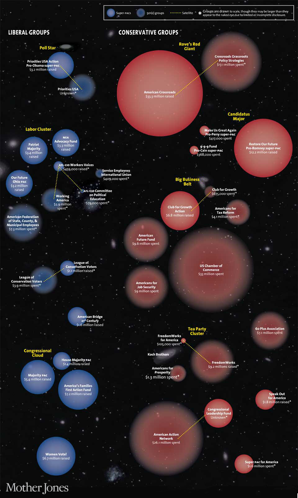
Source of financial data: Center for Responsive Politics, GuideStar.
(via Motherjones.com)

