Tag Archives: Twitter

Mapping the World in Tweets – [VISUALIZATION]

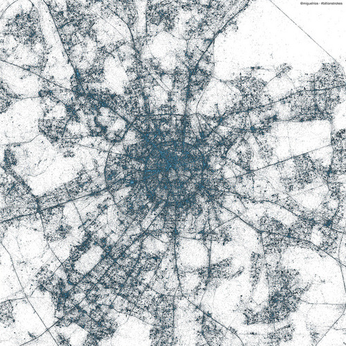
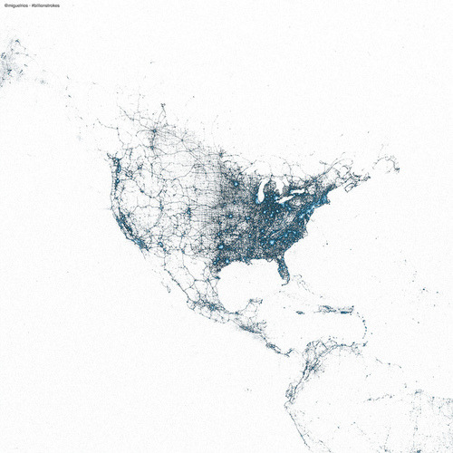
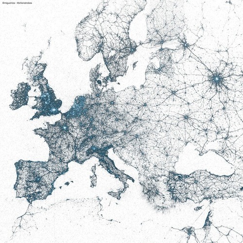
The folks over at Twitter have created some astonishing maps using billions of geotagged tweets. Every dot on the maps below represents a geotagged tweet, with the brighter colors showing high concentrations of tweets.

Europe:

Tokyo:

Moscow:

North America:

(h/t worldbank)

Champions League Final in Lego and Twitter – [VISUALIZATION]

Bayern Munchen’s 2:1 victory against Borussia Dortmund in this year’s Champions League securing their fifth title in Europe’s most prestigious football cup. For anyone who missed this trilling finale, the Guardian has recreated a shortened version of the match in Lego.

Twitter also visualized the final – in terms of tweets per minute and player mentions.

(h/t mashable)

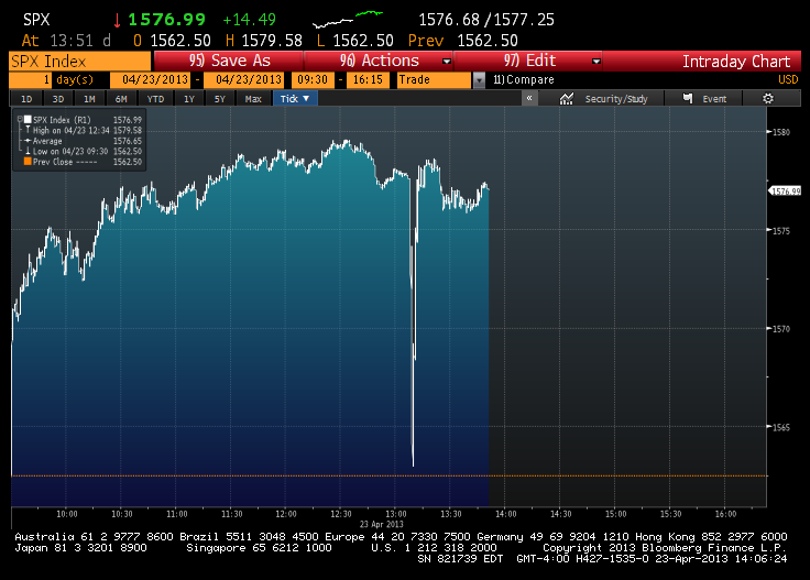
Jittery Financial Markets In One Graph – [GRAPHS]

Earlier this week the Associated Press reported its official Twitter account was hacked. The hacker tweeted out that there had been a White House explosion causing a huge drop in the Dow Jones Industrial Average before it quickly recovered.

(h/t Sunlightfoundation)

Anatomy of Twitter – [FUNNY]

A visual representation of who’s on Twitter. Seems about right to me…

(via Sarahl)

Euro 2012 On Twitter – [INFOGRAPHIC]

Sports website TheScore have visualized the 12 million Euro 2012 tweets to produce the infographic below. The data was taken from social analytics company Sysomos and highlights a new tweets-per-second record for sports in the the final match between Spain and Italy.

Some stats from the infographic:

  • Spain had 873,000 mentions during the tournament, England 849,000 and Italy 716,000.
  • Portugal’s top goalscorer Ronaldo notched up 270,000 mentions with Italy’s Mario Balotelli scoring  213,000 mentions and Spain’s Fernando Torres 188,000.

Euro 2012 on Twitter

(h/t mashable.com)

Euro 2012 Twitter Data Visualization – [VISUALIZATION]

Social media monitoring company Brandwatch have created a cool data visualization Web tool, which reveals what twitter user sentiment on the England and Germany squads. The chatter is updated in real-time as people tweet about different players.

Unfortunately (or fortunately), there is no such visualization available for the Ireland squad.
Brandwatch England Euro 2012

As TheNextWeb says:

If nothing else, this is a good example of how, with the right presentation, social data can be aggregated and used to give a good overview of national sentiment around an event.

(via TheNextWeb)
Visualizing Twitter Hashtags

Follow the Hash Tag is a neat new application, which creates a live visualization of the most active users of any particular twitter hashtag.

Opendata on Followthehashtag.com

From Infosthetics:

The visualization can be filtered for specific keywords, retweets or even unique Twitter users, including several other parameters (such as the minimum or maximum number of times a user needs to mention the keyword to be selected). The result then becomes a large clickable bubble graph accompanied with several Twitter frequency statistics, in which each user is being represented as a unique bubble of which the size depends on the number of appropriate tweets. These bubbles can be further explored to discover the usernames, profiles and their messages