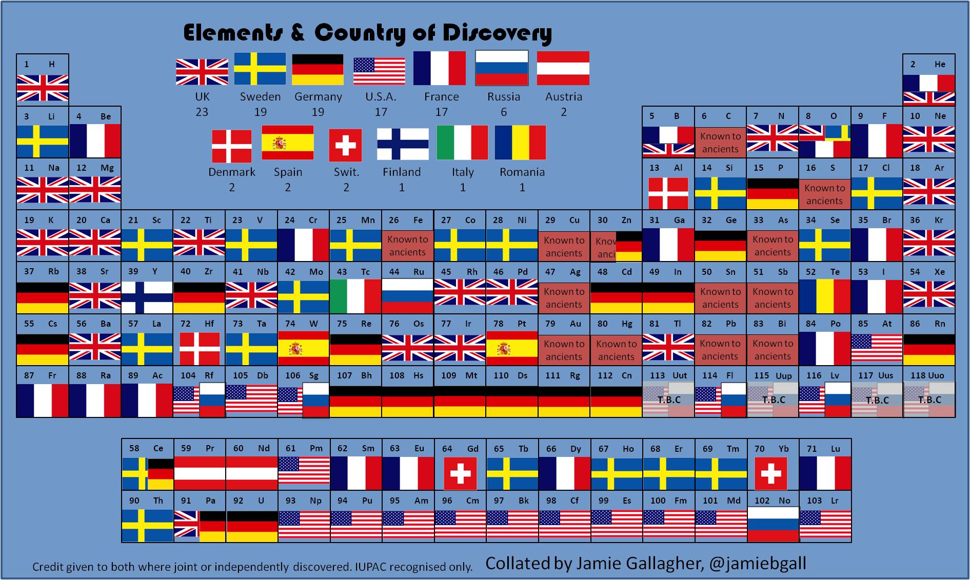
PhD student Jamie Gallagher maps the countries where scientists were living when they discovered the period elements in the table below. The United Kingdom comes first, followed jointly by Sweden and Germany.
(h/t broadsheet)
PhD student Jamie Gallagher maps the countries where scientists were living when they discovered the period elements in the table below. The United Kingdom comes first, followed jointly by Sweden and Germany.
(h/t broadsheet)
Nanex (a developer of real-time trading software) has put together an astonishing video visualizing the stock trading activity in Johnson & Johnson (JNJ) as it occurred during a particular half a second on May 2, 2013.
For more, check out the Huffington Post’s article on the subject.
(h/t SunlightFoundation)
Superb film from the PBSoffbook series on the power and value of well designed data visualizations:
From scientific visualization to pop infographics, designers are increasingly tasked with incorporating data into the media experience. Data has emerged as such a critical part of modern life that it has entered into the realm of art, where data-driven visual experiences challenge viewers to find personal meaning from a sea of information, a task that is increasingly present in every aspect of our information-infused lives.
(via pbsarts)
‘Good Graphic Design makes peoples lives better…Graphic Design is essentially a design for living…It’s about using words and images to convey a message’ – some introductory messages from this PBS short on the art of Graphic Design.
From PBS:
Though often overlooked, Graphic Design surrounds us: it is the signs we read, the products we buy, and the rooms we inhabit. Graphic designers find beauty within limitations, working towards the ultimate goal of visually communicating a message, be it the packaging of a product, the spirit of a book, or the narrative of a building. Utilizing a language of type and imagery, graphic designers try to make every aspect of our lives defined and beautiful.
The film features Debbie Millman, Emily Oberman, Drew Freeman and Steve Attardo.
Foursquare has released a heat-map of check-ins showing the impact of Hurricane Sandy on check-ins throughout Manhattan. The visualization shows how the southern half of the city, which suffered blackouts and flooding, reflects a steep drop in online activity post-sandy.

(via Gigaom)
How much of the earth’s space would be taken up if the world’s population liked like the populations of Bangladesh, India, Uganda, China, Costa Rica, Nepal, France, United States, United Arab Emirates.
Data taken from the Global Footprint Network.
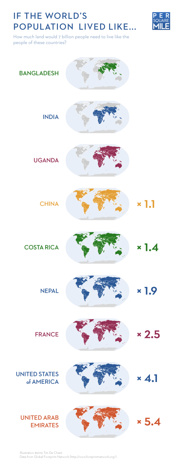
(via philiphagen.com)
Last month, the Cabinet Office’s Efficiency and Reform Group (ERG) released details of their approach to eradicating wasteful government spending and how this achieved over £5.5 billion in savings for the UK taxpayer.
Strict spending controls were implemented cut expenditure by departments on IT contracts, property, marketing, temporary staff and consultancy. These savings are highlighted in a useful Tree-map and accompanying video below released by the Cabinet Office.

The video – created by the Efficiency and Reform Group in the Cabinet Office and released as part of the same news story – outlines how and where the 2011/12 £5.5bn in savings were achieved. It breaks down the £5.5bn into its component parts (as outlined in the graphic above) to show where and how the money was saved.
Altogether the Tree-map and accompanying video represent a clear and effective mechanism of communicating the breath of savings the Cabinet office ERG group have achieved over the past year.
(via Cabinet Office)
Fantastic interactive created by the team at the Guardian showcasing Transparency International’s Transparency in Corporate Reporting index. They ranked the world’s 105 largest companies in terms of the steps they take to fight corruption and the openness of its financial self-reporting. Norwegian oil and gas company Statoil was the clear leader, while the Bank of China came in last place. Check out the interactive below which allows you to explore the data, including a breakdown of each company’s score across the three assessed categories (reporting on anti-corruption, organisational transparency and Country-by-country reporting).

Sociological Images’s Lisa Wade has good concise blog post highlighting the errors in a recent set of graphics released by the Romney campaign. She points out:
Mitt Romney’s campaign put out a set of graphics illustrating a “gap” between what Obama promised and what he has delivered. The graphic is in the form of a Venn diagram, a visual designed to show the overlap between two conditions…
Unfortunately, Romney’s overlapping circles are not Venn diagrams, making the campaign somewhat ridiculous and giving nerdy liberals all over America a good chuckle.
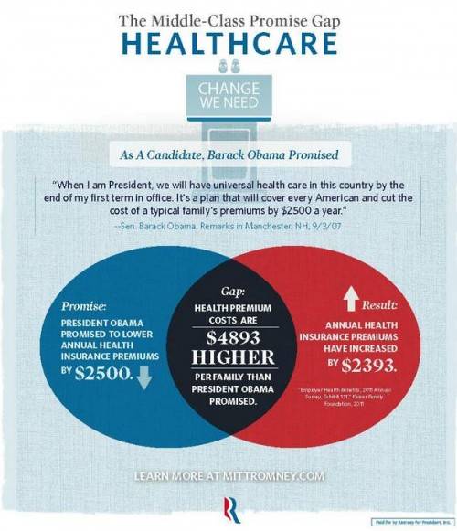


Graphjam also weights in on the subject:

(via Sociological Images and Graphjam)
(h/t Boingboing)
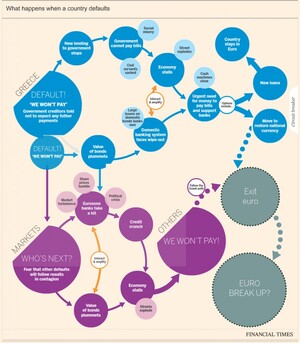
The idea of a Greek exit from the eurozone looks more and more likely each day, with the consequences now said to be ‘managable’. There has been a number of flowcharts and interactive graphics highlighting likely consequences resulting from such a scenario. Some of the most recent are outlined below. Click on the graphics for the full interactive versions.
Financial Times
This interactive graphic from the Financial Times (FT) outlines the likely consequences of a Greece eurozone exit.
Lombard Street Research / (via Guardian)
Along, with this Lombard Street Research has provided a flowchart (considering what happens in the event of a Greek euro exit) and the options ahead for the eurozone.

BBC
The BBC also has a handy interactive graphic contemplating what could happen next if Greece leaves the eurozone.

(h/t broadsheet)

