On April Fools’ Day 2017, a social experiment was launched in the form of a subreddit called “place”. It featured a collaborative pixel art canvas, where a user could place a pixel every five minutes (the timer was temporarily ten and twenty minutes for a few hours on April 1).
DJ Earworm’s eclectic compilation of 2018’s top sounds has just dropped.
Featuring:
Ariana Grande – No Tears Left to Cry Ariana Grande – Thank U, Next Bazzi – Mine Bebe Rexha & Florida Georgia Line – Meant to Be BlocBoy JB & Drake – Look Alive Bruno Mars & Cardi B – Finesse Camila Cabello – Never Be the Same Cardi B feat. Bad Bunny and J. Balvin – I Like It Childish Gambino – This is America Drake – God’s Plan Drake – In My Feelings Drake – Nice for What Dua Lipa – New Rules Ella Mai – Boo’d Up Halsey – Bad at Love Juice WRLD – Lucid Dreams Khalid & Normani – Love Lies Maroon 5 & Cardi B – Girls Like You Marshmello & Bastille – Happier Post Malone – Better Now Post Malone & Ty Dolla Sign – Psycho Travis Scott & Drake – Sicko Mode XXXTentacion – SAD! Zedd Feat. Maren Morris and Grey – The Middle 5 Seconds of Summer – Youngblood
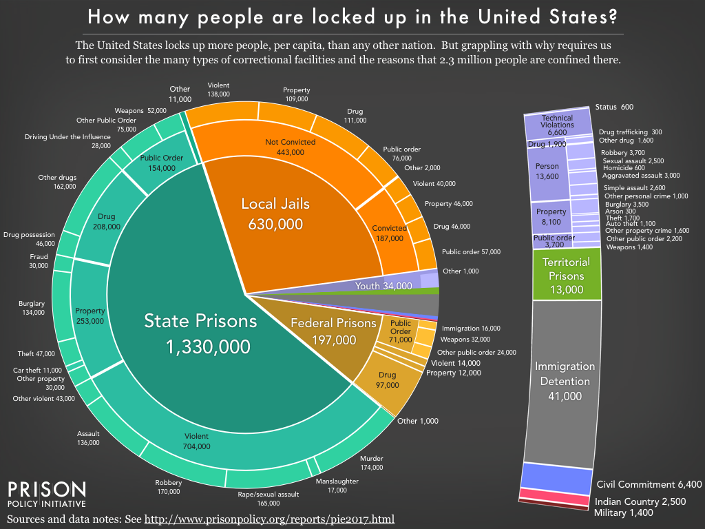
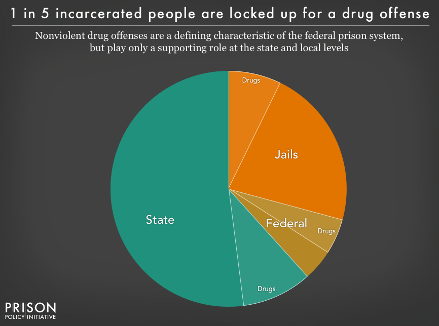
There are over 2.3 million Americans behind bars. The Prison Policy Initiative’s pie chart below illustrates the distribution of this vast population across federal and state prisons.
The American criminal justice system holds more than 2.3 million people in 1,719 state prisons, 102 federal prisons, 901 juvenile correctional facilities, 3,163 local jails, and 76 Indian Country jails as well as in military prisons, immigration detention facilities, civil commitment centers, and prisons in the U.S. territories.
2015 has been a breakthrough year for the New York Times in terms of the breath and reach of its storytelling techniques. Whether it’s through data visualizations or maps, we’ve seen an increase in the scope and breath of graphics to drive narrative and explanation. The news organization has gathered together some of its best examples in 2015: The Year in Visual Stories and Graphics.
The Fallen of World War II is an interactive documentary examining the human cost of the second World War and the decline in battle deaths in the years since the war.
Neil Halloran’s film below explores the numbers to provide a perspective and context on the military and civilian deaths in this conflict and others. It highlights the massive lost of life incurred by Germany, The Soviet Union and China during this time.
For the full interactive visualizations, check out fallen.io.