Tag Archives: Politics

Graphs and Charts Politics Visualizations

2014 Elections Worldwide – [VISUALIZATION]

The Economist’s superb visualization of 2014’s upcoming elections.


(h/t sunlightfoundation.com)

Infographic Politics

How the World would vote – [INFOGRAPHIC]

According to MSN, the World – except China – would vote for Obama.

In 34 of the 35 countries where MSN quizzed its online readers, the current US president won well over half of the votes. The only exception was China, where readers backed Romney by 52% to 48%.

World Vote US Election 2012
According to a BBC World Service opinion poll of 21,797 people in 21 countries , 50% favoured Mr Obama, with 9% for Mr Romney.

Only Pakistan’s respondents said they would prefer to see Mr Romney win November’s election. France was the most strongly pro-Obama (72%).

Countries by support for Obama

Art Internet Politics Video

How Will The Animated GIF Affect The Presidential Election? – [VIDEO]

PBS’s Idea Channel on animated GIFs and their potential impact in the US 2012 election:

The animated GIF has had a long and fascinating history, but the GIF took a giant leap forward this year when it became part of the 2012 Presidential Election!!! This election season, GIFs of Obama, Romney, Biden and Ryan, populated not only Tumblr and Buzzfeed, but also media heavyweights like The Atlantic, Forbes, and The Wall Street Journal. It became the perfect vehicle to capture a reaction, a gaffe or hilarious election moment and stream it ad infinitum. Will the Graphics Interchange Format swing the election for Obama or Romney?

Music: Roglok

Infographic Politics

US Election: Race for the Inbox – [INFOGRAPHIC]

The inbox has still proved a crucial tool for this year’s presidential candidates, especially for campaign funding. Just about every email I have received from both campaigns have requested monetary contributes.

Email analysis Return Path analysed the data surrounding each candidate’s message and created an neat infographic with it’s results below.

Their analysis reveals GMail users favor Obama while Yahoo! users favor Romney. Obama has  has five times more email subscribers than Romney but 5% of his election emails are being marked as spam compared with .8% of Romney email messages.

For more click on the infographic below to read the detail.

Obama vs Romney

(via mashable)

Infographic Politics Spending

US Gov Bailouts by Industry – [INFOGRAPHIC]

NPR’s Planet Money team have created a simple infographic to highlight the US Government’s bailout of various  industries over the past four years. The infographic highlights that:

while much of the bailout money has been paid back, the government still owns large shares in companies such as AIG and GM, and has yet to recoup some $200 billion in bailouts.

Gov Bailouts

The figures on which the infographic is based come from ProPublica, and are based on funds disbursed by the Treasury Department, but exclude programs launched by the Federal Reserve as part of the bailout. Repayments are based on money recovered by the Treasury through direct payments, dividends, interest, stock sales and other collateral.

Beware, however, as the numbers above do not tell the full story about the cost of these bailouts. For more on this, check The Profitable Bailout? Inside the Real Costs of the Saving AIG and Wall St.

(via Planet Money)

Politics Time-lapse Video

Democratic National Convention Arena Transformation – [TIME-LAPSE]

Time-lapse video of the transformation of the Time Warner Cable Arena in Charlotte for this week’s Democratic National Convention.

(via publicyte.com)

Funny Graphs and Charts Politics Visualizations

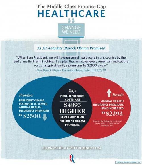
How Not To Venn Diagram – [GRAPHIC]

Sociological Images’s Lisa Wade has good concise blog post highlighting the errors in a recent set of graphics released by the Romney campaign. She points out:

Mitt Romney’s campaign put out a set of graphics illustrating a “gap” between what Obama promised and what he has delivered. The graphic is in the form of a Venn diagram, a visual designed to show the overlap between two conditions…

Unfortunately, Romney’s overlapping circles are not Venn diagrams, making the campaign somewhat ridiculous and giving nerdy liberals all over America a good chuckle.


Graphjam also weights in on the subject:

(via Sociological Images and Graphjam)

(h/t Boingboing)


Politics Spending Visualizations

Presidential Candidates Money Raising – [VIDEO]

The video shows how presidential candidates (Barack Obama, Mitt Romney, Ron Paul, Rick Santorum and Newt Gingrich) raised money state by state during 2011/2012.

The circle sizes indicate the amount of contribution per capita giving to the candidates by each state. The timelines show the overall money per capita raised by candidates during a particular time.

The data is based on the Sunlight Foundations APIs, based on Federal Election Commission data released on Feb. 2012.

(via Sunlight Foundation)

Politics Visualizations

Who Runs The World? – [VISUALIZATION]

David McCandless over at InformationIsBeautiful has a fun visualization of ‘the world government hierarchy’ overlaid onto a ‘Pyramid of Power’. Not only does the visualization illustrate how the world works based on valid institutions, but also provides a conspiracy theory representation of who really is in charge. Based on this view it’s the Illuminati – and not the United Nations – who control governments and mastermind world events.

Who Runs The World

(via InformationIsBeautiful.net)


Politics Spending Visualizations

Slicing the 2013 US Federal Budget – [VISUALIZATION]

President Barack Obama budget for 2013 was submitted to Congress earlier this week. The document is more that 250 pages long, but helpfully the New Your Times have created a cool interactive visualization of budget spending data. Created by Shan Carter, it provides four ways of exploring where the $3.7 Trillion is spent.

Slicing the Federal BudgetTo experience the full interactive budget, and explore types of spending, spending by departments and changes since last year, head over to NYTimes.