Tag Archives: Graphs and Charts

Earth Graphs and Charts Visualizations

Huge Timescales in Perspective – [GRAPHS]

The folks over at wait but why have created a fantastic series of charts representing different timescales in history. They seek to put a wide range of historical moments into a time perspective.

From the blog:

Humans are good at a lot of things, but putting time in perspective is not one of them.It’s not our fault—the spans of time in human history, and even more so in natural history, are so vast compared to the span of our life and recent history that it’s almost impossible to get a handle on it…To try to grasp some perspective, I mapped out the history of time as a series of growing timelines—each timeline contains all the previous timelines (colors will help you see which timelines are which).

For the full series of charts, head to wait but why.


(h/t boingboing)

Funny Graphs and Charts

5 Pie Charts the Irish can relate to – [FUNNY]

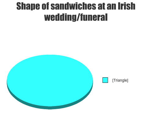
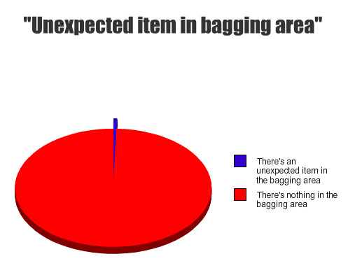
The Daily Edge has a funny compilation of pie-charts on themes Irish people – or those that have lived in Ireland – can all identify with. It contains 17 visualisations of instances which somehow highlight traits to the Irish character. My top five are below:

1) Fields of Athenry

2)  Sandwiches

3) Gaeilge

4) The immersion

5) Tesco

In a similar vein to those above RTE’s Republic of Telly recently had a short clip on the them of being Irish. Check it out below

(for some more funny pie-charts check thepoke’s collection).

Jittery Financial Markets In One Graph – [GRAPHS]

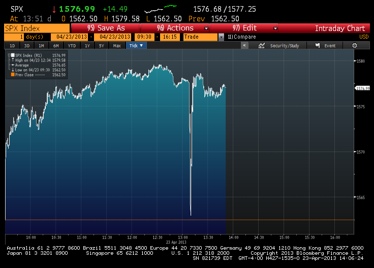
Earlier this week the Associated Press reported its official Twitter account was hacked. The hacker tweeted out that there had been a White House explosion causing a huge drop in the Dow Jones Industrial Average before it quickly recovered.

(h/t Sunlightfoundation)

Funny Graphs and Charts

Unhealthy Pie – [FUNNY]

A lesson in how not to create pie charts…

(h/t broadsheet)

Funny Graphs and Charts

Goss Pie Chart – [FUNNY]

Just a funny pie-chart referencing the 80’s chart topping band Bros.

(h/t broadsheet)

Graphs and Charts Politics Visualizations

Growth in America’s Wealth disparity – [VISUALIZED]

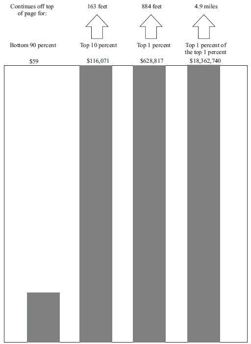
David Cay Johnston writing at Tax Analysts has a superb visualization of the growth in Income inequality in America. The chart below features data taken from the Internal Revenue Service and highlights the growth in income inequality in the USA since the 1960s.
Wealth disparity in America

The bottom 90 percent is represented by an inch-high bar while the growth of the top 10 percent needs a 163 foot-tall bar and the top 0.01% need a 4.9 mile-high bar to represent their wealth growth.

The income growth and shrinkage figures come from analysis of the latest IRS data by economists Emmanuel Saez and Thomas Piketty, who have won acclaim for their studies of worldwide income patterns over the last century.

In 2011 entry into the top 10 percent, where all the gains took place, required an adjusted gross income of at least $110,651. The top 1 percent started at $366,623.

The top 1 percent enjoyed 81 percent of all the increased income since 2009. Just over half of the gains went to the top one-tenth of 1 percent, and 39 percent of the gains went to the top 1 percent of the top 1 percent.

Ponder that last fact for a moment — the top 1 percent of the top 1 percent, those making at least $7.97 million in 2011, enjoyed 39 percent of all the income gains in America. In a nation of 158.4 million households, just 15,837 of them received 39 cents out of every dollar of increased income.

(h/t boingboing)

Funny Graphs and Charts

Correlation and Causation – [CHART]

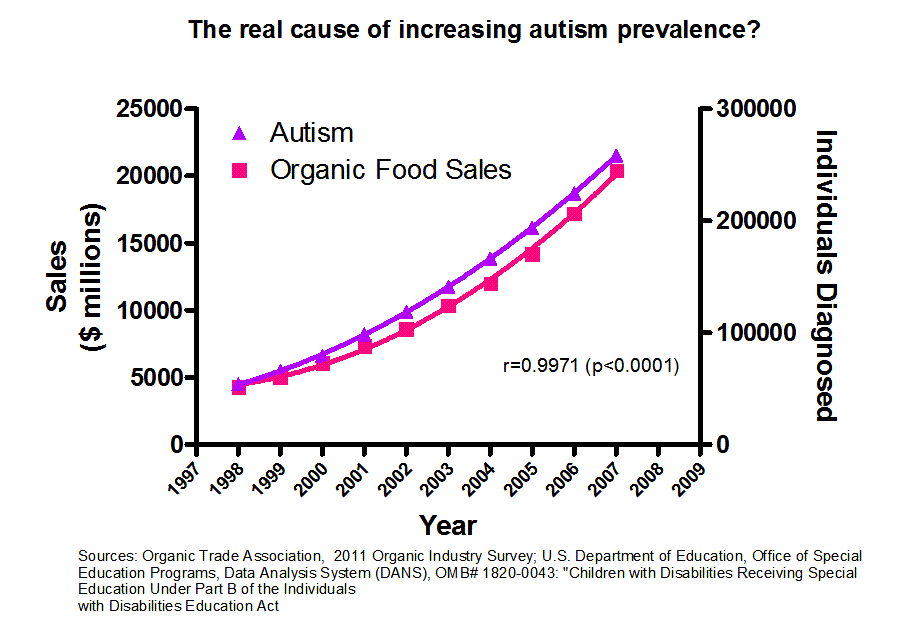
Redditor Jasonp55 has created a fine example of the issues surrounding the confusion of correlation with causation.  The issue relates to associating the number of individuals diagnosed with Autism and the sales of organic food – Correlation does not imply causation.

Real cause of increasing autism prevalence?

(via boingboing)

Art Funny Graphs and Charts Video

Solving the Problem of Ugly Greeting Cards – [VIDEO]

An interesting Kicktarter project to tackle the pressing issue of ugly greeting cards. The project promises to develop a robust solution to the loathsome issue of greeting cards that are so ugly that they make babies cry.

For full images of the cards and to support this project check Kickstarter. My favorite card below:

Greeting Card

(via boingboing)

Graphs and Charts Visualizations

The Elements According to Relative Abundance – [VISUALIZATION]

A periodic chart by Prof W Sheehan of University of Santa Clara depicting each element of the Periodic table by its relative Abundance.

Roughly, the size of an element’s own niche is proportioned to its abundance on Earth’s surface, and in addition, certain chemical similarities.

H is Hydrogen, C is Carbon and O is Oxygen…but you knew that already. (Periodic table)

The Elements According to Relative Abundance

(via Visual.ly)
Graphs and Charts Infographic Visualizations

Modern Approaches to Data Visualization – [VISUALIZATION]

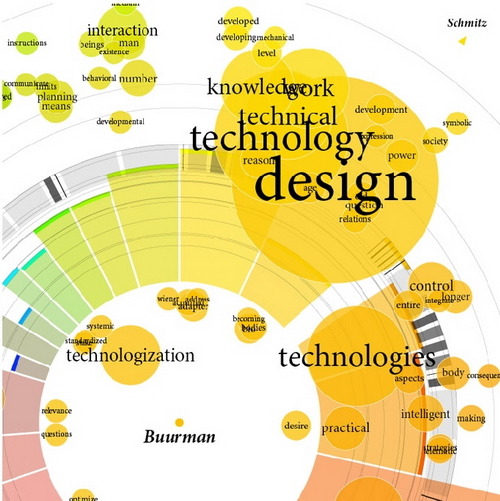
David Friedman (Editor of Smashing Magazine) has crafted together a superb collection of resources representing some of the most interesting modern approaches to data visualization.

The article goes through some fascinating ways to visualize data including: Mindmaps, Ways of displaying news/data/connections and websites. Along with this, the article highlights many useful resources and tools to assist in creating powerful charts, diagrams, maps, statistics and data visualisations. An altogether fantastic resource.
Data visualization - Modern approaches

Check out the full article at Smashing Magazine – Data Visualization: Modern Approaches.