Tag Archives: Graphs and Charts

Graphs and Charts

What Americans Do At Weekends – [GRAPHIC]

Planet Money’s Graphing America series asks the question; What do those people do on the weekends, when they’re not working?

Taking data from the American Time Use Survey (conducted by the Bureau of Labor Statistics), they answer the question below.
What Americans Actually Do All Weekend

(via NPR’s Planet Money)

Graphs and Charts Visualizations

100 Years Of Immigrants In America – [GRAPHS]

NPR’s Planet Money have a couple of new charts showcasing the change in the immigration as a share of the U.S. population over the past century. Given the rhetoric on immigration it’s interesting to note how this percentage has barely changed over the past 100 years.
% of US population born in a foreign country

The also note:

A century ago, U.S. immigrants were overwhelmingly European. Today, Latin America and Asia are the big drivers of U.S. immigration, and Europe accounts for just a small fraction of the whole.

Percentage of foreign born population

(via Planet Money)

Enterprise 2.0 Funny Graphs and Charts

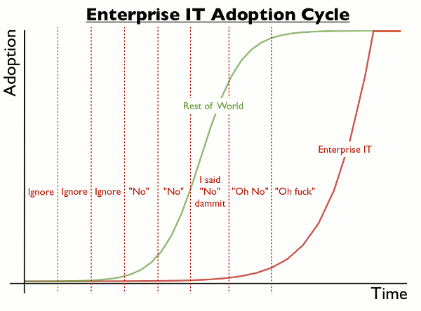
Enterprise IT Adoption – [CHART]

Simon Wardley’s fantastically accurate representation of the enterprise IT adoption cycle.

Enterprise IT Adoption

While the chart could be dismissed as a bit of fun, it has it’s origins in a tweet below from Joe Drumgoole. I challenge those of you working in a corporate IT environment to confess there’s not some truth in it.

(via Adoption cycles)
(h/t boingboing)

Funny Graphs and Charts

Replying to Emails – [FUNNY]

Visual.ly explaining the age old email conundrum of why you sometimes don’t get replys to emails. We’ve all been there…
Email replys

(via visual.ly)

Graphs and Charts Spending

How The Poor And The Rich Spend Their Money – [GRAPHIC]

As part of NPR’s Graphing America series, Planet Money takes a look at how the poor, middle class and rich spend their money. Not surprisingly, the poor spend more of their money on essentials like groceries and utilities while the rich spend more on education and saving for retirement.

The figures highlighted in the graph above come from the Consumer Expenditure Survey, which includes lots of useful data on spending patterns in the U.S.

(via Planet Money)

Funny Graphs and Charts Politics Visualizations

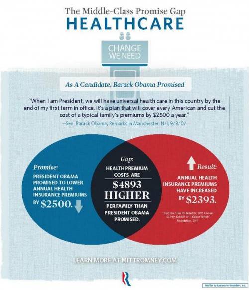
How Not To Venn Diagram – [GRAPHIC]

Sociological Images’s Lisa Wade has good concise blog post highlighting the errors in a recent set of graphics released by the Romney campaign. She points out:

Mitt Romney’s campaign put out a set of graphics illustrating a “gap” between what Obama promised and what he has delivered. The graphic is in the form of a Venn diagram, a visual designed to show the overlap between two conditions…

Unfortunately, Romney’s overlapping circles are not Venn diagrams, making the campaign somewhat ridiculous and giving nerdy liberals all over America a good chuckle.
 

Graphjam also weights in on the subject:

(via Sociological Images and Graphjam)

(h/t Boingboing)


Graphs and Charts Spending Visualizations

50 Years Of US Government Spending – [GRAPH]

The fascinating graphic below – from NPR – details US federal government spending and how this has changed from 50 years ago, 25 years ago and last year. It categories spending into areas such as defense, social security and medicaid.

50 Years Of Government Spending, In 1 Graph

For more details on the categorisations above, check out Planet Money’s blog post on the chart.

Data sourceOffice of Management and Budget

(via NPR Planet Money)

Funny Graphs and Charts

Doing the Hokey Cokey – [CHARTS]

Hokey Cokey

(via Stephen Wildish)

(h/t broadsheet)

Funny Graphs and Charts

Don’t Look At This Pie Chart – [CHARTS]

Did you see the Potato?

(via broadsheet)

Politics Spending Visualizations

Slicing the 2013 US Federal Budget – [VISUALIZATION]

President Barack Obama budget for 2013 was submitted to Congress earlier this week. The document is more that 250 pages long, but helpfully the New Your Times have created a cool interactive visualization of budget spending data. Created by Shan Carter, it provides four ways of exploring where the $3.7 Trillion is spent.

Slicing the Federal BudgetTo experience the full interactive budget, and explore types of spending, spending by departments and changes since last year, head over to NYTimes.