Category Archives: Graphs and Charts

Art Graphs and Charts Visualizations

2015 NYT Year in Visual Stores and Graphics – [VISUALIZATION]

2015 has been a breakthrough year for the New York Times in terms of the breath and reach of its storytelling techniques. Whether it’s through data visualizations or maps, we’ve seen an increase in the scope and breath of graphics to drive narrative and explanation. The news organization has gathered together some of its best examples in 2015: The Year in Visual Stories and Graphics.

My favorites of each category are below:

Visual features

The Dawn Wall – El Capitan’s Most Unwelcoming Route

Longform Stories

Buying Power – The Families Funding The 2016 Presidential Election

Data-Driven Articles

What Drives Gun Sales: Terrorism,Politics and Calls for Restrictions

Maps

The World According to China

Motion Graphics and Video Stories

Three Hours of Terror in Paris, Moment by Moment

Data Visualization

TThe Flight of Refugees Around the Globe

Graphs and Charts Internet Map Visualizations

The Internet Tube – [VISUALIZATION]

The visualization below, from the Oxford Internet Institute, attempts to simplify the world’s network of submarine fiber-optic cables into a commonly understood subway map.

Each stop on the subway is a node (a place where data is sent and received like an Internet service provider) assigned to a country. The map is generated by taking node data from cablemap.info which“aims to provide a global overview of the network, and a general sense of how information traverses our planet,”.

A higher resolution image is available at geography.oii.ox.ac.uk.

(h/t slate.com)

Graphs and Charts Visualizations

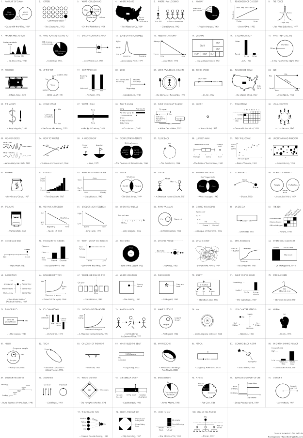
Movie Quotes as Charts – [CHARTS]

FlowingData have visualized the American Film Institute’s 100 most memorable quotes from American cinema. Very clever!

(via flowingdata)

Graphs and Charts Politics Visualizations

2014 Elections Worldwide – [VISUALIZATION]

The Economist’s superb visualization of 2014’s upcoming elections.


(h/t sunlightfoundation.com)

Earth Graphs and Charts Visualizations

Huge Timescales in Perspective – [GRAPHS]

The folks over at wait but why have created a fantastic series of charts representing different timescales in history. They seek to put a wide range of historical moments into a time perspective.

From the blog:

Humans are good at a lot of things, but putting time in perspective is not one of them.It’s not our fault—the spans of time in human history, and even more so in natural history, are so vast compared to the span of our life and recent history that it’s almost impossible to get a handle on it…To try to grasp some perspective, I mapped out the history of time as a series of growing timelines—each timeline contains all the previous timelines (colors will help you see which timelines are which).

For the full series of charts, head to wait but why.


(h/t boingboing)

Graphs and Charts Visualizations

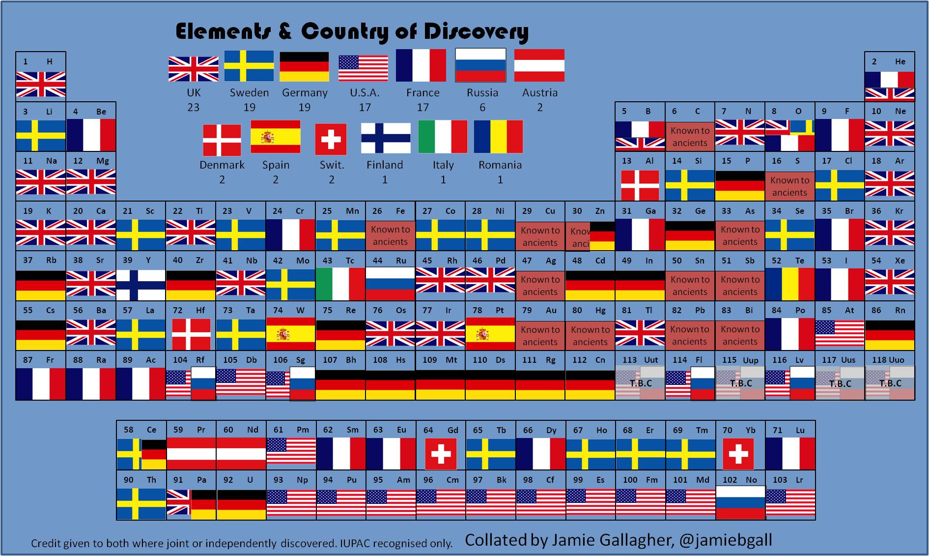
Periodic Elements by Country of Discovery – [CHART]

PhD student Jamie Gallagher maps the countries where scientists were living when they discovered the period elements in the table below. The United Kingdom comes first, followed jointly by Sweden and Germany.


(h/t broadsheet)

Funny Graphs and Charts

5 Pie Charts the Irish can relate to – [FUNNY]

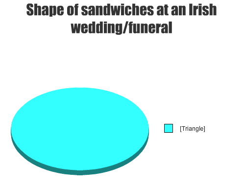
The Daily Edge has a funny compilation of pie-charts on themes Irish people – or those that have lived in Ireland – can all identify with. It contains 17 visualisations of instances which somehow highlight traits to the Irish character. My top five are below:

1) Fields of Athenry

2)  Sandwiches

3) Gaeilge

4) The immersion

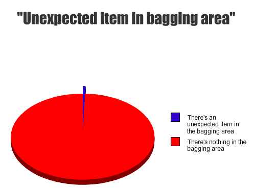
5) Tesco

In a similar vein to those above RTE’s Republic of Telly recently had a short clip on the them of being Irish. Check it out below

(for some more funny pie-charts check thepoke’s collection).

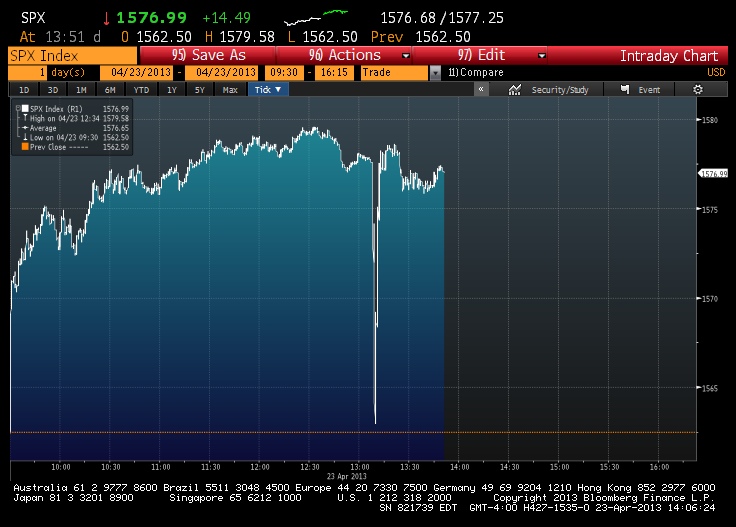
Jittery Financial Markets In One Graph – [GRAPHS]

Earlier this week the Associated Press reported its official Twitter account was hacked. The hacker tweeted out that there had been a White House explosion causing a huge drop in the Dow Jones Industrial Average before it quickly recovered.

(h/t Sunlightfoundation)

Funny Graphs and Charts

Unhealthy Pie – [FUNNY]

A lesson in how not to create pie charts…

(h/t broadsheet)

Funny Graphs and Charts

Goss Pie Chart – [FUNNY]

Just a funny pie-chart referencing the 80’s chart topping band Bros.

(h/t broadsheet)