Category Archives: Map

Graphs and Charts Internet Map Visualizations

The Internet Tube – [VISUALIZATION]

The visualization below, from the Oxford Internet Institute, attempts to simplify the world’s network of submarine fiber-optic cables into a commonly understood subway map.

Each stop on the subway is a node (a place where data is sent and received like an Internet service provider) assigned to a country. The map is generated by taking node data from cablemap.info which“aims to provide a global overview of the network, and a general sense of how information traverses our planet,”.

A higher resolution image is available at geography.oii.ox.ac.uk.

(h/t slate.com)
Earth Map Time-lapse Video

Rapid Urbanisation – [TIME-LAPSE]

NASA, TIME and Google, have teamed up to create a fascinating time-lapse video showcasing the rapid urbanisation of some of the world’s largest cities. The images come from orbiting satellites as part of NASA’s Landsat program. This program monitors how humans are rapidly altering the surface of the planet, through the use of eight satellites which between them have collected millions of images since 1984.

More at ArchDaily

Mapping the World in Tweets – [VISUALIZATION]

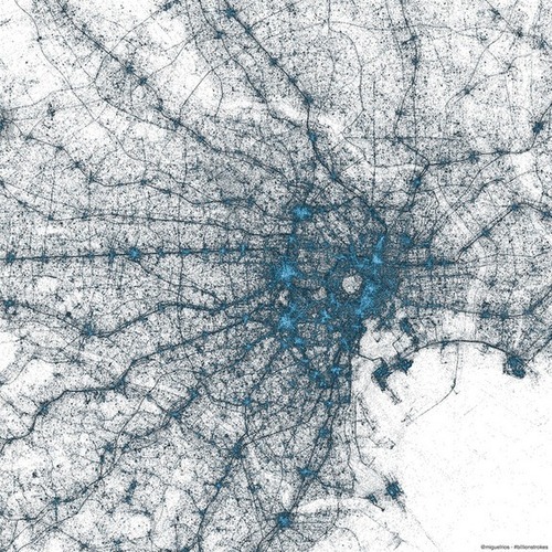
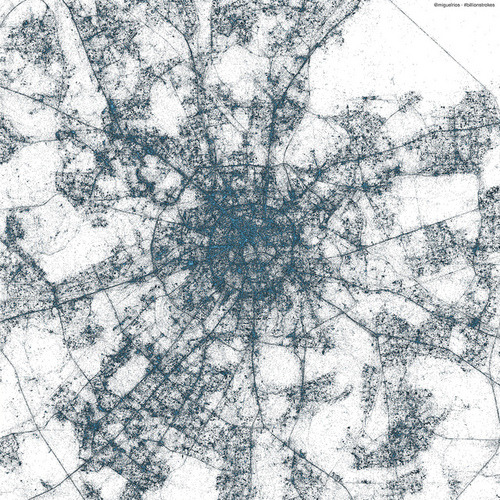
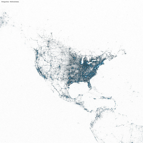
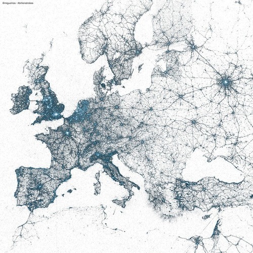
The folks over at Twitter have created some astonishing maps using billions of geotagged tweets. Every dot on the maps below represents a geotagged tweet, with the brighter colors showing high concentrations of tweets.

Europe:

Tokyo:

Moscow:

North America:

(h/t worldbank)

Map Travel Video Visualizations

How London Travels – [VISUALIZATION]

Jay Gordon has created a mesmerizing visualization of the daily flows of London commuters. Spatial.ly notes how:

It combines the 16 million or so daily transactions made with London’s Oyster cards with vehicle-location data from the city’s 8,500 buses to infer journeys of approximately 3.1 million Oyster users. After inferring the times and locations of each bus boarding and alighting, bus and rail transactions are combined to reconstruct each cardholder’s daily travel history.

From more check jaygordon.net.

Map Travel Video Visualizations

24 Hours of European Air Traffic – [VISUALIZATION]

Lee Armstrong of planefinder.net video showing live air traffic over Europe in November 2012. Their related app had its best day of sales following a Daily Mail claim  that it was an ‘aid to terrorists’.

(via broadsheet)

Summer 2012 by Google Maps – [INFOGRAPHIC]

The folks over at Google Maps have crafted a nifty infographic outlining the summer search activity on maps.google.com in various countries. From the end of May to the beginning of September, the infographic highlights some of the top-rising searches and most often-searched landmarks on Google Maps.
Summer 2012

From the blog post:

North Americans sought out the best local beaches to help cool off from the summer heat. In comparison, many more people from Spain, Italy and France searched for community swimming pools. In cooler areas of the U.K. the rising Google Maps searches included many indoor activities such as squash, bars and going to the gym. And, as expected, travel was a clear choice for the summer, as indicated by a surge in searches for lodging in almost every region.

Art Map Mashup Visualizations

London’s Most Common Surnames – [VISUALIZATION]

London Surnames

As part of his PdD research at the University College London’s Geography Dept., James Cheshire has produced a series of interactive maps of London show the relationship of common surnames to different London neighborhoods.

This map shows the 15 most frequent surnames in each Middle Super Output Area (MSOA) across Greater London. The colours represent the origin of the surname (*not necessarily* the person) derived from UCL’s Onomap Classification tool. The surnames have also been scaled by their total frequency in each MSOA.

He concludes:

The more you study these maps the more interesting, and perhaps complex, they become.  My final thoughts therefore appear a little contradictory. The first is that a surprising number of Londoners share the same name (especially with their immediate neighbours). The second is that despite the dominance of relatively few surnames at the top of the rankings, the further down the rankings you get the more you see of London’s population diversity.

(h/t boingboing)

Internet Map Visualizations

The Internet Map – [VISUALIZATION]

Ruslan Ekineev created what he calls “The Internet Map,” an interactive visualization charting 350,000 websites from 196 countries. Each website is represented as a “planet”, with size is determined by traffic, and color by national origin. Ekineev explains:

Every site is a circle on the map, and its size is determined by website traffic, the larger the amount of traffic, the bigger the circle. Users’ switching between websites forms links, and the stronger the link, the closer the websites tend to arrange themselves to each other.

A screengrab from the map below shows Ireland’s Internet Map, with the largest website being google.ie. No surprises there.
The Internet Map - Ireland

(via boingboing)

Graphs and Charts Map Visualizations

How Common Is Your Birthday? – [GRAPHIC]

Amitabh Chandra of Harvard University provided the data for a New York Times article back in 2006 based on babies born in the United States on dates between 1973 and 1999.

The data (visualized on the headmap below) shows Sept. 16 was most common with Feb. 29 (only in a leap year) obviously the least common.
How Common Is Your Birthday?

Data source: NYTimes.com, Amitabh Chandra, Harvard University.

For more check How Common Is Your Birthday – Pt 2.

(via broadsheet)

Map Travel Video Visualizations

How 300,000 People Move Home – [VISUALIZED]

Norwegian developer Even Westvang created a beautiful animation illuminating how 300,000 of his compatriots move around their country. The visualization (created using a C++ application called Deluge) is based on 4m publicly available Norwegian tax records detailing birth date, income and address details. The underlying data was generated by cross referencing records from 2006 and 2007 to find changes in postal codes.

Deluge from even westvang on Vimeo.

(via Infostethics.com)