A fantastic journey through the wonders and magnificence of Alanaia. This 4k tilt-shift video travels UNESCO World Heritage sites like Berat, Gjirokastra and Butrin. It shows the beautiful beaches of Ksamil, Himara along with the serenity of the capital Tirana.
Nightvision is a celebration of the brilliance and diversity of architecture found across Europe. Over the course of three months I journeyed with a friend through 36 cities in 21 countries with the ambition of capturing some of the greatest European structures in a new and unique way. Comprised of thousands of carefully taken photographs, strung together and stabilized in post-production, Nightvision aims to inspire appreciation for these man-made landmarks.
Tomorrow Croatia will become the 28th Member of the European Union. In preparation for this, the folks over at neurope.eu have prepared an informative infographic detailing many interesting facts and figures about Europe’s newest member.
Social media monitoring company Brandwatch have created a cool data visualization Web tool, which reveals what twitter user sentiment on the England and Germany squads. The chatter is updated in real-time as people tweet about different players.
Unfortunately (or fortunately), there is no such visualization available for the Ireland squad.
If nothing else, this is a good example of how, with the right presentation, social data can be aggregated and used to give a good overview of national sentiment around an event.
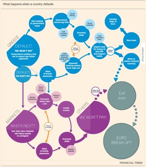
The idea of a Greek exit from the eurozone looks more and more likely each day, with the consequences now said to be ‘managable’. There has been a number of flowcharts and interactive graphics highlighting likely consequences resulting from such a scenario. Some of the most recent are outlined below. Click on the graphics for the full interactive versions.
Financial Times
This interactive graphic from the Financial Times (FT) outlines the likely consequences of a Greece eurozone exit.
Along, with this Lombard Street Research has provided a flowchart (considering what happens in the event of a Greek euro exit) and the options ahead for the eurozone.
BBC
The BBC also has a handy interactive graphic contemplating what could happen next if Greece leaves the eurozone.
The Institute of International and European Affairs (IIEA) recently released an informative Infographic entitled “The European Union’s Response to the Euro Crisis”. It provides and overview of many of the EU’s actions taken to date to tackle the crisis and provides an overview of some policies still under discussion e.g the Fiscal compact.
The infographic is fairly comprehensive in its presentation of data, which rather detracts from any narrative regarding the response to the crisis. Nevertheless, it represents a smorgasbord of policy actions, rules and ideas implemented over the last few years.
Created by Hang IO as an entry for the visualization challenge Money Panics, the infographic below explains some of the Key Indicators in relation to the Euro Debt Crisis.
Some quick numbers:
European Debt as a % of Gross Domestic Product (GDP) in 2011 was 87.3%
Greece has the highest Government Gross Debt as % of GDP at 142.8%
Ireland has the highest Government Debt per Capita at €33,105 per person
Manu Fernandez has gathered together a collection of visualisations highlighting the intensity of urban activity in cities around the world. The expanding urban landscape is generating a huge amount of data on the inner workings of cities and the social interactions occurring within these environments. The growing open data movement provides a rich ecosystem of data in which to visualize the fabric and life of these societies.
Some of the examples below represent the best formats of how to visualize the intensity of urban life through video and interactive web tools.
Transport data mapping experts ITO World have taken official data from the National Highway Traffic Safety Administration, and produced a powerful interactive map detailing US road fatalities between Jan 2001 and December 2009. Each dot on the map represents one of the 369,629 people that died on America’s roads between 2001 and 2009.
It used hundreds of small, location aware tags attached to different types of trash to follow progress of trash through city’s waste management system. These revealed the stunning final journey of everyday trash in a series of real time visualizations. The project represented “an initial investigation into understanding the ‘removal-chain’ in urban areas and it represents a type of change that is taking place in cities: a bottom-up approach to managing resources and promoting behavioral change through pervasive technologies”.
This map visualizes all bikes of the public hire schemes in London and many other cities throughout the world. The animated map displays information on the distribution of all the checkin points, the level of use at any given time and the availability of bicycles at each point.
Along with the interactive map, there is a superb real-time animation of the use of bikes in London.
This visualization aims to provide a greater understanding of some of the city’s dynamics. It provides people with access to a range of useful real-time urban activity information. The aim is to give “people visual and tangible access to real-time information about their city enables them to take their decisions more in sync with their environment, with what is actually happening around them.”