Category Archives: Politics

Politics Video Visualizations

Military and Civilian Deaths of World War II – [VISUALIZATION]

The Fallen of World War II is an interactive documentary examining the human cost of the second World War and the decline in battle deaths in the years since the war.

Neil Halloran’s film below explores the numbers to provide a perspective and context on the military and civilian deaths in this conflict and others. It highlights the massive lost of life incurred by Germany, The Soviet Union and China during this time.

For the full interactive visualizations, check out fallen.io.

Graphs and Charts Politics Visualizations

2014 Elections Worldwide – [VISUALIZATION]

The Economist’s superb visualization of 2014’s upcoming elections.


(h/t sunlightfoundation.com)

Europe Infographic Politics

CROATIA: The 28th Member of the EU – [INFOGRAPHIC]

Tomorrow Croatia will become the 28th Member of the European Union. In preparation for this, the folks over at neurope.eu have prepared an informative infographic detailing many interesting facts and figures about Europe’s newest member.

INFOGRAPHIC: Get to know Croatia - the 28th member of the European Union
Infographic design by: Stedas dizajn – infographic design and web usability

Flow Chart Politics

The Ultimate Conspiracy Theory – [FLOWCHART]

Crispian Jago of The Reason Stick introduces his expansive and detailed Conspiracy Theory flowchart:

If you’re new to the exciting world of conspiracy theories and just can’t decide which paranoid delusion best suits you, then why not use this handy flowchart to find your ideal conspiracy theory. Then you too can go and stick it to THE MAN.

(h/t broadsheet)

Graphs and Charts Politics Visualizations

Growth in America’s Wealth disparity – [VISUALIZED]

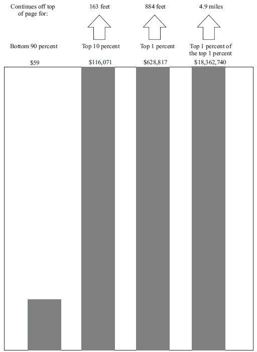
David Cay Johnston writing at Tax Analysts has a superb visualization of the growth in Income inequality in America. The chart below features data taken from the Internal Revenue Service and highlights the growth in income inequality in the USA since the 1960s.
Wealth disparity in America

The bottom 90 percent is represented by an inch-high bar while the growth of the top 10 percent needs a 163 foot-tall bar and the top 0.01% need a 4.9 mile-high bar to represent their wealth growth.

The income growth and shrinkage figures come from analysis of the latest IRS data by economists Emmanuel Saez and Thomas Piketty, who have won acclaim for their studies of worldwide income patterns over the last century.

In 2011 entry into the top 10 percent, where all the gains took place, required an adjusted gross income of at least $110,651. The top 1 percent started at $366,623.

The top 1 percent enjoyed 81 percent of all the increased income since 2009. Just over half of the gains went to the top one-tenth of 1 percent, and 39 percent of the gains went to the top 1 percent of the top 1 percent.

Ponder that last fact for a moment — the top 1 percent of the top 1 percent, those making at least $7.97 million in 2011, enjoyed 39 percent of all the income gains in America. In a nation of 158.4 million households, just 15,837 of them received 39 cents out of every dollar of increased income.

(h/t boingboing)

Politics Spending Visualizations

Obama / Romney Campaign Spending – [VISUALIZATION]

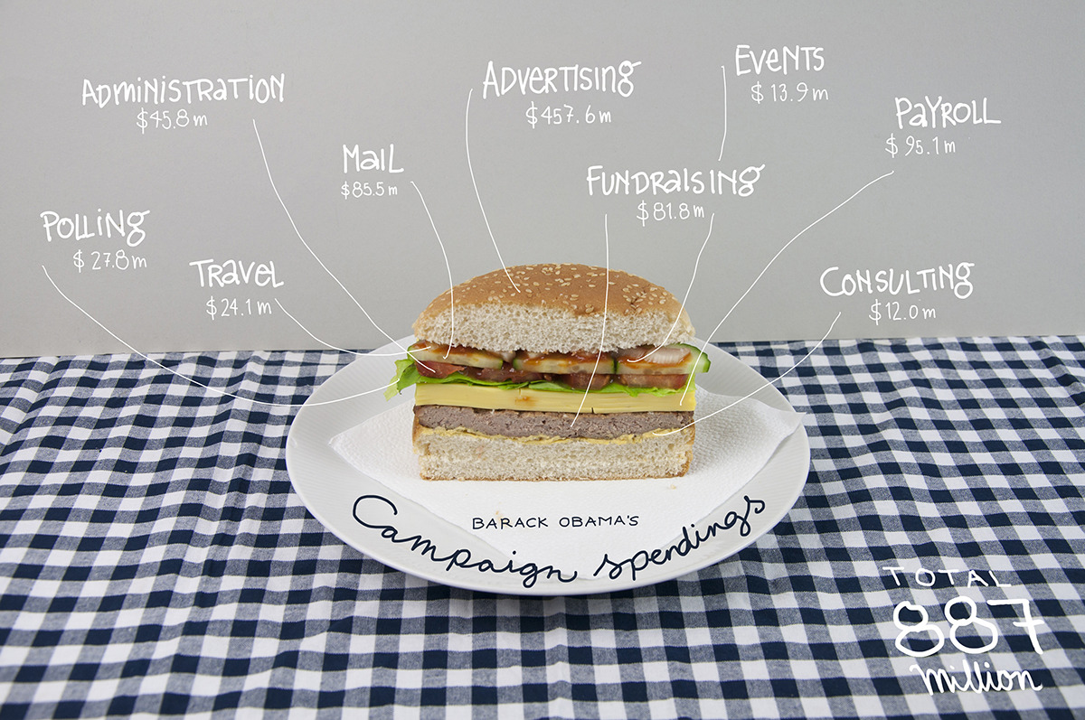
The wonderful tumbler bindersfullofburgers has a couple of great visualisations highlighting where the Obama and Romney campaigns have spent their election dollars.

Obama Campaign
Obama's Campaign Spending

Romney Campaign
Romney's Campaign Spending

(h/t SunlightFoundation)

Infographic Politics

How the World would vote – [INFOGRAPHIC]

According to MSN, the World – except China – would vote for Obama.

In 34 of the 35 countries where MSN quizzed its online readers, the current US president won well over half of the votes. The only exception was China, where readers backed Romney by 52% to 48%.

World Vote US Election 2012
According to a BBC World Service opinion poll of 21,797 people in 21 countries , 50% favoured Mr Obama, with 9% for Mr Romney.

Only Pakistan’s respondents said they would prefer to see Mr Romney win November’s election. France was the most strongly pro-Obama (72%).

Countries by support for Obama

Art Internet Politics Video

How Will The Animated GIF Affect The Presidential Election? – [VIDEO]

PBS’s Idea Channel on animated GIFs and their potential impact in the US 2012 election:

The animated GIF has had a long and fascinating history, but the GIF took a giant leap forward this year when it became part of the 2012 Presidential Election!!! This election season, GIFs of Obama, Romney, Biden and Ryan, populated not only Tumblr and Buzzfeed, but also media heavyweights like The Atlantic, Forbes, and The Wall Street Journal. It became the perfect vehicle to capture a reaction, a gaffe or hilarious election moment and stream it ad infinitum. Will the Graphics Interchange Format swing the election for Obama or Romney?

Music: Roglok

Infographic Politics

US Election: Race for the Inbox – [INFOGRAPHIC]

The inbox has still proved a crucial tool for this year’s presidential candidates, especially for campaign funding. Just about every email I have received from both campaigns have requested monetary contributes.

Email analysis Return Path analysed the data surrounding each candidate’s message and created an neat infographic with it’s results below.

Their analysis reveals GMail users favor Obama while Yahoo! users favor Romney. Obama has  has five times more email subscribers than Romney but 5% of his election emails are being marked as spam compared with .8% of Romney email messages.

For more click on the infographic below to read the detail.

Obama vs Romney

(via mashable)

Infographic Politics Spending

US Gov Bailouts by Industry – [INFOGRAPHIC]

NPR’s Planet Money team have created a simple infographic to highlight the US Government’s bailout of various  industries over the past four years. The infographic highlights that:

while much of the bailout money has been paid back, the government still owns large shares in companies such as AIG and GM, and has yet to recoup some $200 billion in bailouts.

Gov Bailouts

The figures on which the infographic is based come from ProPublica, and are based on funds disbursed by the Treasury Department, but exclude programs launched by the Federal Reserve as part of the bailout. Repayments are based on money recovered by the Treasury through direct payments, dividends, interest, stock sales and other collateral.

Beware, however, as the numbers above do not tell the full story about the cost of these bailouts. For more on this, check The Profitable Bailout? Inside the Real Costs of the Saving AIG and Wall St.

(via Planet Money)