Time-lapse video of the transformation of the Time Warner Cable Arena in Charlotte for this week’s Democratic National Convention.
(via publicyte.com)
Time-lapse video of the transformation of the Time Warner Cable Arena in Charlotte for this week’s Democratic National Convention.
(via publicyte.com)
Sociological Images’s Lisa Wade has good concise blog post highlighting the errors in a recent set of graphics released by the Romney campaign. She points out:
Mitt Romney’s campaign put out a set of graphics illustrating a “gap” between what Obama promised and what he has delivered. The graphic is in the form of a Venn diagram, a visual designed to show the overlap between two conditions…
Unfortunately, Romney’s overlapping circles are not Venn diagrams, making the campaign somewhat ridiculous and giving nerdy liberals all over America a good chuckle.
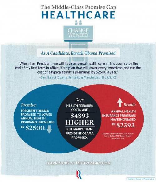


Graphjam also weights in on the subject:

(via Sociological Images and Graphjam)
(h/t Boingboing)
The video shows how presidential candidates (Barack Obama, Mitt Romney, Ron Paul, Rick Santorum and Newt Gingrich) raised money state by state during 2011/2012.
The circle sizes indicate the amount of contribution per capita giving to the candidates by each state. The timelines show the overall money per capita raised by candidates during a particular time.
The data is based on the Sunlight Foundations APIs, based on Federal Election Commission data released on Feb. 2012.
(via Sunlight Foundation)
Canada’s Globe and Mail has good set of infographics explaining Canada’s 2012 federal budget. The interactive set of infographics explores revenue, expenses and projects from the budget and serves as a useful template for providing easy explanations of complex spending choices and patterns.

(via The Globe and Mail)
The folks over at Where Does My Money Go and Daily Bread have created a simple budget 2012 interactive showing where British taxpayer’s taxes are spent. It provides a slider for users to select their salary, and then breaks down the associated income tax and national insurance paid into buckets for areas such as the National Health Service (NHS), education and defence.
The UK Chancellor George Osborne is planning to provide taxpayers with a personal tax breakdown detailing how much of their income is paid to the state and what it is being spent on. These annual tax statements are due to be issued from 2014 – 15.

Specimen annual tax statement due to be issued from 2014-15 onwards.
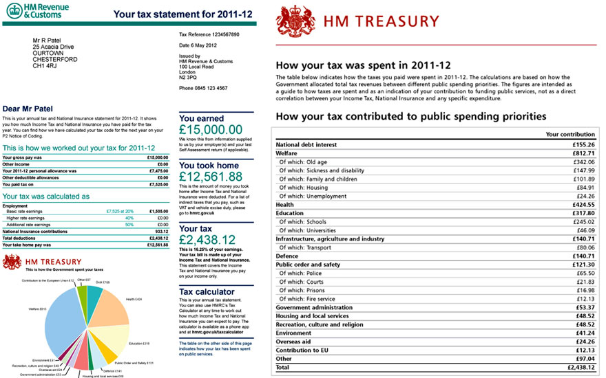
Photo: Guardian/HM Treasury/PA
(via Guardian data blog)
David McCandless over at InformationIsBeautiful has a fun visualization of ‘the world government hierarchy’ overlaid onto a ‘Pyramid of Power’. Not only does the visualization illustrate how the world works based on valid institutions, but also provides a conspiracy theory representation of who really is in charge. Based on this view it’s the Illuminati – and not the United Nations – who control governments and mastermind world events.

(via InformationIsBeautiful.net)
President Barack Obama budget for 2013 was submitted to Congress earlier this week. The document is more that 250 pages long, but helpfully the New Your Times have created a cool interactive visualization of budget spending data. Created by Shan Carter, it provides four ways of exploring where the $3.7 Trillion is spent.
 To experience the full interactive budget, and explore types of spending, spending by departments and changes since last year, head over to NYTimes.
John Pavlus over at FastCodeDesign.com has a fascinating article on the subject of whether ‘Infographics Can Save Morons From Themselves’. The essence of the piece is a discussion based on academic research from Darthmoth college which suggests (from the research abstract):
Graphical corrections are found to successfully reduce incorrect beliefs among potentially resistant subjects and to perform better than an equivalent textual correction
Political researchers Brendan Nyhan and Jason Reifler designed some experiments to test – as Pavlus puts it – ‘the efficacy of graphical “correctives” to inaccurate beliefs’
He goes on to say:
The authors suggest that conveying “counter-attitudinal information” (i.e., facts that directly contradict one’s beliefs on a subject like climate change, which the authors directly examined) graphically instead of textually simply provides less opportunity for counter-argument…
But there’s a big hole in this whole conceit. Just because people might be more psychologically inclined to accept infographics as “more objective” doesn’t mean that they actually are more objective. Graphic design is a language just like text, and it provides just as ample opportunity for obfuscation and distortion. The rub is that because graphics are so effective as communication tools, misleading graphics have the potential to be that much more dangerous as misinformation weapons.

It’s true that infographics have the potential to be more dangerous than simple text (see Megan McArdle’s recent article on Ending the Infographic plague), but the researchers are circumspect and not unequivocal in their conclusions. (How could they when you have examples of Fox News playing loose with their graphics, while stating the correct data). Instead, they say their results:
highlight the exciting possibility that graphical corrections can reduce misperceptions more effectively than text. However, the results underscore the psychological factors that make misperceptions so difficult to reduce…
And in conclusion (my emphasis):
Our results suggest that journalists writing stories about changes or trends in a measurable quantity where misperceptions are likely should consider including graphs in their stories.
So my conclusion from the research and subsequent discussion – us graphics to highlight trends or changes and you might, just might make things clearer and change opinions.
For more on where graphics can help and details of the experiments, check the research paper:
Opening the Political Mind? The effects of self-affirmation and graphical information on factual misperceptions.
From idsgeek:
Crony capitalism – a capitalist economy in which success in business depends on close relationships between business people and government officials.
For information on how to stop this head over to rootstrikers.org.

(via lerockwell)
The guys over at Motherjones.com have charted Democrat and Republican groups spending millions to influence the 2012 election.
Following the seminal Citizens United case – which prohibits government from censoring political broadcasts by corporations or unions – there has been a ratcheting up of money spent by nebulous groups in federal elections. Expanding super-PACs and vague 501(c) groups are exerting their considerable influence – in terms of advertising – in many areas of the political specturm. The chart below illustrates each group’s size based upon all known fundraising or spending since 2010.
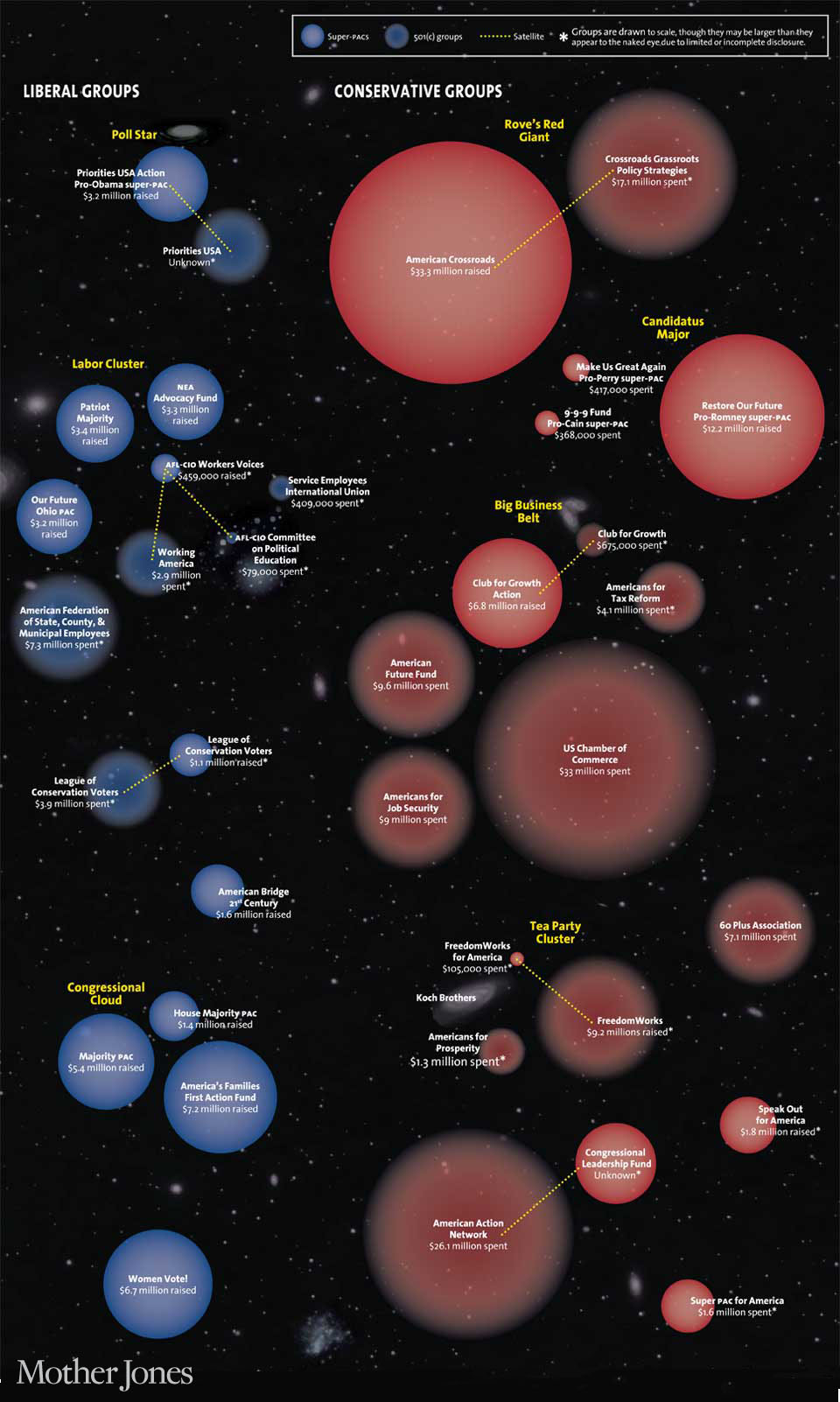
Source of financial data: Center for Responsive Politics, GuideStar.
(via Motherjones.com)

