The folks over at Where Does My Money Go and Daily Bread have created a simple budget 2012 interactive showing where British taxpayer’s taxes are spent. It provides a slider for users to select their salary, and then breaks down the associated income tax and national insurance paid into buckets for areas such as the National Health Service (NHS), education and defence.
The UK Chancellor George Osborne is planning to provide taxpayers with a personal tax breakdown detailing how much of their income is paid to the state and what it is being spent on. These annual tax statements are due to be issued from 2014 – 15.

Specimen annual tax statement due to be issued from 2014-15 onwards.
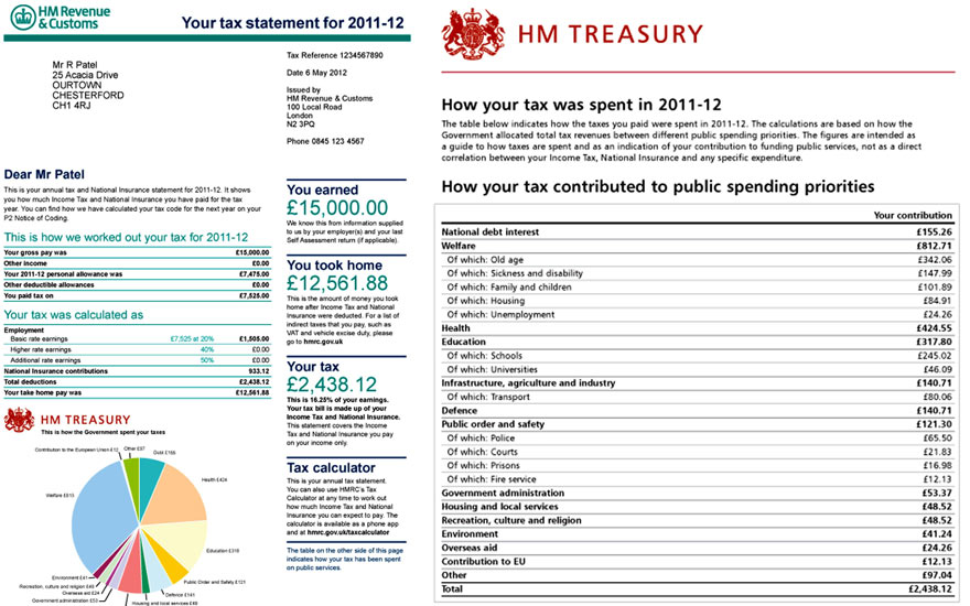
Photo: Guardian/HM Treasury/PA
(via Guardian data blog)


