Tag Archives: OpenSpending

Spending Video Visualizations

UK Gov Savings 2011/12 – [VISUALIZATION]

Last month, the Cabinet Office’s Efficiency and Reform Group (ERG) released details of their approach to eradicating wasteful government spending and how this achieved over £5.5 billion in savings for the UK taxpayer.

Strict spending controls were implemented cut expenditure by departments on IT contracts, property, marketing, temporary staff and consultancy. These savings are highlighted in a useful Tree-map and accompanying video below released by the Cabinet Office.
Government savings 2011-12

The video – created by the Efficiency and Reform Group in the Cabinet Office and released as part of the same news story – outlines how and where the 2011/12 £5.5bn in savings were achieved. It breaks down the £5.5bn into its component parts (as outlined in the graphic above) to show where and how the money was saved.

Altogether the Tree-map and accompanying video represent a clear and effective mechanism of communicating the breath of savings the Cabinet office ERG group have achieved over the past year.

(via Cabinet Office)

Infographic Journalism Open Source Visualizations

Data Journalism Handbook – [BOOK]

The Data Journalism Handbook is a “free, open source reference book for anyone interested in the emerging field of data journalism”.

It was born at a 48 hour workshop at MozFest 2011 in London and subsequently spilled over into an international, collaborative effort involving dozens of data journalism’s leading advocates and best practitioners – including from the Australian Broadcasting Corporation, the BBC, the Chicago Tribune, Deutsche Welle, the Guardian, the Financial Times, the New York Times, ProPublica, the Washington Post, and many others.

The result, so far, is a beta online book, the outline of which is described below. It offers a glimpse into the practice of data journalism, with guidance on how to get started and a  range of case studies, along with sections on getting data, understanding data and delivering data to the public.

Data Journalism Handbook

The handbook covers topics such as

  • open data,
  • data use rights,
  • scraping and crowd-sourcing data,
  • becoming data literate,
  • presenting data to the public
  • community engagement.

It also provides details of tools and mechanisms to understand and deliver data to the public through telling stories. As a means of bolstering the case for data-driven journalism, the book also provides many case studies demonstrating “how data sources have been used to augment and improve coverage of everything from elections to spending, riots to corruption, the performance of schools to the price of water.”

Link: Data Journalism Handbook

(via ReadWriteWeb)

Infographic Spending

Spending Patterns: 1947 – 2007 – [INFOGRAPHIC]

The Atlantic has published research into how US consumer spending has changed in 2007 compared to 1947 levels. The results are visualized through two interactive infographics, which tell the story of we’re now spending less on the production of tangible goods and more on services such as health care, education and recreation.

From the article:

Taking 1967 as our starting point, 30% of the cost of the things we consumed that year went to manufacturing them; by 2007, that figure had fallen to 16%. In contrast, what we spent on business services over the same period jumped from 12% to 26%. That’s because baked into the price of everything we buy is the rising cost of advertising, accounting, legal services, insurance, real estate, consulting, and the like—jobs performed by the high-wage workers of our modern economy.

Click on the images for the full interactive infographics.

Infographic: How spending has changed

Change in spending over the past 40 years

Infographic: How we spend (Breaking It Down)

The infographics were created by Kiss Me I’m Polish, based on data from the Bureau of Economic Analysis, Department of Commerce and Census Bureau and noted the challenge in converting the complex datasets into a high level overview:

The data set we were provided was full of complexities – and we wanted our illustration to reflect those meticulous details without becoming visually overwhelming. So we created simple charts and blasted them with a hefty dose of playful and comprehensive imagery.

(via The Atlantic)

Infographic Politics Spending Visualizations

Canada Budget 2012 – [INFOGRAPHIC]

Canada’s Globe and Mail has good set of infographics explaining Canada’s 2012 federal budget. The interactive set of infographics explores revenue, expenses and projects from the budget and serves as a useful template for providing easy explanations of complex spending choices and patterns.
Infographic: Your 2012 federal budget explained

(via The Globe and Mail)

Politics Spending Visualizations

UK Budget 2012 – [INTERACTIVE]

The folks over at  Where Does My Money Go and Daily Bread have created a simple budget 2012 interactive showing where British taxpayer’s taxes are spent. It provides a slider for users to select their salary, and then breaks down the associated income tax and national insurance paid into buckets for areas such as the National Health Service (NHS), education and defence.

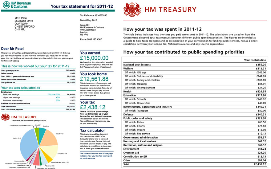
The UK Chancellor George Osborne is planning to provide taxpayers with a personal tax breakdown detailing how much of their income is paid to the state and what it is being spent on. These annual tax statements are due to be issued from 2014 – 15.

Budget 2012: how your taxes are spent - interactive

Specimen annual tax statement due to be issued from 2014-15 onwards.

A mock up of a 'tax receipt'.

Photo: Guardian/HM Treasury/PA


(via Guardian data blog)

Spending Visualizations

OpenSpending Visualisations – Uganda

Uganda Budget

The Guardian’s Poverty Matters blog recently published an article on the interactive visualisations of a London-based Overseas Development InstitutePublish What You Fund. The piece deals with how the institute is bringing transparency and clarity to of how donors are spending aid in Uganda, and comparing that with where the government allocates its resources.

It notes how ‘the Ugandan government was only aware of half the aid being spent in the country, despite routinely requesting this information from donors.’

From the article:

The Publish What You Fund campaign group and the Open Knowledge Foundation have now produced a visualisation of Uganda’s aid and budget data for 2003-2006, billed as the first time both sets of data have been displayed together in a way that is easy to explore. A quick look shows just how big a piece of the puzzle aid spending is – more than 50% of overall resources available in Uganda for 2005-2006. The vast majority of this $1.1bn in aid was spent directly by donors on various projects, with only a third given to the government to spend along with its domestic resources. Interestingly, aid money made up only a small proportion of resources for education, while accounting for the majority of resources for health, agriculture, water and the environment.

(via blog.openspending.org)