Tag Archives: Open Data

Government Open Data Visualizations

What Does Your Country Export? – [VISUALIZATION]

The Observatory of Economic Complexity describes itself as a tool that allows users to quickly compose a visual narrative about countries and the products they exchange. Their superb interactive visualization below shows the makeup of Ireland’s 2010 exports.

For the full story of how the country’s exports have changed since 1962 (from 23% live cattle to current 2.1%) , check out the full interactive at The Observatory of Economic Complexity.

It provides:

The observatory provides access to bilateral trade data for roughly 200 countries, 50 years and 1000 different products of the SITC4 revision 2 classification.

The source for the data

1962 – 2000: The Center for International Data from Robert Feenstra

2001 – 2009: UN COMTRADE

The source code for the visualizations is available on github and you can access the data via an API.

(h/t Worldbank)
Open Data Visualizations

World Bank on Tumblr – [VISUALIZATION]

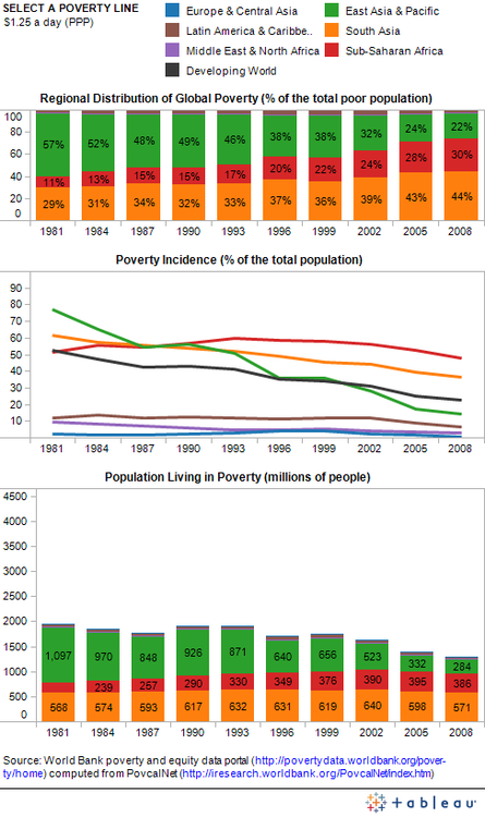
The World Bank just launched a new Data Visualization Tumblr blog dedicated to the latest and greatest open data visualizations on the fight against poverty.

The blog is part of the bank’s Open Data Initiative and will feature “open data visualizations made by economists, graphic artists and all of you open data enthusiasts from both inside and outside the Bank”.

The first visualization presented on the site details Global Poverty Trends and was created using the bank’s re-vamped version of PovcalNet: an interactive on-line computational poverty analysis tool. The team downloaded the table with regional poverty estimates and then used PovcalNet to calculate the results for additional poverty lines. They then combined all the data in the three-panel visualization below – for full interactive version of the chart check out Seeing Between the Lines: Visualizing Global Poverty Trends .

Visualizing Poverty trends

Infographic Journalism Open Source Visualizations

Data Journalism Handbook – [BOOK]

The Data Journalism Handbook is a “free, open source reference book for anyone interested in the emerging field of data journalism”.

It was born at a 48 hour workshop at MozFest 2011 in London and subsequently spilled over into an international, collaborative effort involving dozens of data journalism’s leading advocates and best practitioners – including from the Australian Broadcasting Corporation, the BBC, the Chicago Tribune, Deutsche Welle, the Guardian, the Financial Times, the New York Times, ProPublica, the Washington Post, and many others.

The result, so far, is a beta online book, the outline of which is described below. It offers a glimpse into the practice of data journalism, with guidance on how to get started and a  range of case studies, along with sections on getting data, understanding data and delivering data to the public.

Data Journalism Handbook

The handbook covers topics such as

  • open data,
  • data use rights,
  • scraping and crowd-sourcing data,
  • becoming data literate,
  • presenting data to the public
  • community engagement.

It also provides details of tools and mechanisms to understand and deliver data to the public through telling stories. As a means of bolstering the case for data-driven journalism, the book also provides many case studies demonstrating “how data sources have been used to augment and improve coverage of everything from elections to spending, riots to corruption, the performance of schools to the price of water.”

Link: Data Journalism Handbook

(via ReadWriteWeb)