The folks over at UsVsTh3m have created a neat explainer for the latest Daft Punk record.
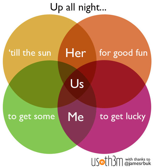
Watch the video below and check the resemblance.
(via UsVsTh3m)
What if we condensed the world’s 7 billion people into a visual representation of 100 people? How would they be distributed according to gender, age, geography or religion? The folks over at Knowledge Visualization System have done just that, based on data from 100People.org.
One of the most startling and sober stats is that 1 out of 2 children would live in poverty.

(h/t World Bank)
Some very useful information on the shelf life of different foods – something to stick on the fridge perhaps.
(via broadsheet)
9 steps to create your own audience-flattering TED Talk by Bruce Feirstein and Walter C. Baumann for Vanity Fair.
![]()
(via broadsheet)
The BBC Magazine has a terrific story on the evolution of container ships and discusses a new vessel – the largest ever – to enter service later this year.
From the article:
What is blue, a quarter of a mile long, and taller than London’s Olympic stadium? The answer – this year’s new class of container ship, the Triple E. When it goes into service this June, it will be the largest vessel ploughing the sea.
Each will contain as much steel as eight Eiffel Towers and have a capacity equivalent to 18,000 20-foot containers (TEU).
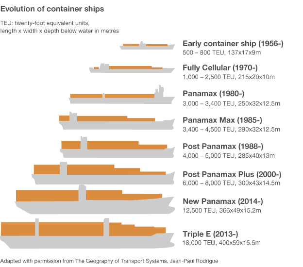
(via sunfoundation)
Barcelona FC’s Lionel Messi won his fourth straight Ballon d’Or trophy earlier this month, topping off a record breaking 12 months. It ranks him as this years best player in the world’s most popular sport, and arguably the best ever. 2012 say him score a record-breaking 91 goals — breaking a 40-year-old mark held by German Gerd Muller.
(h/t mashable)
Rocket science in the 100 most frequently used words.
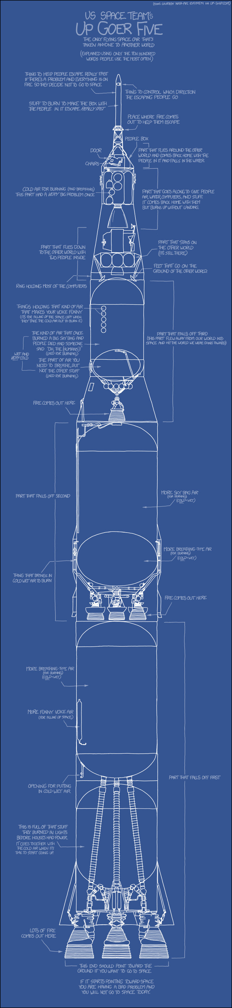
(via xkcd)
The Huffington Post has superbly informative infographic comparing Disasters: Sandy vs. Katrina. It walks through the data to put the two mega-storm hurricanes into perspective.

Designed by Tim Wallace and Jaweed Kaleem.
(h/t Sunlightfoundation)
According to MSN, the World – except China – would vote for Obama.
In 34 of the 35 countries where MSN quizzed its online readers, the current US president won well over half of the votes. The only exception was China, where readers backed Romney by 52% to 48%.

According to a BBC World Service opinion poll of 21,797 people in 21 countries , 50% favoured Mr Obama, with 9% for Mr Romney.
Only Pakistan’s respondents said they would prefer to see Mr Romney win November’s election. France was the most strongly pro-Obama (72%).

Following on from Frankel’s record breaking win at Ascot last weekend, the folks over at betting-directory.com have put together his trumps in this handy infographic.


