Category Archives: Graphs and Charts

Graphs and Charts Spending

How The Poor And The Rich Spend Their Money – [GRAPHIC]

As part of NPR’s Graphing America series, Planet Money takes a look at how the poor, middle class and rich spend their money. Not surprisingly, the poor spend more of their money on essentials like groceries and utilities while the rich spend more on education and saving for retirement.

The figures highlighted in the graph above come from the Consumer Expenditure Survey, which includes lots of useful data on spending patterns in the U.S.

(via Planet Money)

Graphs and Charts Visualizations

Transparency in Corporate Reporting – [VISUALIZATION]

Fantastic interactive created by the team at the Guardian showcasing Transparency International’s Transparency in Corporate Reporting index. They ranked the world’s 105 largest companies in terms of the steps they take to fight corruption and the openness of its financial self-reporting. Norwegian oil and gas company Statoil was the clear leader, while the Bank of China came in last place. Check out the interactive below which allows you to explore the data, including a breakdown of each company’s score across the three assessed categories (reporting on anti-corruption, organisational transparency and Country-by-country reporting).

Funny Graphs and Charts Politics Visualizations

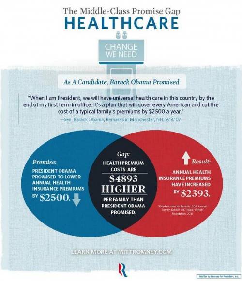
How Not To Venn Diagram – [GRAPHIC]

Sociological Images’s Lisa Wade has good concise blog post highlighting the errors in a recent set of graphics released by the Romney campaign. She points out:

Mitt Romney’s campaign put out a set of graphics illustrating a “gap” between what Obama promised and what he has delivered. The graphic is in the form of a Venn diagram, a visual designed to show the overlap between two conditions…

Unfortunately, Romney’s overlapping circles are not Venn diagrams, making the campaign somewhat ridiculous and giving nerdy liberals all over America a good chuckle.


Graphjam also weights in on the subject:

(via Sociological Images and Graphjam)

(h/t Boingboing)


Graphs and Charts Spending Visualizations

50 Years Of US Government Spending – [GRAPH]

The fascinating graphic below – from NPR – details US federal government spending and how this has changed from 50 years ago, 25 years ago and last year. It categories spending into areas such as defense, social security and medicaid.

50 Years Of Government Spending, In 1 Graph

For more details on the categorisations above, check out Planet Money’s blog post on the chart.

Data sourceOffice of Management and Budget

(via NPR Planet Money)

Funny Graphs and Charts

Sources of Stress Over Time – [GRAPH]

How our sources of stress change over time. Seems fairly apt.
Sources of Stress over time

(via ilovecharts)

(h/t broadsheet)

Funny Graphs and Charts

Doing the Hokey Cokey – [CHARTS]

Hokey Cokey

(via Stephen Wildish)

(h/t broadsheet)

Graphs and Charts Map Visualizations

How Common Is Your Birthday? – [GRAPHIC]

Amitabh Chandra of Harvard University provided the data for a New York Times article back in 2006 based on babies born in the United States on dates between 1973 and 1999.

The data (visualized on the headmap below) shows Sept. 16 was most common with Feb. 29 (only in a leap year) obviously the least common.
How Common Is Your Birthday?

Data source: NYTimes.com, Amitabh Chandra, Harvard University.

For more check How Common Is Your Birthday – Pt 2.

(via broadsheet)

Earth Graphs and Charts Images

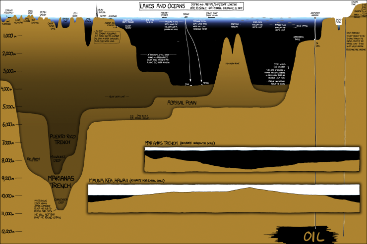
Planet Earth: The other 70% – [CHART]

Randall Munroe’s “Lakes and Oceans” is another in his beautiful series of charts visualizing large complex things and putting them in proportion to objects we can understand (BTW that tower is the Burj Khalifa – the tallest building in the world).
Lakes and Oceans

(via BoingBoing)

Funny Graphs and Charts

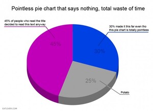
Don’t Look At This Pie Chart – [CHARTS]

Did you see the Potato?

(via broadsheet)

Art Funny Graphs and Charts

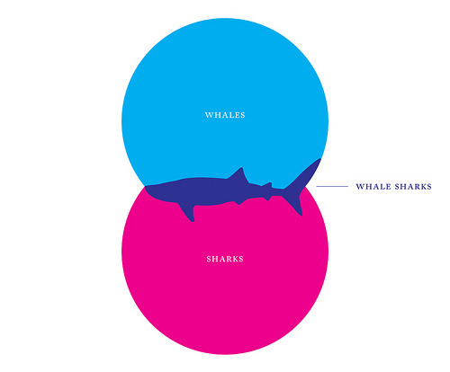
Whale Sharks – [VENN DIAGRAM]

Venn Diagrams – is there anything they cannot do!
Whale or Shark?

(via broadsheet)