Category Archives: Infographic

Premier League Versus La Liga – [INFOGRAPHIC]

The folks over at thescore created this great infographic a few weeks ago to highlight the differences and similarities between arguably Europe’s two best football leagues. The flamboyance and money of the English Premier League, versus the technical prowess of the Spanish La Liga. The Infographic takes a look how both leagues figure in the world of social media, versus the real world.

Premier League Versus La Liga

(via thescore)

Funny Infographic

How To Nap – [INFOGRAPHIC]

How to Nap

(via broadsheet)

Infographic

America’s Economic Machine – [INFOGRAPHIC]

An in-depth infographic from the US Census Bureau detailing the entire American economy.
Inside Americas Economic infographic image [Source: U.S. Census Bureau]

Infographic

How to Setup an Off-Shore Company – [GRAPHIC]

The folks over a NPR’s excellent Planet Money podcast recently reported on how easy it was to setup an off-shore company. One of the more fascinating aspects to the podcast is that while most countries require some kind of documentation e.g. a passport, when setting up an offshore company, there is one country that requires no such identification. It makes it the easiest country in the world to register a company anonymously. Can you guess which country that is?

Set up an offshore company

For more on this story, check Adam Davidson’s column on the topic in the NY Times:  My Big Fat Belizean, Singaporean Bank Account.

(via Planet Money)

Infographic

Creating Great Infographics – [INFOGRAPHIC]

The folks over at Infographic Labs have created a cool infographic on the topic of, wait for it…creating infographics! First published by Performancing.com it highlights the best practices on developing an infographic and sharing it around the web. It’s seven easy steps include:

1) Think of an idea
2) Create a skeleton and flowchart
3) Colour scheme it
4) Choose eye-catching graphics
5) Research
6) Provide facts and conclusions
7) Edit, edit, edit

(h/t mashable.com)

Infographic

15 Common Grammar Mistakes – [INFOGRAPHIC]

CopyBlogger have assembled 15 of the most egregious grammar mistakes into a simple, easy to use Infographic.

15 Grammar Goofs That Make You Look Silly
Like this infographic? Get more content marketing tips from Copyblogger.

Euro 2012 On Twitter – [INFOGRAPHIC]

Sports website TheScore have visualized the 12 million Euro 2012 tweets to produce the infographic below. The data was taken from social analytics company Sysomos and highlights a new tweets-per-second record for sports in the the final match between Spain and Italy.

Some stats from the infographic:

  • Spain had 873,000 mentions during the tournament, England 849,000 and Italy 716,000.
  • Portugal’s top goalscorer Ronaldo notched up 270,000 mentions with Italy’s Mario Balotelli scoring  213,000 mentions and Spain’s Fernando Torres 188,000.

Euro 2012 on Twitter

(h/t mashable.com)

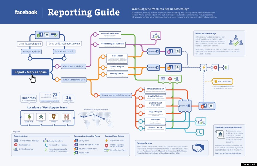
Facebook’s Policing Process – [INFOGRAPHIC]

Facebook provided a rare insight into how it polices the social networking site and its attempts to keep it free of content it deems offensive, illegal or inappropriate.

The infographic below highlights the elaborate reporting system staffed by “hundreds” of people around the world who handle millions of user reports on everything from spam to hate speech or sexually explicit content.

Facebook Reporting Guide

(via HuffingtonPost)

Funny Infographic

iPad Usage – [GRAPHIC]

What people should be doing, and are doing with their iPads.
iPad usage

(via Visual.ly)

Most Popular Stolen LinkedIn Passwords – [INFOGRAPHIC]

According to the folks over at Rapid7  “Link” was the number one hacked password based on the recent LinkedIn data breach. Other popular passwords included “1234”, “work”, “god” and “job”.

LinkedIn Passwords

(via mashable)

Related: