A funny rundown of college laundry habits from the folks over at xkcd.

(via xkcd)
There is news circulating today that a collection (estimates of 6.5 million) of LinkedIn passwords have reportedly been posted on a Russian hacker web forum. Linkedin are currently investigating if any security breaches have taken place, and have released a blog post on account security best practices.
While the passwords remain encrypted – the hackers who stole the data apparently asked others for help to decipher the files. Apparently, the encryption is quite easy to break though, which brings us to xkcd’s insightful infographic below on password strengths.

Also from: Preliminary analysis of LinkedIn user passwords
I thought it’d be fun to try to guess some passwords just based on intuition alone, using LeakedIn to check the guesses. Here’s some of the more entertaining passwords that are in the database: ‘obama2012′, ‘Obama2012′, ‘paladin’, ‘linkedinsucks’, ‘fuckyou’, ‘godsaveus’, ‘ihatemyjob’, ‘ihatejews’ (tsk tsk), ‘manson’, ‘starbucks’, ‘qwer1234′, ‘qwerty’, ‘aoeusnth’ (hello fellow dvorak user!), ‘bigtits’ (really?), ‘colbert’, ‘c0lbert’, ‘bieber’, ‘ilovejustin’, ’50cent’, ‘john316′, ‘john3:16′, ‘John3:16′, ’1cor13′, ‘psalm23′, ‘exodus20′, ‘isiah40′, ‘Matthew6:33′, ‘hebrews11′ (bible verses are quite popular passwords!).
(via xkcd)
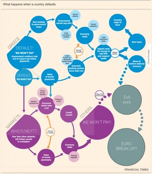
The idea of a Greek exit from the eurozone looks more and more likely each day, with the consequences now said to be ‘managable’. There has been a number of flowcharts and interactive graphics highlighting likely consequences resulting from such a scenario. Some of the most recent are outlined below. Click on the graphics for the full interactive versions.
Financial Times
This interactive graphic from the Financial Times (FT) outlines the likely consequences of a Greece eurozone exit.
Lombard Street Research / (via Guardian)
Along, with this Lombard Street Research has provided a flowchart (considering what happens in the event of a Greek euro exit) and the options ahead for the eurozone.

BBC
The BBC also has a handy interactive graphic contemplating what could happen next if Greece leaves the eurozone.

(h/t broadsheet)
The Data Journalism Handbook is a “free, open source reference book for anyone interested in the emerging field of data journalism”.
It was born at a 48 hour workshop at MozFest 2011 in London and subsequently spilled over into an international, collaborative effort involving dozens of data journalism’s leading advocates and best practitioners – including from the Australian Broadcasting Corporation, the BBC, the Chicago Tribune, Deutsche Welle, the Guardian, the Financial Times, the New York Times, ProPublica, the Washington Post, and many others.
The result, so far, is a beta online book, the outline of which is described below. It offers a glimpse into the practice of data journalism, with guidance on how to get started and a range of case studies, along with sections on getting data, understanding data and delivering data to the public.

The handbook covers topics such as
It also provides details of tools and mechanisms to understand and deliver data to the public through telling stories. As a means of bolstering the case for data-driven journalism, the book also provides many case studies demonstrating “how data sources have been used to augment and improve coverage of everything from elections to spending, riots to corruption, the performance of schools to the price of water.”
Link: Data Journalism Handbook
(via ReadWriteWeb)
Types of coffee.

(via drysoda.tumblr.com)
(h/t sunlightfoundation)
Graphic artist Jared Fanning’s graphic of the top ten most popular books based on sales over the last 50 years. No surprise what’s at number 1, although wouldn’t have thought ‘The Twilight Saga” or “Gone with the wind” would have been top sellers.
The data is sourced from squidoo.com/mostreadbooks based on research from James Chapman (although the exact details of the methodology used is not outlined).

(via businessinsider)
The Atlantic has published research into how US consumer spending has changed in 2007 compared to 1947 levels. The results are visualized through two interactive infographics, which tell the story of we’re now spending less on the production of tangible goods and more on services such as health care, education and recreation.
From the article:
Taking 1967 as our starting point, 30% of the cost of the things we consumed that year went to manufacturing them; by 2007, that figure had fallen to 16%. In contrast, what we spent on business services over the same period jumped from 12% to 26%. That’s because baked into the price of everything we buy is the rising cost of advertising, accounting, legal services, insurance, real estate, consulting, and the like—jobs performed by the high-wage workers of our modern economy.
Click on the images for the full interactive infographics.

Change in spending over the past 40 years

The infographics were created by Kiss Me I’m Polish, based on data from the Bureau of Economic Analysis, Department of Commerce and Census Bureau and noted the challenge in converting the complex datasets into a high level overview:
The data set we were provided was full of complexities – and we wanted our illustration to reflect those meticulous details without becoming visually overwhelming. So we created simple charts and blasted them with a hefty dose of playful and comprehensive imagery.
(via The Atlantic)
Canada’s Globe and Mail has good set of infographics explaining Canada’s 2012 federal budget. The interactive set of infographics explores revenue, expenses and projects from the budget and serves as a useful template for providing easy explanations of complex spending choices and patterns.

(via The Globe and Mail)
Gestalten.tv‘s 2010 podcast, speaks with Steve Duenes (Graphics Director) and Archie Tse (Graphics Editor) of the New York Times about creating diagrams, charts, infographics and interactive media.
(via Sunlight GoViz)
Putting James Cameron’s 11km dive to the Mariana Trench into perspective.

Source OurAmazingPlanet.com, Exploring the wonder and beauty of planet Earth through exclusive news, features and images.

