Doghousediaries’ nice visual representation of where your data lives.
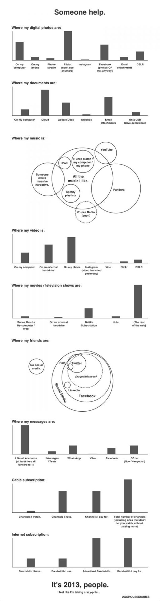
(h/t sunlightfoundation)
Doghousediaries’ nice visual representation of where your data lives.
(h/t sunlightfoundation)
A superbly informative Ted-Ed animation from Scott Gass explaining the immensity of planet earth’s ‘one big ocean’. Some astonishing facts here – “The oceans hold the greatest geological features of our planet” including the largest waterfall, mountain and mountain range.
(h/t broadsheet)
PhD student Jamie Gallagher maps the countries where scientists were living when they discovered the period elements in the table below. The United Kingdom comes first, followed jointly by Sweden and Germany.
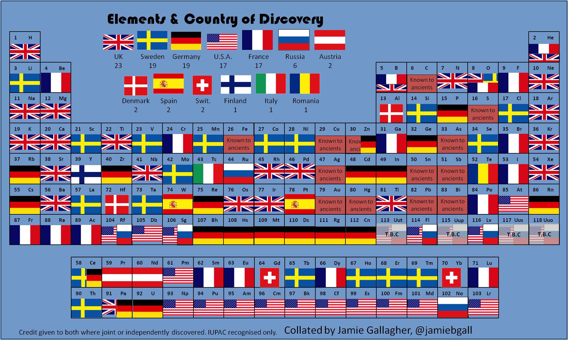
(h/t broadsheet)
Michael Rigley beautiful animation below – titled “Network” – provides a thought provoking analysis of the sheer mass of personal data being captured and stored by mobile phone companies. The video was created for his BFA design thesis project at the California College of Art.
(via boingboing)
Google has announced a new visualization page highlighting the latest trending topics in different colors and sizes. It provides information on real-time searches being executed on the site. Check out Google Trends.

(via mashable)
Bayern Munchen’s 2:1 victory against Borussia Dortmund in this year’s Champions League securing their fifth title in Europe’s most prestigious football cup. For anyone who missed this trilling finale, the Guardian has recreated a shortened version of the match in Lego.
Twitter also visualized the final – in terms of tweets per minute and player mentions.

(h/t mashable)
Jay Gordon has created a mesmerizing visualization of the daily flows of London commuters. Spatial.ly notes how:
It combines the 16 million or so daily transactions made with London’s Oyster cards with vehicle-location data from the city’s 8,500 buses to infer journeys of approximately 3.1 million Oyster users. After inferring the times and locations of each bus boarding and alighting, bus and rail transactions are combined to reconstruct each cardholder’s daily travel history.
From more check jaygordon.net.
Nanex (a developer of real-time trading software) has put together an astonishing video visualizing the stock trading activity in Johnson & Johnson (JNJ) as it occurred during a particular half a second on May 2, 2013.
For more, check out the Huffington Post’s article on the subject.
(h/t SunlightFoundation)