Tag Archives: Visualisation

Visualizing Twitter Hashtags

Follow the Hash Tag is a neat new application, which creates a live visualization of the most active users of any particular twitter hashtag.

Opendata on Followthehashtag.com

From Infosthetics:

The visualization can be filtered for specific keywords, retweets or even unique Twitter users, including several other parameters (such as the minimum or maximum number of times a user needs to mention the keyword to be selected). The result then becomes a large clickable bubble graph accompanied with several Twitter frequency statistics, in which each user is being represented as a unique bubble of which the size depends on the number of appropriate tweets. These bubbles can be further explored to discover the usernames, profiles and their messages

Video Visualizations

Amazon’s Recommendation Network – Visualized

Ever wondered how Amazon manages its recommendation engine? Ever wondered what a book looks like in relation to it’s peers and associated titles? Through the interactive processing tool Gephi API Christopher Warnow helps you delve into the network of relationships surrounding a book.

Amazon Recommendation Network from Christopher Warnow on Vimeo.

The application takes a link from a book on Amazon and visualizes the network of books surrounding it. It presents a fascinating insight into how deep and complex Amazon’s recommendation engine has become.

(via O’Reilly Radar)

Video Visualizations

Shan Carter on Storytelling at the NYT

Shan Carter, Interactive graphic editor at the The New York Times, talks about his work telling stories with data. The presentation entitled: “How I tried for years to find the perfect form for interactive graphics, how I failed, and why, whether a perfect form exists or not, I’ve stopped my desperate pursuit.”, walks through some of the best NYT’s examples of interactive data journalism.

Shan Carter at Data Vis Meetup from sha on Vimeo.

The essential question is how best to present data and tell stories using different levels of interactivity. As part of this, he discusses a number of New York Times visualizations with differing levels of user interaction:

Essentially, what he really wants is:

Something that does statistical analysis, has approachable storytelling and has useful and judicious interactivity

He goes on to say the questions we should ask about data visualizations are: ‘Is it surprising? Is it heartfelt? Does it make me laugh? Our goal is not to make great visualizations, but to communicate with human beings.’

(via FlowingData)

Infographic Video Visualizations

The corruption map of the world

Transparency International’s transparency index measures each country in the world on corruption. See how they compare by clicking on each country.

Transparency International’s 2011 Corruption Perceptions Index (CPI) has just been released, and reveals that corruption around the world remains deeply entrenched – especially on the African continent.

From Transparency International:

The 2011 corruption perceptions index measures the perceived levels of public sector corruption in 183 countries and territories around the world. It is a composite index, a combination of polls, drawing on corruption-related data collected by a variety of reputable institutions. The CPI reflects the views of observers from around the world, including experts living and working in the countries/territories evaluated.

Afghanistan and Myanmar share second to last place with a score of 1.5, while Somalia and North Korea come in last with a score of 1.

New Zealand is perceived as the country with the least corruption with a score of 9.5; while Denmark, Finland, Sweden and Singapore all come in the top five.

See how they compare by clicking on each country, in the Guardian’s Interactive graphic below.

The corruption map of the world

For more infographics on the Corruption Perceptions Index 2011, check out transparency.org.

(via Guardian data blog)

Infographic Spending Visualizations

A Proportional view of the French Budget 2012

Ever wondered how France allocates its budget? A new interactive visualization displays how the country proposes to allocate its spending for across the range of government departments i.e. Employment, Education, Defense, etc. It’s based on 2012 budget policy data that will soon be voted on in Parliament.

The size of each rectangle is proportional to the level of allocations.

For the full graph – only a screengrab of which is shown below – head over to Et voilà le travail.

France Budget - 2012

Spending Visualizations

OpenSpending Visualisations – Uganda

Uganda Budget

The Guardian’s Poverty Matters blog recently published an article on the interactive visualisations of a London-based Overseas Development InstitutePublish What You Fund. The piece deals with how the institute is bringing transparency and clarity to of how donors are spending aid in Uganda, and comparing that with where the government allocates its resources.

It notes how ‘the Ugandan government was only aware of half the aid being spent in the country, despite routinely requesting this information from donors.’

From the article:

The Publish What You Fund campaign group and the Open Knowledge Foundation have now produced a visualisation of Uganda’s aid and budget data for 2003-2006, billed as the first time both sets of data have been displayed together in a way that is easy to explore. A quick look shows just how big a piece of the puzzle aid spending is – more than 50% of overall resources available in Uganda for 2005-2006. The vast majority of this $1.1bn in aid was spent directly by donors on various projects, with only a third given to the government to spend along with its domestic resources. Interestingly, aid money made up only a small proportion of resources for education, while accounting for the majority of resources for health, agriculture, water and the environment.

(via blog.openspending.org)

Visualizations

8 years of US road fatalities

Transport data mapping experts ITO World have taken official data from the National Highway Traffic Safety Administration, and produced a powerful interactive map detailing US road fatalities between Jan 2001 and December 2009.

Each dot on the map represents one of the 369,629 people that died on America’s roads between 2001 and 2009. The map is rendered through OpenStreetMap, and allows you to zoom and navigate through using the controls on the left. You can also search for your town using the box on the top right.

(H/T Guardian data blog)

Infographic Visualizations

Everything you wanted to know about money

XKCD: Money


XKCD's Chart on Money

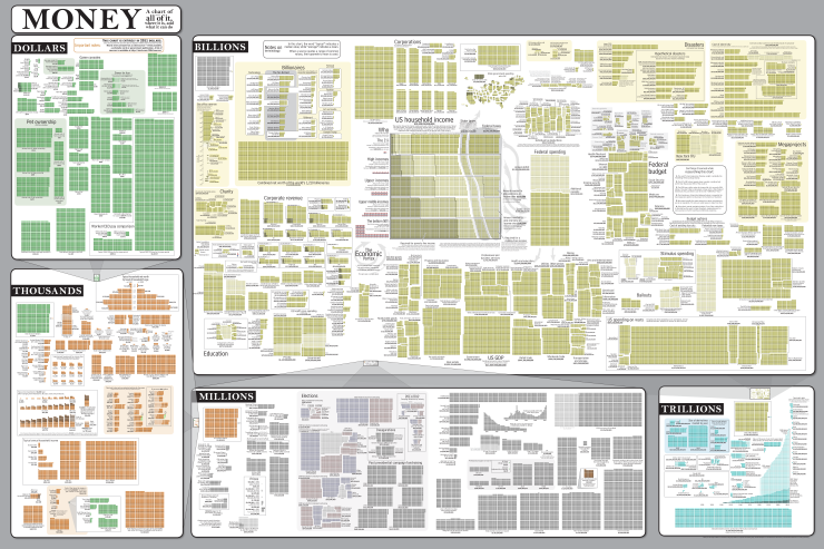
Randall Munroe at xkcd created an epic infographic, called “MONEY: A chart with almost all of it, where it is, and what it can do”.

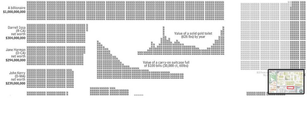
It charts what money can buy  – all the way from a single dollar up to the world’s entire economic output. The chart details are amazing. If you zoom into it you can analyse things like the cost of one B-2 bomber ($2,500,000,000) against the US per capital income in 2005 ($32,360).

Well worth spending some time zooming into and out of the chart to get a sense of the proportions involved…truly staggering.

For the full infographic in all its detail, zoom over to XKCD’s Money

Infographic Visualizations

Eurozone debt web – Interactive Visualization

An interactive visualization of the Eurozone’s debt web, gathered from data by the IMF, Bank for International Settlements, World Bank and UN Population Division.

For an interactive perspective, visit the BBC site.

Open Source Visualizations

American Migration Visualization

Close to 40 million Americans move from one home to another every year. Jon Bruner’s updated “American Migration” visualization, demonstrates how “Americans are enormously mobile: 37.5 million people moved from one house to another last year, with 4.3 million of them moving between states.”

The interactive map lets you click on a specific county and see the immigration and emigration data for that location. Bruner explains on his blog some of the more technical specifics on the creation and workings of the visualization:

When you visit the page, JavaScript code renders a county map of the United States and prepares it for interaction. When you roll over a county, an event listener fires, displaying a callout with the name of the county and turning the county’s edges red. When you click on a county, your browser downloads a corresponding file that includes a list of other counties to which and from which people migrated, along with relevant stats (income per capita of migrants) and the figures that are shown above the map (year-by-year migration, population). Your browser fills out the stats at the top of the screen, draws a graph (or animates a change from the previous graph, if you’ve already clicked on a county), and loops over the counties in the file, filling them with some shade of red or blue to indicate net inward or outward migration.

My JavaScript code deals with two big datasets: one—the migration data—is downloaded and rendered on the fly every time you click on a county. The other consists of the contours of the map itself: the locations of the boundaries that define the 3,143 counties in the United States.

For details on how he used open source tools to create the visualization, check How To Build an Interactive Map with Open-Source Tools.

(Via O’Reilly Radar)