The Global Terrorism Database Visualization (GTDV) is an information visualization application displaying data from 80,000 terrorist events between 1970 and 2004. It aims “to contribute to the emergence of a thorough knowledge about the phenomenon of terrorism”.
The BBC’s visualization below would be beautiful were it not so tragic. It’s a map visualizing traffic casualties between 1999 and 2010. Each light point on the map represents more than 2 million road collisions that resulted in a casualty; the brighter the light, the more frequently collisions occurred in that spot.
Want to explore the travels of Phileas Fogg? How about the journey of Columbus to the new world in 1492? Good.is have put together an informative interactive visualization of history’s greatest journeys from Magellan to Kerovac.
The visualization is available in full at Wanderlust.
Stephen Malinowski played the piano for decades before beginning a career as a programmer. He then went on to create The Music Animation Machine – a visualization software program to animate musical notes. Frédéric Chopin’s famous Nocturne opus 9 No. 2 in E flat major, is visualized below using this software.
The sheet piece for the music is available at ChopinOpus9 and the software to create the animations is available for free at Animation player.
Manu Fernandez has gathered together a collection of visualisations highlighting the intensity of urban activity in cities around the world. The expanding urban landscape is generating a huge amount of data on the inner workings of cities and the social interactions occurring within these environments. The growing open data movement provides a rich ecosystem of data in which to visualize the fabric and life of these societies.
Some of the examples below represent the best formats of how to visualize the intensity of urban life through video and interactive web tools.
Transport data mapping experts ITO World have taken official data from the National Highway Traffic Safety Administration, and produced a powerful interactive map detailing US road fatalities between Jan 2001 and December 2009. Each dot on the map represents one of the 369,629 people that died on America’s roads between 2001 and 2009.
It used hundreds of small, location aware tags attached to different types of trash to follow progress of trash through city’s waste management system. These revealed the stunning final journey of everyday trash in a series of real time visualizations. The project represented “an initial investigation into understanding the ‘removal-chain’ in urban areas and it represents a type of change that is taking place in cities: a bottom-up approach to managing resources and promoting behavioral change through pervasive technologies”.
This map visualizes all bikes of the public hire schemes in London and many other cities throughout the world. The animated map displays information on the distribution of all the checkin points, the level of use at any given time and the availability of bicycles at each point.
Along with the interactive map, there is a superb real-time animation of the use of bikes in London.
This visualization aims to provide a greater understanding of some of the city’s dynamics. It provides people with access to a range of useful real-time urban activity information. The aim is to give “people visual and tangible access to real-time information about their city enables them to take their decisions more in sync with their environment, with what is actually happening around them.”
David Parker’s film “Light” presents a striking visual representation for wasted energy. It attempts to highlight wasted energy as waste-like gooey substance that spills forth from oil disasters or toxic containers.
The filmmakers explained the concept behind “Light”:
[The film] initially began as a project intended to bring awareness to energy waste. Bleeding, crying lights were meant to metaphorically parallel the way in which we invisibly squander our natural resources without much thought. While the original sentiment remains, the film also grew into a poetic statement about a world run amok and the human tendency to exploit that which we hold dear.
Is the US really split 99% v 1%? As poverty and inequality reach record levels, the Guardian has created an animation highlighting the gap between rich and poor in the United Status, and how this has developed over the course of many administrations.
From the Guardian blog post on the animation above:
One in every seven Americans lives below the poverty line – that’s a record 46.2 million people (although it might actually be higher).
• One in six Americans have no health insurance – 50 million people, a population twice the size of Texas (27m people). Of every 17 Americans, at least one will be earning below the minimum wage of $7.25 per hour.
• 14.5% of Americans households are defined as “food insecure”. That means for every seven households, one will have trouble putting enough food on the table
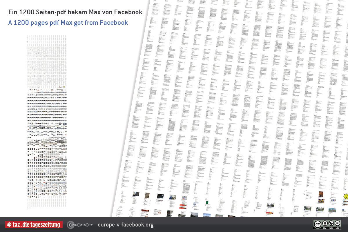
Earlier this year an Austrian law student Max Schrems sent a request to Facebook to provide him with all his personal data. As Facebook has its European Operations center within the EU – in Dublin, Ireland – it must conform to EU law, and thus was obliged to provide all the data it stored about him.
Facebook sent Max received a CD containing about 1,222 pages (PDF files). This included deleted chats and other interactions dating back to 2008. This data was then visualized by Berlin-based newspaper taz.de [see results below].
Max Schrems has also requested more information on any other data which Facebook stores about him. Facebook has said this is confidential, and the matter is now with Ireland’s data protection commissioner which has started an audit. As a result of this, a new initiative has been started called Europe versus Facebook, which aims for greater transparency and control of personal data on Facebook.
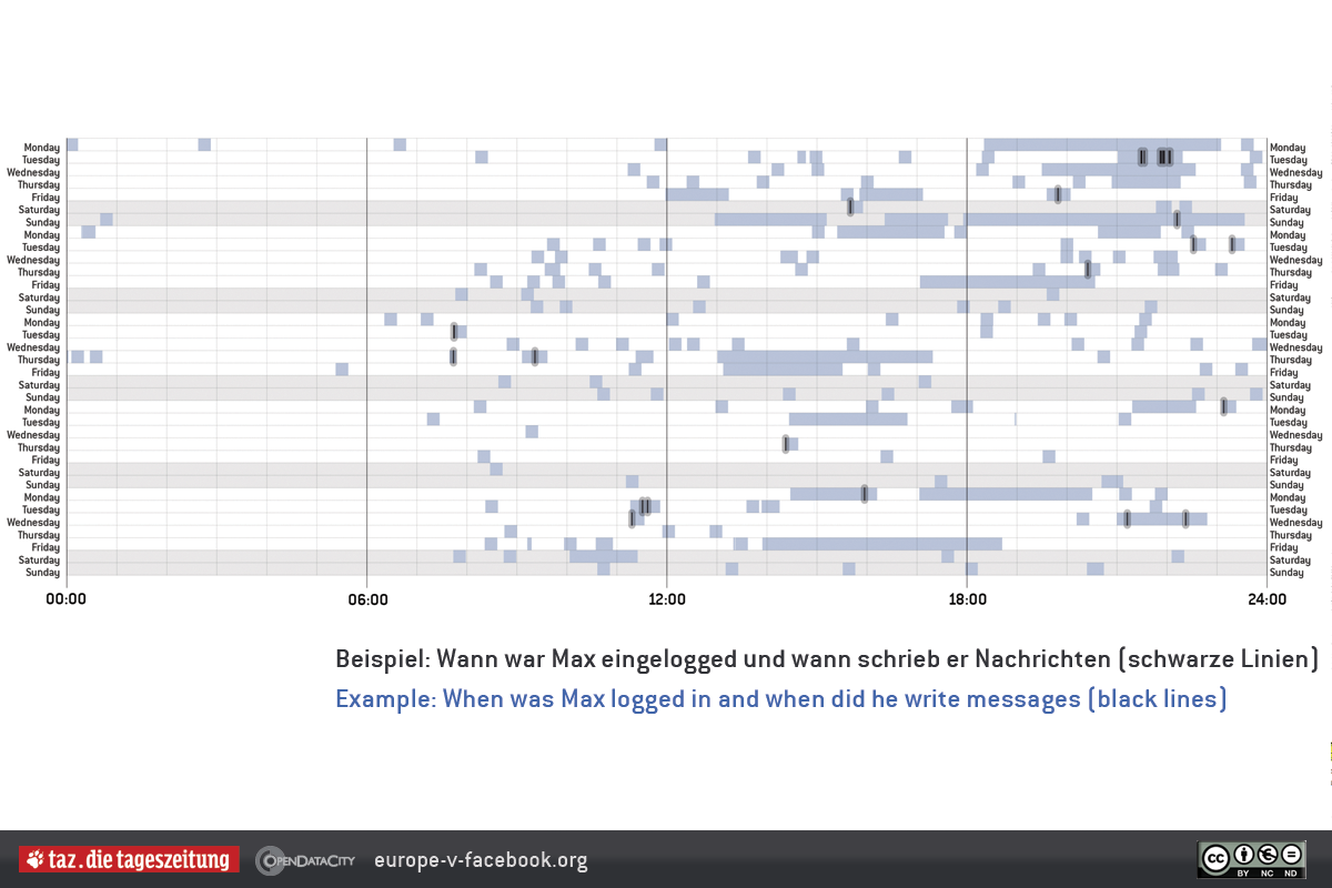
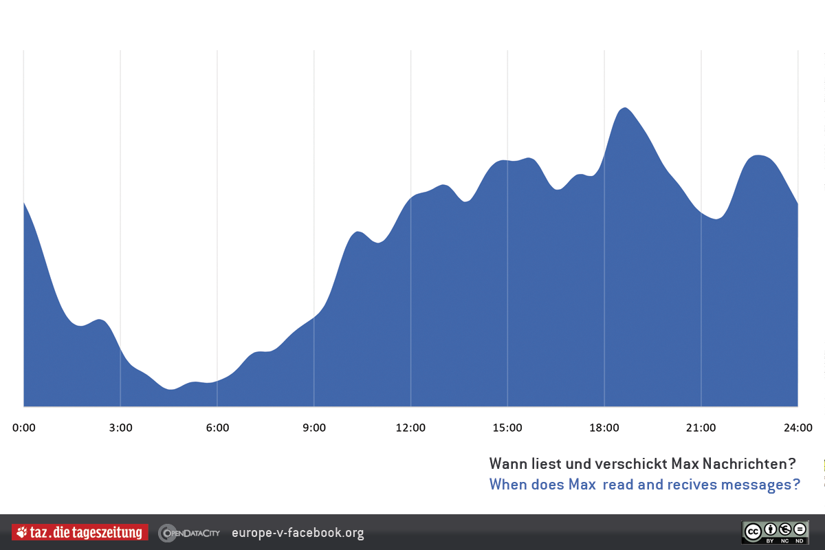
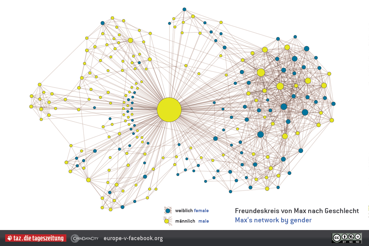
Visualizations of Max’s Facebook data from Taz.de
1,222 pages of Max’s Facebook data
Max’s Facebook logins
Max’s Message Activity
Max’s Facebook Network
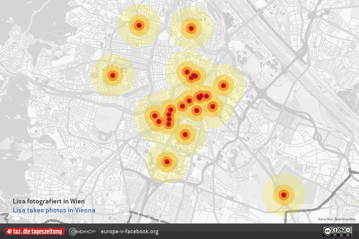
Max’s Vienna Photos
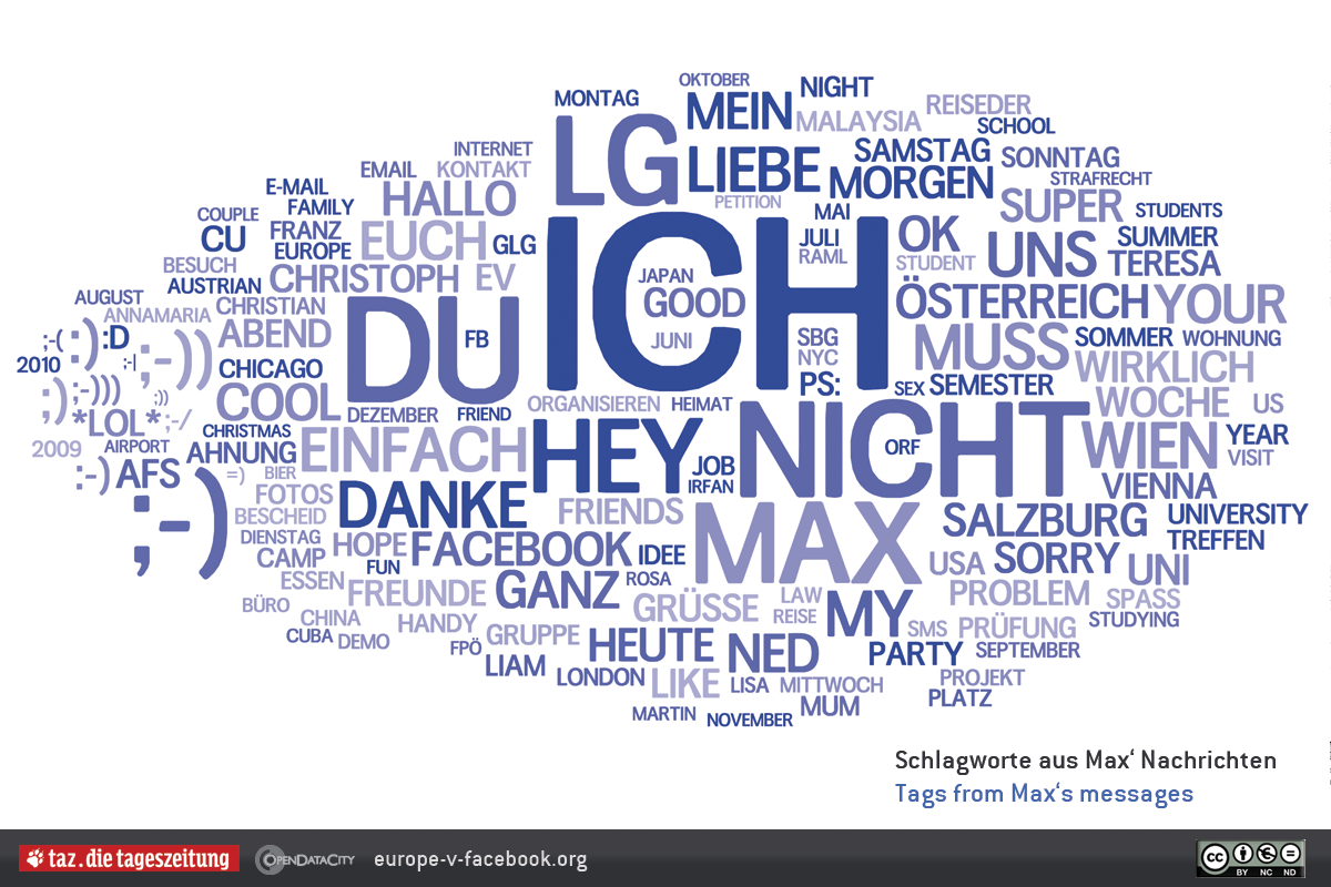
Tags from Max’s Messages
To get access to your own data from Facebook, follow the instructions at Europe-v-Facebook.org.
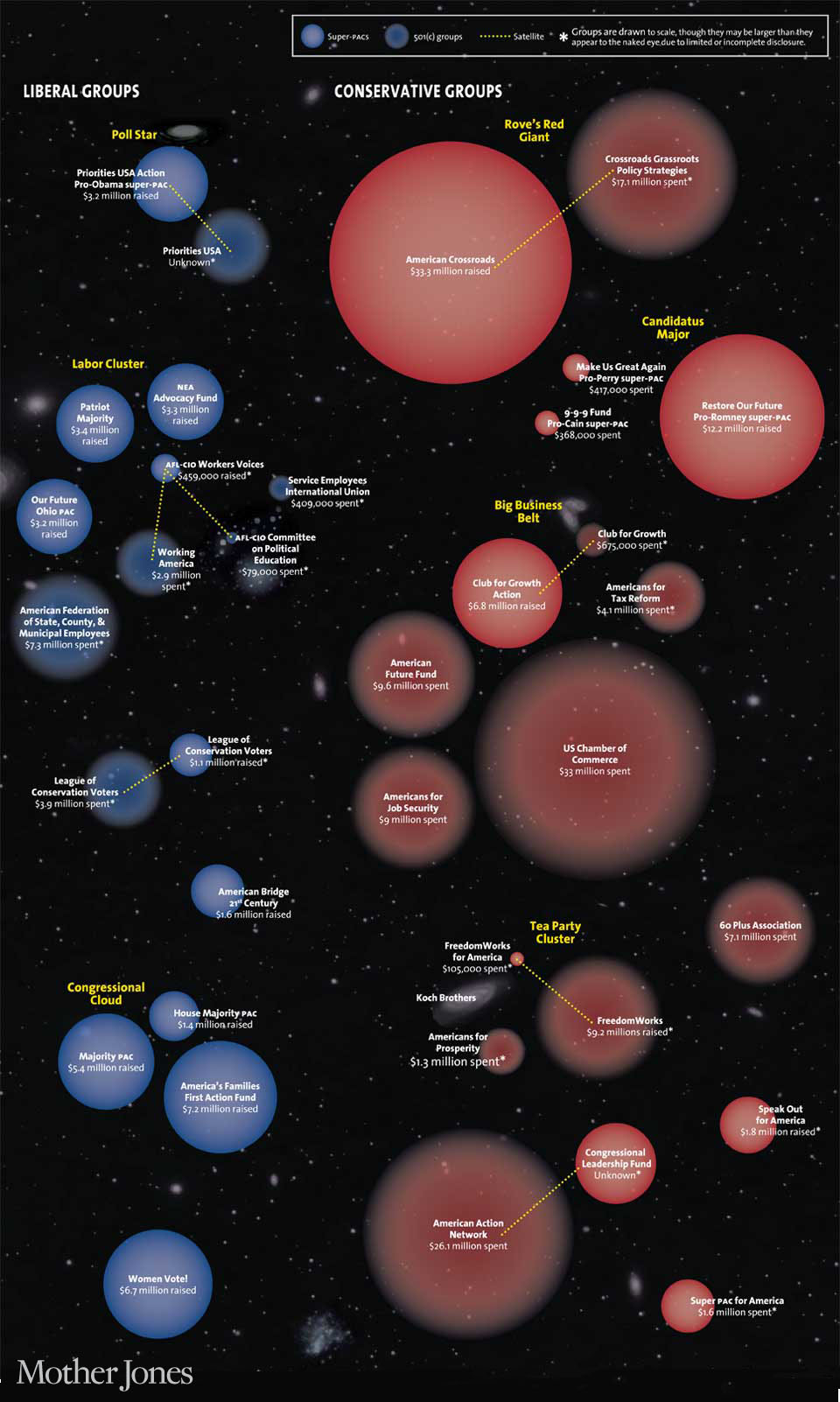
The guys over at Motherjones.com have charted Democrat and Republican groups spending millions to influence the 2012 election.
Following the seminal Citizens United case – which prohibits government from censoring political broadcasts by corporations or unions – there has been a ratcheting up of money spent by nebulous groups in federal elections. Expanding super-PACs and vague 501(c) groups are exerting their considerable influence – in terms of advertising – in many areas of the political specturm. The chart below illustrates each group’s size based upon all known fundraising or spending since 2010.