Category Archives: Visualizations

Visualizations

America Revealed: Pizza Delivery – [VISUALIZATION]

PBS’s America Revealed Food Machine provides an insight into the mammoth supply chains necessary to feed 300 million Americans every day.

From the series:

For the first time in human history, less than 2% of the population can feed the other 98%.  Yul embarks on a trip that begins with a pizza delivery route in New York City then goes across country to California’s Central Valley, where nearly 50% of America’s fruits, nuts and vegetables are grown and skydives into the heartland for an aerial look of our farmlands.

Euro 2012 Twitter Data Visualization – [VISUALIZATION]

Social media monitoring company Brandwatch have created a cool data visualization Web tool, which reveals what twitter user sentiment on the England and Germany squads. The chatter is updated in real-time as people tweet about different players.

Unfortunately (or fortunately), there is no such visualization available for the Ireland squad.
Brandwatch England Euro 2012

As TheNextWeb says:

If nothing else, this is a good example of how, with the right presentation, social data can be aggregated and used to give a good overview of national sentiment around an event.

(via TheNextWeb)

Politics Spending Visualizations

Presidential Candidates Money Raising – [VIDEO]

The video shows how presidential candidates (Barack Obama, Mitt Romney, Ron Paul, Rick Santorum and Newt Gingrich) raised money state by state during 2011/2012.

The circle sizes indicate the amount of contribution per capita giving to the candidates by each state. The timelines show the overall money per capita raised by candidates during a particular time.

The data is based on the Sunlight Foundations APIs, based on Federal Election Commission data released on Feb. 2012.

(via Sunlight Foundation)

Europe Infographic Visualizations

Consequences of a Greek eurozone exit – [INFOGRAPHIC]

The idea of a Greek exit from the eurozone looks more and more likely each day, with the consequences now  said to be ‘managable’. There has been a number of flowcharts and interactive graphics highlighting likely consequences resulting from such a scenario. Some of the most recent are outlined below. Click on the graphics for the full interactive versions.

Financial Times

This interactive graphic from the Financial Times (FT) outlines the likely consequences of a Greece eurozone exit.

Consequences of a Greek eurozone exit

Lombard Street Research / (via Guardian)

Along, with this Lombard Street Research has provided a flowchart (considering what happens in the event of a Greek euro exit) and the options ahead for the eurozone.

Greek euro exit flowchart: what happens next

BBC

The BBC also has a handy interactive graphic contemplating what could happen next if Greece leaves the eurozone.

What could happen next if Greece leaves the eurozone?

(h/t broadsheet)

Infographic Journalism Open Source Visualizations

Data Journalism Handbook – [BOOK]

The Data Journalism Handbook is a “free, open source reference book for anyone interested in the emerging field of data journalism”.

It was born at a 48 hour workshop at MozFest 2011 in London and subsequently spilled over into an international, collaborative effort involving dozens of data journalism’s leading advocates and best practitioners – including from the Australian Broadcasting Corporation, the BBC, the Chicago Tribune, Deutsche Welle, the Guardian, the Financial Times, the New York Times, ProPublica, the Washington Post, and many others.

The result, so far, is a beta online book, the outline of which is described below. It offers a glimpse into the practice of data journalism, with guidance on how to get started and a  range of case studies, along with sections on getting data, understanding data and delivering data to the public.

Data Journalism Handbook

The handbook covers topics such as

  • open data,
  • data use rights,
  • scraping and crowd-sourcing data,
  • becoming data literate,
  • presenting data to the public
  • community engagement.

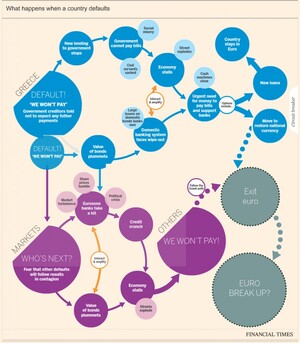
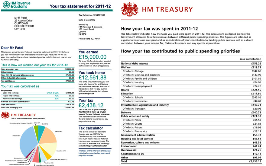
It also provides details of tools and mechanisms to understand and deliver data to the public through telling stories. As a means of bolstering the case for data-driven journalism, the book also provides many case studies demonstrating “how data sources have been used to augment and improve coverage of everything from elections to spending, riots to corruption, the performance of schools to the price of water.”

Link: Data Journalism Handbook

(via ReadWriteWeb)

Graphs and Charts Spending Visualizations

50 Years Of US Government Spending – [GRAPH]

The fascinating graphic below – from NPR – details US federal government spending and how this has changed from 50 years ago, 25 years ago and last year. It categories spending into areas such as defense, social security and medicaid.

50 Years Of Government Spending, In 1 Graph

For more details on the categorisations above, check out Planet Money’s blog post on the chart.

Data sourceOffice of Management and Budget

(via NPR Planet Money)

Graphs and Charts Map Visualizations

How Common Is Your Birthday? – [GRAPHIC]

Amitabh Chandra of Harvard University provided the data for a New York Times article back in 2006 based on babies born in the United States on dates between 1973 and 1999.

The data (visualized on the headmap below) shows Sept. 16 was most common with Feb. 29 (only in a leap year) obviously the least common.
How Common Is Your Birthday?

Data source: NYTimes.com, Amitabh Chandra, Harvard University.

For more check How Common Is Your Birthday – Pt 2.

(via broadsheet)

Infographic Politics Spending Visualizations

Canada Budget 2012 – [INFOGRAPHIC]

Canada’s Globe and Mail has good set of infographics explaining Canada’s 2012 federal budget. The interactive set of infographics explores revenue, expenses and projects from the budget and serves as a useful template for providing easy explanations of complex spending choices and patterns.
Infographic: Your 2012 federal budget explained

(via The Globe and Mail)

Politics Spending Visualizations

UK Budget 2012 – [INTERACTIVE]

The folks over at  Where Does My Money Go and Daily Bread have created a simple budget 2012 interactive showing where British taxpayer’s taxes are spent. It provides a slider for users to select their salary, and then breaks down the associated income tax and national insurance paid into buckets for areas such as the National Health Service (NHS), education and defence.

The UK Chancellor George Osborne is planning to provide taxpayers with a personal tax breakdown detailing how much of their income is paid to the state and what it is being spent on. These annual tax statements are due to be issued from 2014 – 15.

Budget 2012: how your taxes are spent - interactive

Specimen annual tax statement due to be issued from 2014-15 onwards.

A mock up of a 'tax receipt'.

Photo: Guardian/HM Treasury/PA


(via Guardian data blog)

SXSWi: Creating Visual Stories – [GRAPHIC]

This year’s South by South West (SXSW) festival saw Ogilvy Notes partner with ImageThink and others to create visual notes for a number of the conference sessions. Artists sketched notes from hour long sessions in real time, and the results of these were made available for free to conference attendees on the OgilvyNotes website.

Sean Parker Presentation

Today’s Observer has an interview with Nora Herting – one of the founding members of ImageThink – in which they explain how they can take complex theories on technology and turn them into dynamic visual stories:

Compressing knotty discussions into easy-to-digest visual stories is hard work. Before they started Image Think in 2009, Herting and her co-founder, Heather Willems, spent four years at a consulting company in New York where part of the job involved what they call “graphic facilitation”. They would turn up at private business meetings and engage the participants by sketching the discussion as it unfolded. Backgrounds in fine art helped, but getting their drawing up to speed took practice.

“We had to very quickly develop a visual language,” says Willems. “Now, if somebody talks about innovation and change, there are immediate icons that pop into my head. We’re constantly trying to develop our skills: listening and synthesising as well as the more graphic components of the work.”

Now, the little start-up is working with some of the biggest organisations in the US, including Google, Disney, Microsoft and Nasa. The advertising and PR giant Ogilvy commissioned ImageThink – Herting, Willems and a small team of freelance illustrators – to sketch the talks at SXSW.

ImageThink in action.

(via Observer)